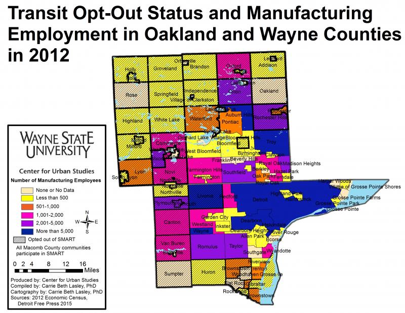
Opting-Out limits manufacturing employment opportunities for the transit dependent

James Robertson, has been coined Detroit’s “walking man” because of his tenacity in earning a perfect attendance mark at his suburban factory job all while walking nearly 21 miles round trip from Detroit to Rochester Hills. Without a car, Robertson must hobble together a defunct set of bus routes, leaving him no choice but to walk most of the distance into the Detroit suburbs. This story is surely one of many in the Metro-Detroit are, begging the question: Why is the public transit system in the Detroit area far less than mediocre?

Drawing Detroit sets out to illustrate the issue and to discuss how allowing communities to opt out of transit service can limit employment opportunities and create a situation of economic injustice.

Below is a map showing the number of manufacturing employees reported to the 2012 Economic Census of the U.S. Census Bureau in 2012 along with the transit status of communities in Wayne and Oakland counties. Aside from the Detroit Department of Transportation, the only existing transit system that is close being considered somewhat regional is Suburban Mobility Authority for Regional Transit (SMART). SMART has bus lines that run throughout Wayne, Oakland and Macomb counties. In Wayne and Oakland counties municipalities have the option to either opt-in or opt-out supporting SMART, and therefor having it run through their community. In Oakland, the majority of communities-55 percent of 33 of 60- have opted out. In Macomb County, all municipalities support SMART; they do not have the option to opt-out. Because of this, they are irrelevant to the discussion.

Some critics of the Free-Press article on Robertson indicated that there has been little need for low-skill workers in Detroit and other poorer communities to travel into these opt-out communities for employment or otherwise, characterizing these suburbs as bedroom communities with limited job prospects for transit-dependent workers. A quick examination of the map below indicates this is a fallacy. Many manufacturing jobs have moved to the suburbs, following its workforce and also seeking out new facilities and campuses in unsettled areas. Opt-out communities including Oxford Township, Novi and Canton have in excess of 2,000 manufacturing jobs located in their boundaries; Livonia had 9,447 manufacturing jobs in 2012.

In total, 38,461 manufacturing jobs were located in opt-out communities in these two counties, representing 34.1 percent of all manufacturing jobs in the two-county area. Broken down by county, it is 29.6 percent (19,484 manufacturing jobs) of Wayne County’s manufacturing employment and 40.6 percent (18,977 manufacturing jobs) of Oakland’s manufacturing employment.

Median income provide different view of Southeastern Michigan

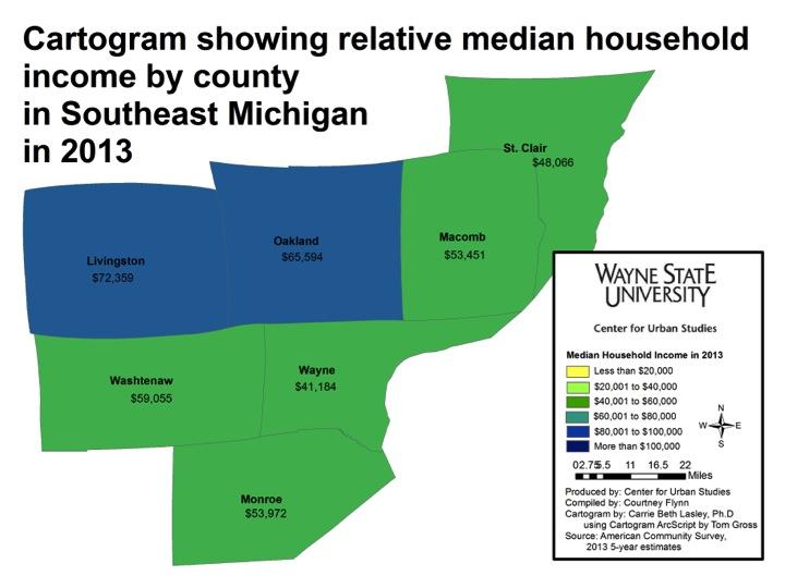
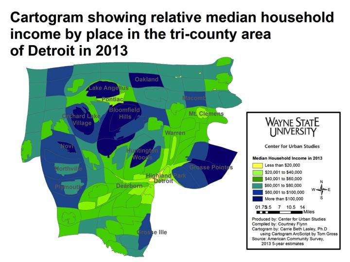
Various blog posts drawing attention to the income disparities that exist throughout Southeastern Michigan have appeared on Drawing Detroit. This particular post though is more visual in its depiction of income throughout the region at the county and municipal levels. In particular, this post presents the 2013 median household income for the seven counties in the region, along with the municipalities in the tri-county region, in a cartogram form.

A cartogram is a geographic representation method that alters the area and shape of locations, while still preserving their spatial relationships, in order to demonstrate the relative relationship of a data feature. This method allows the cartographer to change the way the map is experienced visually, by applying weight to data, while also maintaining geographic relationships.

Of the maps presented in this post, the above map is the least skewed in terms of income in relation to the size of the counties. Livingston County, which had the highest median household income in 2013 at $72,359, appears only slightly larger than its size on a normal scale. There is also a noticeable difference in the size of Wayne County, which had a median household income of $41,138 in 2013. This was the lowest median household income of all the seven counties.

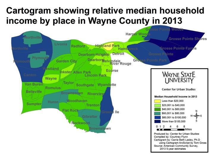
The above two maps truly highlight the income disparities in the tri-county region, particularly in Wayne County. In both maps, the Grosse Pointes stand out as having median household incomes above $80,001. Grosse Pointe Woods ($105,071) and Grosse Pointe Farms ($107,152) had the highest incomes in that area.

In looking at both maps we see that Detroit simply serves as a low-income small connector between wealthy municipalities like the Grosse Pointes and the Plymouth area. Because the size of a municipality in these maps is determined by relative median household income and not geographic size, Detroit, which is the largest city by population in the state of Michigan, does not draw the visual attention it typically would. It has been dramatically impacted by its low median household income of $26,325 in 2013.

Another notable municipality with a high median household income is Lake Angelus in Oakland County. Lake Angelus is only 1.6 square miles but in the above map we see that its median household income makes it larger (in the cartogram) than cities such as Pontiac, Detroit, Warren and Mount Clemens. Lake Angelus had a median household income of $163,393 in 2013.

Other municipalities whose size appears larger in these maps because of their median household income were: Bloomfield Hills ($147,969), Novi Township ($108,125), Plymouth Township ($86,217), Canton ($81,667), Northville Township ($97,161), Grosse Ile ($88,238), and Orchard Lake ($137,321).

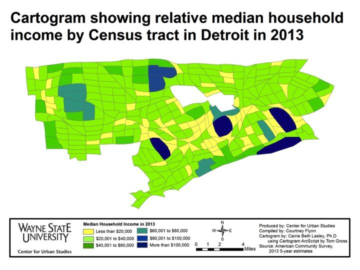
The above cartogram looks at median household income in Detroit by Census Tract in 2013. Areas making less than $20,000 greatly outnumber those making $80,000 or more. Riverview, Midtown, Rosedale Park and Indian Village swell greatly due to their high median income, while areas like Palmer Park and Grandmont-Rosedale also increase in size at the expense of areas like Brightmoor, Briggs, Core City and Poletown.

By viewing a municipality’s size in relation to the median household income we are able to gain a better understanding of where higher household incomes are located in Southeastern Michigan. These maps show that much of the wealth in the region is located in the northeastern and northwestern portions of Wayne County and throughout Oakland County.

Wayne Disposal releases highest amount of mercury in the region

According to the Agency of Toxic Substances and Disease Registry, exposure to mercury, a naturally occurring element, can cause gastrointestinal, developmental, neurological, ocular, and renal damage. While the most common way humans are exposed to mercury is through consumption of fish and shellfish, we are also exposed to it when coal is burned. According to the Environmental Protection Agency, the largest human cause of mercury emissions comes from burning coal. With this in mind, the EPA issued a mandate for mercury emissions from coal-fired power plants to be limited by 2015. By 2016 the mandate is to be fully implemented and mercury emissions are to be reduced by 90 percent, according to the EPA.

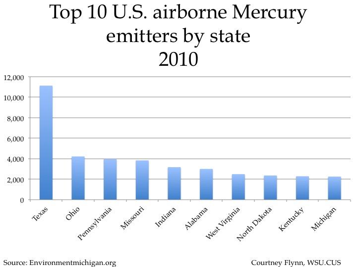
As presented by EnvironmentMichigan.org, above the top 10 mercury emitters by state (this includes coal-fired power plants and other emitters) are shown from 2010. Michigan came in at number 10, with facilities emitting 2,253 pounds of mercury into the atmosphere. Ohio, Indiana, and Pennsylvania were the three Great Lakes States that came in above Michigan. Texas was the state with the overall highest mercury emissions at 11,127 pounds.

Unlike the previous chart, this one shows the 2010 emissions for coal-fired power plants. In parallel with the first chart, Ohio, Indiana and Pennsylvania’s coal-fired power plant emissions were higher than Michigan’s.
In 2010, according to the Natural Resources Defense Council, Michigan based coal-fired power plants emitted 1,924 pounds of mercury into the air. In comparison, the following Great Lakes states produced these emissions from coal-fired power plants: Ohio power plants emitted 2,865 pounds, Pennsylvania emitted 2,720 pounds, Indiana emitted 2,174 pounds, Illinois emitted 1,484 pounds, Wisconsin emitted 1,269 pounds, Minnesota emitted 873 pounds and New York emitted 239 pounds.

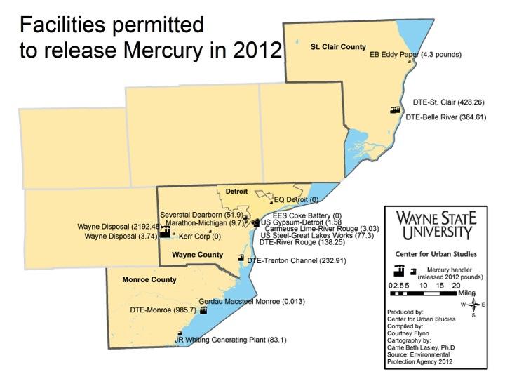
The map above displays 2012 mercury releases for the 15 facilities in southeast Michigan that are permitted to release mercury. According the EPA, a chemical release means the material is emitted into the air or water or placed in a type of landfill for disposal.
DTE, released a total of 2,127.8 pounds of mercury from its five power plants in the region. The largest contributor to mercury releases from power plants was the DTE Monroe Power Plant at 985.7 pounds. The St. Clair DTE Power Plant released 426.26 pounds of mercury and the Belle River DTE Power Plant, just a few miles south of the St. Clair location, released 364.7 pounds of mercury in 2012. The Trenton Channel DTE Power Plant released 232.91 pounds and the River Rouge location released. 138.25 pounds.
The largest mercury releaser in 2012 was not a coal-fired power plant,
but a hazardous waste landfill:  Wayne Disposal had the highest mercury releases on a single permit, 2,192.48 pounds. The second largest mercury release site in the region, The Monroe power plant released 965.7 pounds of mercury in 2012, which is higher than what the Natural Resources Defense Council reported was emitted in 2010. Although information from 2010 was presented above, this map offers information from 2012 to show the most recent emissions. This same data was not readily available for 2010 and 2011.

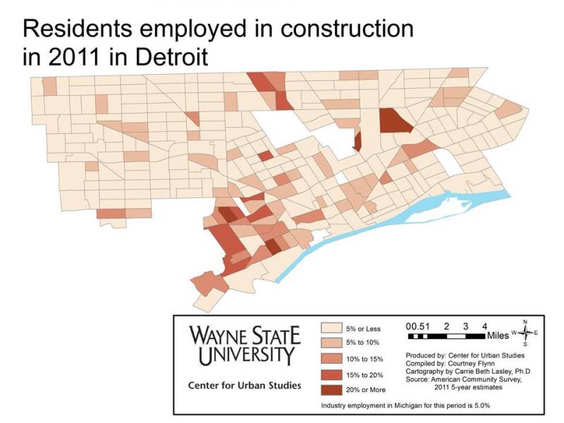
Most Detroit residents employed in health care, educational services, and social assistance industries

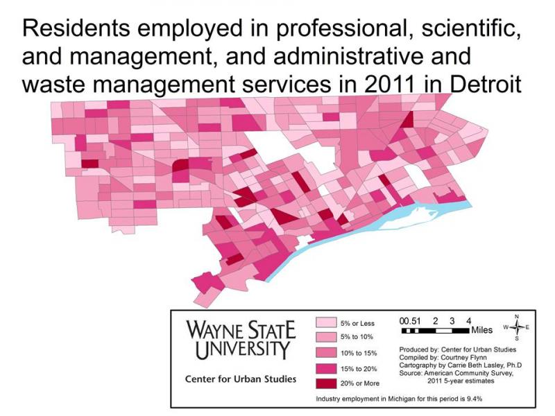
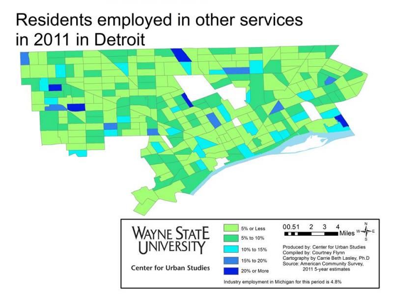
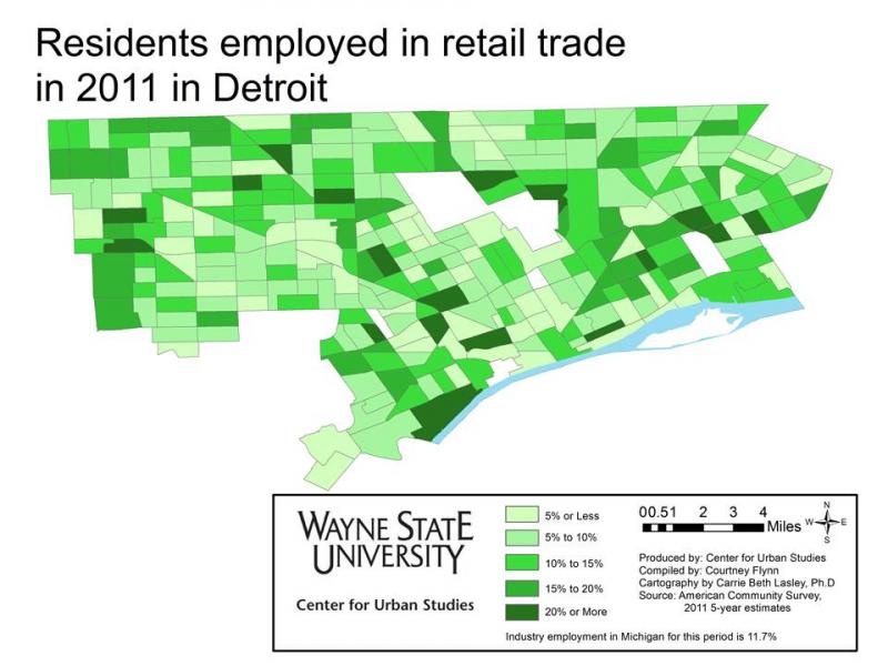
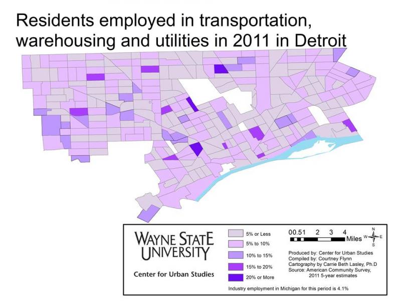
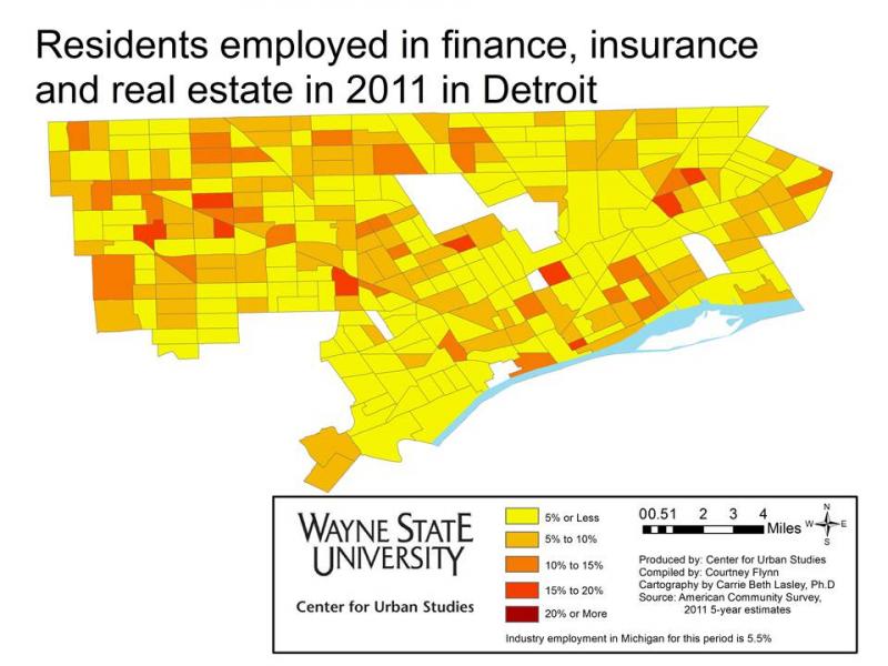
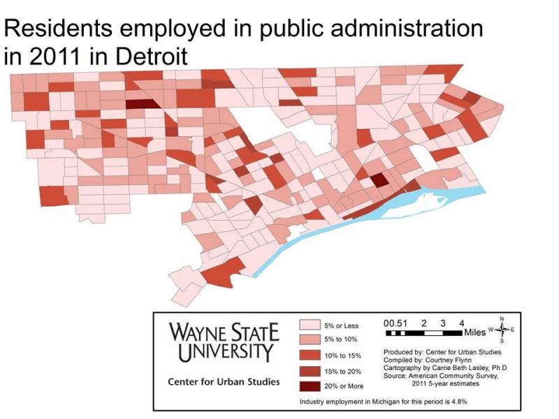
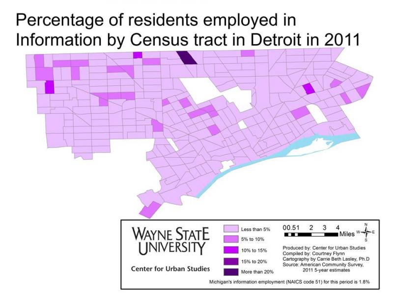
This post is an extension of last week’s (link here), in that we are showing which industries draw the most about of Detroit residents, ages 16 and older, for employment. Here  we examine the types of jobs by percentage of the working population in the City of Detroit in 2011, according to the five-year American Community Survey. To learn more about the specific occupations included in the different industries described  in this post please click here.

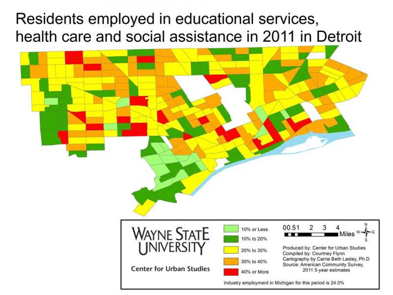
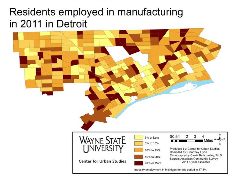
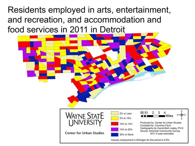
In reviewing the maps, a pattern similar to the region is reflected. The structure of the local economy is based around health care, educational services, social assistance, manufacturing, arts, entertainment, and food service industries.

According to the map, in the health care, educational services, and social assistance industries there were about 20 Census tracts that had 41 percent or more of the population employed in these services. There were also about 75 Census tracts where between 30 and 40 percent of the population was employed in these industries in 2011.The other top industries in which Detroit residents were employed in for the year 2011 were the arts, entertainment and recreation, accommodation, and food service industries. There were about 40 Census tracts in the city were 20 percent or more of the residents were employed in these industries. Manufacturing also had a large employment draw in the city; there were about 35 Census tracts within Detroit where 20 percent or more of the 16 years and older population was employed in the manufacturing industry.

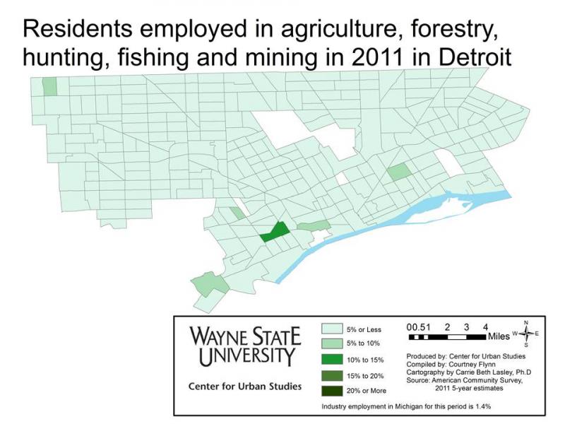
Agriculture was the industry with the least amount of Detroit residents employed in it. All but five of the Census tracts had 5 percent or less of the population employed in the industry. The information and construction industries also had low draws. There was a pocket in southwest Detroit though where there was about 15 Census tracts in 2011 with 15 percent or more of the population employed in construction.

Marriage coming at a later age for most

According to a recent column in The New York Times, the national marriage rate isn’t necessarily declining. Rather, people are choosing to get married at an older age (late 20s compared to late teens). To learn about why read the article here. Also, to get a look at marriage rates for Detroit check out our recent post here.

Jobs in healthcare on the rise

A look at the information presented below shows the numbers of healthcare related jobs becoming available are on the rise. As this industry is expected to grow in the Detroit area (Lapeer, Monroe, Macomb, Oakland, St. Clair and Wayne counties) job loss in the manufacturing industry is expected to continue through 2018. Overall in the area there is expected to be about 112,000 more jobs added to the Detroit area labor market through 2018; this is a 5.5 percent growth.

All of the information presented on job growth and decline spans over 10 years, from 2008 to 2018.

Of the industry and occupation forecasts examined in this post, the industry forecasts are produced by the Michigan Department of Management, Technology and Budget.  The industry forecasts are based on historical job trends in the specific industry and the expected short-term, or long-term demand, in those sectors. These demands are determined by industry experts and the Michigan Department of Management, Technology and Budget. Once the industry projections are produced, information on occupational staffing patterns and the shifting trends in such occupational patterns are examined. The examination of these patterns is then used to generate the occupational forecasts.

According to the Michigan Department of Management, Technology and Budget, since a specific occupation is often found in many industries, the relative concentration of an occupation in high demand or low demand industries impacts the overall expected growth rate.  Technology factors are also used because the impact of technological change can decrease or increase future jobs in specific occupations.

growth1

growth2

The above charts show the top 10 jobs the Michigan Department of Technology, Management and Budget predicts will experience the highest percent of growth from 2008-2018 in the Detroit area. While the percentage of growth for the above occupations range from 48 to 26 percent, the raw numbers show the growth will not be that significant. For example, there is a projected 36.3 percent growth in the financial examiner occupation in the Detroit area through 2018. However, when looking at the raw numbers it shows that 36 percent growth is equivalent to 65 jobs over a 10 year span.

Occupations are defined as a set of activities or tasks that persons are paid to perform. Someone can have the same occupation as another person and not be employed in the same industry.

growth3

The above chart shows the expected top 10 growing occupations in the Detroit area through 2018, based on raw or absolute numbers. While three health related occupations are on the top 10 list based on percent of growth, they did not make this top 10 list on raw numbers. According to the Michigan Department of Technology, Management and Budget, healthcare practitioners and technical related occupations will experience the most growth with an expected 18,911 increase in jobs through 2018. There are four healthcare related occupations that are expected to add about 92,000 jobs in the Detroit area in the coming years. The two computer and technology occupations on the list are expected to add about 19,000 jobs.

growth4

growth5

While health and computer related fields are among the occupations suggested to experience growth through 2018, it is the manual labor based jobs that are suggested to decline, according to the Michigan Department of Technology, Management and Budget. The above two charts show the top 10 declining occupations in the Detroit area based on percent of decline. Drilling and boring occupations are expected to decline the most by percent through 2018. However, when looking at the raw numbers of the 10 occupations shown above, postal service sorters and processors are expected lose the most number of jobs.

growth6

When examining the top 10 occupations expected to experience the most job loss through 2018 based on raw numbers, most are related to manufacturing processes.  There is only one listed in the top 10 declining occupations based on percent decline. This occupation is the postal service sorters and processors. The Michigan Department of Technology, Management and Budget expects there to be a loss of 1,006 positions in this occupation through 2018. The production occupation is expected to experience the largest decline in jobs, based on raw numbers from 2008 to 2018. There is an estimated loss of 16,818 jobs.

growth8

growth9

Of the top 10 growing industries in the Detroit area, based on percent growth, three are healthcare related and one is technology related. When examining the raw numbers of the top 10 growing industries based on percent growth the healthcare and social assistance industry is expected to grow the most, by 47,421 jobs in the 10 year period.

An industry is a group of establishments that produces similar goods and services.

growth10

When just examining the raw numbers of expected job increases of the top growing industries in the Detroit area, the healthcare and social assistance industry is expected to experience the most amount of growth. This industry is expected to produce an additional 47,421 jobs through 2018.

Slide18

Slide19

When looking at the raw numbers of the industries presented in the above two charts, fabricated metal product manufacturing is expected to experience the largest decline with a loss of 4,144 jobs. Machine manufacturing came in closely behind with an expected loss of 3,836 jobs.

Slide21

When examining declining industries in the Detroit area, six of the top 10 declining industries, based on percent of decline, match those on the top 10 declining list based on just the raw numbers.  Of those six that match both lists, four industries are manufacturing based. Overall, the Michigan Department of Technology, Management and Budget is expecting a loss of 40,332 manufacturing related industry jobs in the Detroit area through 2018.

For further information on Michigan’s “Hot 50” jobs visit here.
Educational attainment: The drop out rate is declining while the graduation rate is increasing

There is good news for Detroit’s children in this post. Both the graduation rate and the drop out rate are improving. This post shows, among other indicators of educational attainment, that the drop out rate in Detroit’s schools is declining, while the graduation rate is increasing.

In this post we also present educational attainment information by Census tract for the City of Detroit and a comparison of educational attainment for the City of Detroit and the State of Michigan.

edu1


From 2007 to 2009, the graduation rate for Detroit Public Schools slowly increased. After a drop to 59.7 percent in 2011, the Detroit graduation rate rose to 64.7 percent in 2012. In the same time frame, the State of Michigan’s graduation rate has not dipped below 74.3 percent. In 2012, it was recorded at 76.2 percent. Thus, there is some closing of the gap between Detroit and the state.

The same is true for drop out rates. The drop out rates for both Detroit and Michigan decreased from 2007 to 2009 and then remained relatively flat from 2009 to 2012. Nevertheless, the gap between the state and Detroit declined.

The graduation rates examined are based on the percentage of each four year cohort that graduates.

Edu2


According to information from the 2007-2011 American Community Survey, 28.3 percent of the Detroit’s population aged 18 to 24 years old had less than a high school diploma. The percentage for all Michigan residents was 17.4 percent. Those with a high school degree, or equivalent, comprised 33.4 percent and those with some college made up 34.6 percent of this same population. In the 2007-2011 time frame there were 3.7 percent of Detroit residents with a bachelor’s degree or higher. For Michigan, this was 6.7 percent.

edu3


In both Detroit and Michigan, the highest level of education attained by most residents aged 25 and older was a high school degree, or the equivalent: 33.4 percent in Detroit and 31.1 percent in Michigan.  Those with some college education, but no degree, made up 25.3 percent of the 25 and older population in Detroit and 23.8 percent in Michigan. While the city and state had similar rates in those two categories, Detroit had higher percentages of residents with less than a high school diploma and Michigan had higher percentages of residents with college degrees.


(Please click maps to make larger)

The above map shows the number of Detroit residents who received a high school diploma, or the equivalent, according to the American Community Survey 2007-2011 5-year estimate. The lowest levels of those who only earned a diploma are in the city’s inner core. Some of these locations in the lightest shade of purple are primarily industrial centers or commercial properties. There were nine Census tracts, shown in the darkest shade of purple, where at least 500 residents had a minimum of a high school diploma.


College graduates in Detroit are concentrated in three areas. These include, first, the far east side, areas adjacent to the Pointes.  Second there is a corridor along the Jefferson Boulevard into downtown and then up through Midtown. Third, a large area of the Northwest has a high number of college graduates.

To see our previous post educational attainment click here.

Detroit’s unemployment decreases, Purchasing Manager’s and Commodity Price indexes remain steady

•For the month of April 2013, Detroit’s unemployment rate decreased while the number of employed remained steady.
•When looking at the auto-manufacturing employment, the data showed employment in this industry continued to increase since January 2013 for the Detroit Metropolitan Statistical Area.
•Purchasing Manager’s Index remained steady from March 2013 to April 2013 for Southeast Michigan (monthly);
•Commodity Price Index decreased from March 2013 to April 2013 for Southeast Michigan (monthly);
•The most recent Consumer Price Index changes for all and all items less food and energy showed no increase (bi-monthly) for the Detroit-Ann Arbor-Flint area;
•Building permits pulled increased for Wayne and Oakland counties from March 2013 to April 2013; they decreased for Macomb County (monthly).
econ1

According to the most recent data provided by the Michigan Department of Technology, Management and Budget, the March 2013 and April 2013 unemployment rates for the State of Michigan were 8.8 and 8.4 per 100 people, respectively. Since July 2012, the unemployment rates for the State of Michigan decreased. For the City of Detroit, the unemployment rate for March and April of this year were 17.5 and 16. While there have been fluctuations in the city’s unemployment rate, the unemployment rate in the City of Detroit was 15.8 in April 2012, just .2 lower than the April 2013 rate.

Slide04

Since February 2013, the unemployment rate in the City of Detroit decreased while the number of employed slightly increased.

In March 2013, there were 280,363 employed Detroit residents and in April 2013 it was reported there were 280,367 people employed.

Slide06

The above chart shows the number of people employed in the auto manufacturing industry in the Detroit Metropolitan Statistical Area from April 2012 to April 2013. Employment sharply increased in January 2013 and continued to increase through April 2013. In April 2013, 92,800 people were employed in both the auto manufacturing and auto parts manufacturing industries, which is 15,300 more than were employed in this sector in April 2012.

Slide08

The Purchasing Manger’s Index (PMI) is a composite index derived from five indicators of economic activity: new orders, production, employment, supplier deliveries, and inventories; a PMI above 50 means the economy is expanding. According to the most recent data released on Southeastern Michigan’s Purchasing Manager’s Index, the number decreased by .4 points from March 2013 to April 2013; in April it was recorded at 55.3. The PMI of 55.3 indicates the economy was expanding. The recorded number for April of this year, however, is 7.3 points below where it was in 2012.

Slide10

The Commodity Price Index, which is a weighted average of selected commodity prices for Southeast Michigan, fluctuated throughout 2012. For January and February 2013 the index appeared to be following the same pattern as 2012. However,  there was a decrease of 8.8 points from March 2013 to April 2013. From February 2013 to April 2013 there was a 16.7 point decrease.  When comparing the Commodity Price Index from April 2012 to April 2013 there was a 6.9 point decrease.

Slide12

Slide13

The Consumer Price Index measures the change in prices. The prices which are measured are based on prices of “food, clothing, shelter, fuels, transportation fares, charges for doctors’ and dentists’ services, drugs, and the other goods and services that people buy for day-to-day living,” according to the Bureau of Labor Statistics.

The above graphs show the percent change in the price index measurements. This means although the graph appears to show a decrease from February there was no change since the percent change is 0.

The Consumer Price Index, which is reported every two months, did not change from February 2013 to April 2013 for the Detroit-Ann Arbor-Flint area. According to the Bureau of Labor Statistics this is mainly based on the fact that energy and food costs did not experience much increase within the past two months. From February to April there was a .1 decrease in the energy index and a .3 increase in the food index. The Consumer Price Index minus the prices of energy and food, shown in the second Consumer Price Index graph, also remained the same. This stability was based around the fact that the price for apparel and shelter rose while medical costs decreased, according to the BLS.

Slide15

Slide16

Slide17

The above charts show the number of residential building permits obtained each month in Oakland, Macomb, and Wayne counties from January 2012 until April 2013. These numbers are reported by local municipalities to the Southeastern Michigan Council of Governments and include single family, two family, attached condo, and multi-family units. Macomb County was the only one of the three counties that did not experience an increase in the number of permits obtained from March to April in either 2012 or 2013.  Oakland County had the largest increase in the number of building permits pulled from March to April of this year. For Oakland County, there was an increase in 82 permits pulled. In Wayne County, there was a 53 permit increase.

When comparing the number of permits pulled in April 2012 and April 2013, all three counties showed an increase over the previous year.

In the coming weeks Drawing Detroit will be posting a map showing where growth in the housing industry is taking place in Macomb, Oakland and Wayne counties; please check back for updates.

Michigan’s marriage rate consistently falls under U.S.;Half of Detroit’s population has never been married

Marriage is typically described as a formal union between a man and woman, although in recent years certain states have been moving to allow marriage between couples of the same sex. In order for a marriage to be legal a marriage license must be obtained. As can be seen in the data presented below, the rate of those choosing to join in this union has been declining over the last 10 plus years. The marriage rate for the U.S. has consistently remained higher per 1,000 people than the rates in Michigan and the Metro-Detroit area (Wayne County, Macomb County, and Oakland County). The divorce rate in the U.S. has also remained higher in the U.S. than in Michigan; this rate has also been declining over the years.

The declining marriage rate has widely been attributed to increased cohabitation between couples and the decision by couples to marry at an older age. In this post we will examine the marriage and divorce rates for the Metro-Detroit area, along with the breakdown of who has been married, widowed, divorced and never married in the area.

All data for this post was obtained from the Michigan Department of Community Health and 2011 American Community Survey (three year estimates). For the American Community Survey numbers, the population considered was male and female residents ages 16 and over.

While about half of Detroit’s population has never been married, data shows that males  more than females were more likely to be married. More females in the area were divorced. Depending on the area, between 20 and 50 percent of residents in the Metro-Detroit area were married in 2011. Overall though, marriage rates in the area have been decreasing.

marriage1

marriage2

Since 1999, Wayne County has had the lowest marriage rate per 1,000 residents of the seven counties that makeup Southeastern Michigan. After 2001, the marriage rate in Wayne County began to decline (going from 9.3 in 2001 to 9.1 in 2002); this overall trend continued until 2007 when the rate reached 7.3. Then, in 2008 the marriage rate began to increase, finally reaching 8.2 per 1,000 residents in 2011. With the exception of Monroe County, all counties in the region experienced an increased marriage rate in 2011 compared to 2010. St. Clair County had the highest marriage rate in 2011 at 11.4. The overall trend since 1999, however, shows a decreasing marriage rate.

marriage3

Oakland County had the highest total percentage of married couples in 2011 at 51.3 percent; according to the American Community Survey. The City of Detroit on the other hand had the lowest at 21.7 percent. The state average was 48.8 percent.

marriage4

According to the American Community Survey, there were a higher percentage of married males in from 2009 to 2011 than females. Oakland County had the highest percent of married males with 55 percent; Oakland County also had the highest percent of married females at 50.9 percent. Of the three counties examined, Wayne County had the lowest percent of married individuals (40.9 percent for males and 39.2 for females). Also, Detroit had the lowest percent married, for both males and females, of all the areas examined above. In 2011, 25.6 percent of Detroit males were married and 21.1 percent of Detroit females were married.

marriage6

The divorce rate per 1,000 people for both the U.S. and the state of Michigan has seen an overall declining trend since 1990. However, from 2006 to 2008 there was a 1.8 increase for the U.S. The state of Michigan also experienced an increases  from 2000-2001, 2005-2006, and 2008-2009.
marriage9

St. Clair County not only had the highest marriage rate for 2011, but it also had the highest divorce rate per 1,000 people of the seven county region. That rate was 7.9. Wayne County had the lowest divorce rate in area at 5.4.

marriage10

The number of divorces in the Southeastern Michigan area has remained fairly consistent since 2000 (long-term trend information on divorce rates for Michigan counties was not available from the MDCH). Wayne County has experienced the most change of the seven counties in the region; there was a drop of 1,614 divorces from 2002 to 2003. Since then, there haven’t been more than 5,778 divorces in a year in Southeastern Michigan.

marriage11

While there was an overall higher percentage of married males than females from 2009 to 2011 (as an average), the opposite was true for divorces. For Michigan, 12.3 percent of females were divorcees, compared to 10.4 percent of males.  The percent of both divorced men and women was highest for the City of Detroit, 11.5 and 13.2 percent respectively. Macomb County had the lowest percentage of divorced males and females, 9 and 12 percent respectively.

marriage12

Detroit had the highest percent of unmarried residents (percent never married) from 2009-2011 for both males and females. According to the American Community Survey, in 2011, 55.5 percent of males in Detroit  ages 16 and older had never been married and 50.7 percent of females age 16 and older had never been married. Wayne County had the second highest rate of unmarried residents; 42.9 percent of males 16 and older and older had never married and 37.4 percent of females 16 and older had never married. Overall, there was a higher percentage of never married males than females.

marriage13

Of the marital statuses examined in this post, the percent of separated married couples was the lowest. For the areas examined, the City of Detroit had the highest percentage of separated individuals. In 2011, the three year rolling average for the city was 3.8 percent for both males and females. Wayne County had the second highest percentage; 2.7 percent of female residents in the county were separated and 2.2 percent of males were separated. Oakland and Macomb counties were tied for the lowest percent of separated male residents at .9 percent; Oakland County had the lowest percent of females of at 1.2 percent.

Slide23

The percent of widowhood is much higher for females than for males in all the areas examined in this post, with the exception of the state as a whole.  For the state of Michigan, 10.4 percent of males were widowers for the three year average from 2009-2011, and 9.7 of females were widows. For the City of Detroit, 11.2 of females were widows while 3.6 percent of males shared the same status.  Oakland County had the lowest percentage for both males and females who had lost their spouse; 2.3 percent of males were widowers and 8.9 percent of females were widows.

Household composition in Metro-Detroit: Female family based households makeup majority of Detroit

This post examines demographics of households in Detroit and the tri-county area, using information available from the U.S. Census Bureau’s 2011 American Community Survey one-year estimates. According to the American Community Survey, female-run family households are the majority of households in Detroit. While the City of Detroit and Wayne, Macomb and Oakland counties all have more family than non-family households, only Detroit has such a high percentage of female-run family households. Detroit also had the largest average household size and family size.

It should be noted that in this post Wayne County estimates include estimates from the City of Detroit as well.

makeup1


According to the 2011 American Community Survey data, Oakland County had a higher percent of males-52.3 percent-while Macomb and Wayne counties and the city of Detroit had a higher percentage of women.

makeup2

In 2011, Detroit had the largest average number of residents in a household (2.74) while Oakland County had the smallest (2.49). The difference between the two was 0.25 persons per household. Wayne County was 0.06 below Detroit, and Macomb County was 0.2 below Detroit.

According the U.S. Census Bureau, the average number of persons per household for each geographic location was obtained by dividing the number of persons in a household by the number of households in that geographic location. A household included all persons who occupy all types of housing units, except housing units classified as group quarters.

makeup3

Like with the average household size, in 2011, Detroit had the largest average family size (3.76) of the geographical areas examined while Oakland County had the smallest (3.12).  For all geographical areas examined, the average family size is larger than the average household size. Wayne County had an average family size of 3.47 and for Macomb County that number was 3.17.

A family is defined as a group of two or more people, one who is the householder, who are related by birth, marriage or adoption and reside together.

makeup4

The percent of family households in Macomb and Oakland counties is above 65 percent, while that number is below 60 percent in Detroit.  In Detroit, the percent of family households in 2011 was 57.3 and the percent of non-family households was 42.7. For Macomb County in 2011, the percent of family households in the county was 66.9; the percent of non-family households was 33.1. Oakland County’s distribution was similar to that of Macomb County, with 65.4 percent of the county consisting of families. In Wayne County, the percent of family households was 62.9.

A non-family household is defined as a person living in a household with non-relatives or alone, according to the U.S. Census Bureau. A family household includes any unrelated sub-family members and/or secondary individuals; the householder is part of a family that consists of two or more people related by birth, marriage or adoption.

makeup5

The above chart demonstrates the composition of family households in Detroit as well as Wayne, Macomb and Oakland counties.

Considering only family households in the Metro-Detroit area, the data show that Detroit had the highest percent of female householders with no husband. For Wayne, Macomb and Oakland counties, married couple families made up majority of the family households. Macomb County had the highest percent of married couple families with 49.8 percent of all family households; Oakland County had 49.7 percent.

For all four geographic locations examined, a family based around a male householder with no wife made up the smallest percentage of the family-type households.

makeup6

According to age distribution data by the American Community Survey the largest segment of Detroit’s population are those between the ages of 5 and 14; this group makes up 14.1 percent of Detroit’s population. The 45-54 age group accounts for about 14 percent of the population; this age group accounts for the second highest percent of Detroit’s population. Those 75 and over comprise the smallest portion of Detroit’s population at 5.6 percent.

makeup7

makeup8

makeup9

Unlike Detroit, the 45-54 age group is the largest segment of the Wayne, Macomb and Oakland counties population. For Wayne County, this age group makes up 14.6 percent of the population, for Macomb County it makes up 15.6 percent of the population and for Oakland County it makes up 16.2 percent. Like Detroit though, the oldest population makes up the smallest percent in Wayne County. For Macomb County though, those between the ages of under the age of 5 make up the smallest percent of the population, at 6.5 percent. For Oakland County it is those between the ages of 20 and 24 that make up the smallest percent of the population at 5.4 percent.