Where’s population up and down? Part II

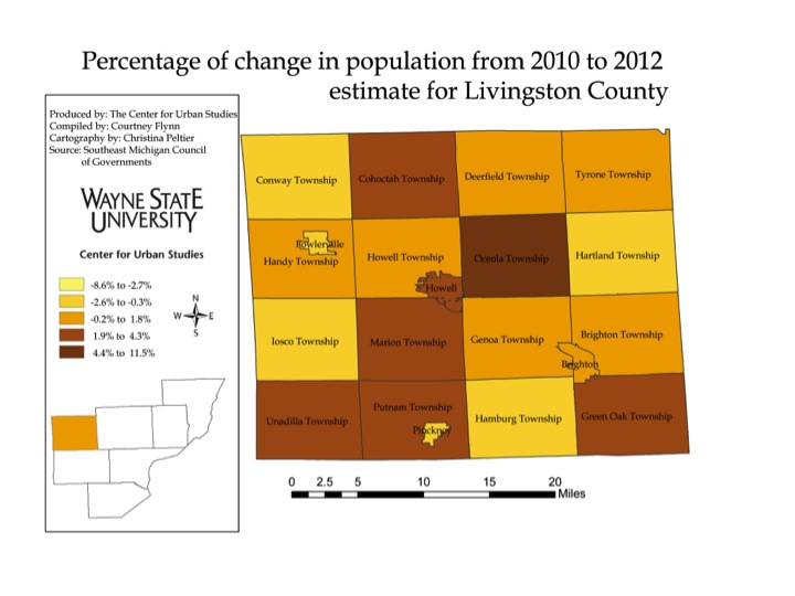
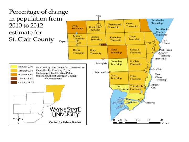
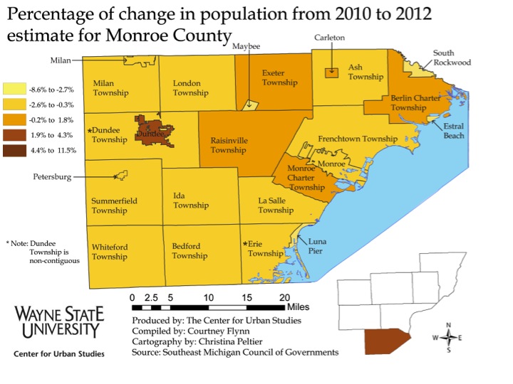
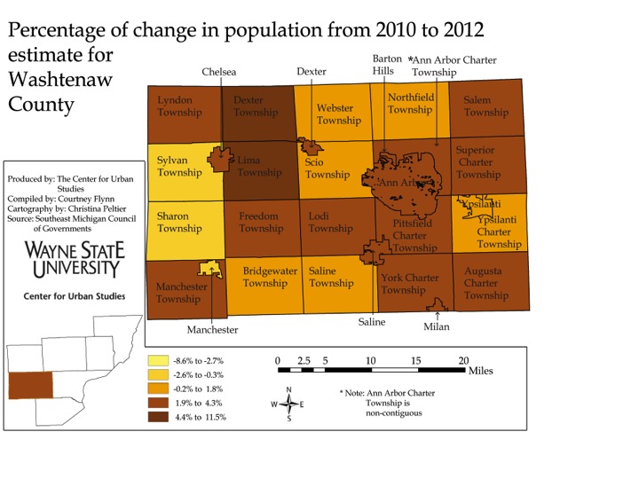
Continuing from last week’s post, this week’s post will examine the percentage change in population  in the outlying counties of Southeastern Michigan from April 2010 to December 2012. These counties are Washtenaw, Livingston, St. Clair, and Monroe counties. St. Clair County had the largest number of communities with a high population loss (four communities with a population loss over 3 percent) and Washtenaw County had the highest number of communities with the largest population increase (two communities with a population increase over 7.5 percent).

The lightest shade of yellow represents the communities with highest percent of population loss while the darkest shade of brown represents the largest percent increase.

Slide3

Slide4

Slide5

Slide6

Slide7

According to the above maps, of all the municipalities listed, Dexter Township in Washtenaw County had the highest percent of population growth (9.2%) from 2010 to 2012. This 9.2 percent represents a population increase from 4,067 to 4,443. Lima Township in Washtenaw County was the only other municipality to have a similar growth rate; this community experienced a 7 percent population increase. While Estral Beach in Monroe County had the largest percent of population decline of the four counties represented in this post, the 7.2 percent decline only represented a 30 person loss. In St. Clair County there were four municipalities with losses ranging from 3.2 percent to 3.7 percent.

•Municipality with highest overall growth in numbers: Oceaola

•Municipality with highest overall decline in numbers: Clay Township

Below, the municipalities represented in the highest and lowest percent change categories in the maps are shown.

Washtenaw County:

There were no municipalities with  a population decline between 2.7 and 8.6 percent in Washtenaw County.

Municipalities with highest percent increase

•Dexter Township: 9.2 (376)
•Lima: 7.7 (253)

Livingston County:

There were no municipalities with  a population decline between 2.7 and 8.6 percent in Livingston County.

Municipality with highest percent increase

•Oceaola: 5.4 (684)

St. Clair County:

Municipalities with highest percent decline

•East China: -3.7 (142)
•Ira Township: -3.5 (183)
•Clay Township: -3.3 (303)
•Columbus: -3.2 (129)

There are no municipalities with a  population increase between 4.4 and 11.5 percent in St. Clair County.

Monroe County:

Municipalities with highest percent decline:

•Estral Beach: -7.2 (30)
•Maybee: -3.7 (21)
• South Rockwood: -3.8 (63)

There are no municipalities with a  population increase between 4.4 and 11.5 percent in Monroe County.

Where’s population up and down? Census and SEMCOG estimates

Over the next two posts, we will examine the percent change in population from 2010 to 2012 for Southeastern Michigan. This week we present  the municipalities that make up Wayne, Oakland and Macomb counties. Next week we will consider the same information for Washtenaw, Livingston, St. Clair and Monroe counties.


The data used for these maps comes from two sources, the U.S. Census for the 2010 figures and the Southeast Michigan Council of Governments for the 2012 estimates. We use the SEMCOG estimates for 2012 because they are the most recent available.  Census estimates based on the American Community Survey (ACS) are only available for 2011. We will be revisiting this post once the ACS numbers are available for 2012. Also we will present a comparison of the SEMCOG and ACS numbers, accessing patterns of variation between the two.

The individual county maps are presented from largest to smallest overall population.

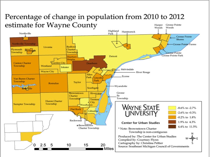
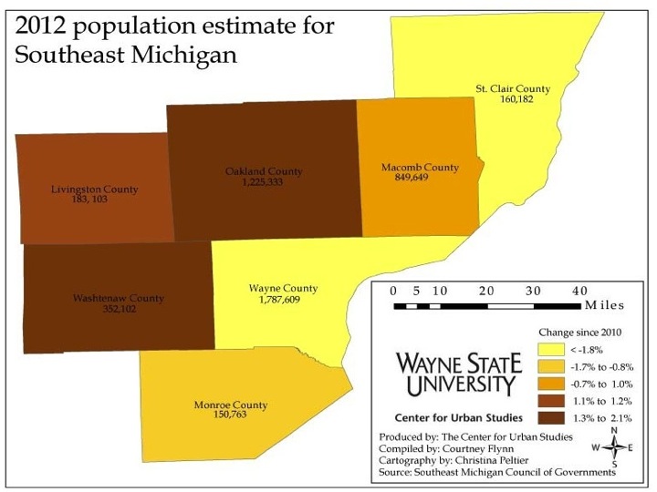
During this period, Oakland and Washtenaw counties experienced the highest percentage increase in population while Wayne County had the largest population decline.

Of all the municipalities in the tri-county region, Highland Park experienced the largest percentage loss in population (-8.6%) from 2010 to 2012, which was about 1,000 people. However, Detroit, which has a much higher population than its neighbor, lost about 32,000 people, but had a lower percent of population loss. Such population losses contributed to Wayne County have the largest percent of population loss of the tri-county and seven-county regions.

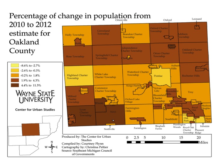
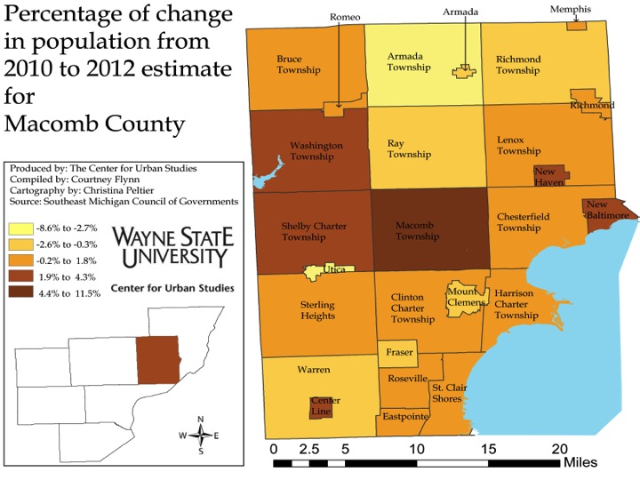
The ranges of percent change vary in each map but the color-coding remains the same. The lightest shade of yellow represents the communities with highest percent of population loss while the darkest shade of brown represents the largest percent increase.

Slide3


Slide4


Slide5


Slide6


According to the information provided by SEMCOG, Highland Park in Wayne County experienced the largest percent in population decline from 2010 to December of 2012 at 8.6 percent. Its population dropped from 11,776 in 2010 to 10,762 in 2012.  Detroit, which has long been in the public eye for its loss of population, experienced a 4.1 percent population decline: in 2010 the population was recorded at 713,862 , and in 2012 it was estimated at 684,799.

In Wayne County, Northville Township had the highest percentage population increase at 3.2 percent, based on a 926 resident increase.

In the tri-county area, Macomb County had the most municipalities with a population increase over 3 percent. In Macomb County, Macomb Township experienced the highest percent of population growth at 5.2 percent; this represents a 4,114 person increase from 79,580.

It was Lyon Township in Oakland County that had the highest overall percent increase in population change out of the three counties at 11.4 percent. The township’s population increased from 14,545 to 16,212, or 1,667 residents.  Below the municipalities represented in the highest and lowest percent change categories in the maps are shown.

•Municipality with highest overall growth in numbers: Macomb Township

•Municipality with highest overall decline in numbers: Detroit
•Wayne County: 
•There were no municipalities in the highest percent increase bracket for Wayne County ( Northville Township had the highest percent increase at 3.2% (926)
•Municipalities with highest percent decline
•Highland Park: -8.6% (-1,014)
•Detroit -4.1% (-29,063)
•Inkster: -3.8% (958)
•Woodhaven: -3.3% (419)
• Oakland County:
•Municipalities with highest percent increase
• Lyon Charter Township: 11.4% (1,667)
•Novi: 5.3% (2,969)
•Wixom: 6 % (818)
•Lake Orion: 5.6% (167)
•There are no municipalities with in the highest percent of decline bracket for Oakland County (Oak Park: and Pontiac each had the highest percent of decline for Oakland County though at -1.2 percent.)
•Macomb County:
• Municipality with highest  percent increase
•Macomb Township: 5.2% (4,113)
Municipalities with highest percent decline
•Utica: -3% (-144)
•Armada: -2.7% (-98)

**The number of municipalities listed in each  category vary because they come from the highest percent of increase and decrease category in each map. 


Marriage coming at a later age for most

According to a recent column in The New York Times, the national marriage rate isn’t necessarily declining. Rather, people are choosing to get married at an older age (late 20s compared to late teens). To learn about why read the article here. Also, to get a look at marriage rates for Detroit check out our recent post here.

Number of gun permits issued in Metro-Detroit area increasing

In the state of Michigan, residents age 18 and older are legally allowed to purchase a pistol(1) with a purchase license from a private seller. At the age of 21, residents are allowed to purchase a firearm(2) from a Federal Firearms License dealer. However, no license is required to purchase a long gun(3) but the purchaser must be 18 years of age or older and have no criminal or mental illness health history.

Despite the decline in population in the Metro-Detroit area, the number of total gun permits and concealed pistol permits issued has been increasing substantially. This increase began in 2005 for Detroit and Wayne County and in 2007 for Oakland and Macomb counties.

(1)A pistol is a handgun where the chamber is integrated into the barrel.

(2)A firearm which is a portable, barreled weapon that launches one or more projectiles.

(3)A long gun is in the category of firearms where the barrel is longer and the gun itself is meant to braced against the shoulder while firing.

Slide03

The above chart shows the rate, per 100,000 residents, of the total number of gun permits issued in 2012. This rate is based on the December population estimates released from the Southeastern Michigan Council of Governments. As can be seen, Macomb County had the highest rate of gun permits issued in 2012 at 3,189 and Detroit had the lowest at 1,227.

Slide05

The total number of gun permits issued in the City of Detroit began to increase in 2005 when 3,486 permits were issued. By 2012, 8,406 permits were issued despite the city’s declining population. By the end of April in 2013, 3,076 permits were issued, according to information provided by Michigan State Police.

Like the City of Detroit, the total number of gun permits issued in Wayne County also began to increase to in 2005. In that year 16,212 permits were issued and in 2012, 41,522 were issued, again in the context of a declining population. In 2012, 20 percent of the gun permits issued in Wayne County were issued in Detroit. By the end of April in 2013, 18,034 permits were issued, according to the Michigan State Police.

Since 1990, the total number of gun permits issued in Macomb County has consistently been below the number of permits issued in Wayne County. However, while the population in Wayne County has been declining, Macomb County’s population has been increasing, as have the total number of gun permits issued. Still the rate of gun permits in Macomb is much higher than the other counties. The number of permits issued in Macomb County began to increase in 2007.  In that year, 11,564 were issued and in 2012, 27,906 were issued. By the end of April of 2013, 12,973 gun permits were issued.

The total number of gun permits issued in Oakland County since 1990 has also been below the number of permits issued in Wayne County. However, more permits have been issued in Oakland County than Macomb County, with the exception of 1997 and 1998. Along with the increasing number of gun permits issued in Oakland County, the population has also been increasing. The number of permits issued in Oakland County began to increase in 2007; that year, 15,211 were issued. By 2012, 342,624 were issued and by the end of April in 2013, 16,467 were been issued, according to the Michigan State Police.

Slide13

To obtain a concealed pistol permit in the state of Michigan, one must be at least 21 years old and have been a Michigan resident for at least six months prior to applying for the license. The applicant must also have also completed a pistol training course and not have been convicted of a felony, a violent crime, or certain misdemeanors. An applicant must also be mentally stable, which means not having been committed for mental illness, being diagnosed with a mental illness or been charged with a crime where mental illness was deemed a factor. Exact details on the type of misdemeanors an applicant cannot have been convicted of within a certain time frame, along with other specifics on applying for a permit, can be found at Michigan.gov.

When a person obtains a concealed pistol permit, he or she is still not allowed to carry the weapon in federal buildings, schools, daycare centers, child-related centers and agencies, hospitals, dormitories, religious centers, sports arenas, bars, and dormitories and classrooms of colleges and universities.

While Macomb County had the highest rate of total gun permits issued in 2012, it had the lowest rate, per 100,000 residents, of concealed pistol permits issued.  The rate at which concealed pistol permits were issued in 2012 for Macomb County was 988 per 100,000 residents. For Oakland County the rate was 1,012 and for Wayne County it was 1,017.

The number of concealed pistol permits issued for the City of Detroit was not available on the Michigan State Police website.

Slide15

The total number of concealed pistol permits issued over the years has followed the same increasing trend as the number of gun permits.  The data on the number of concealed pistol permits issued is tracked annually from July 1 to June 30. Overall, there has been a higher number of concealed pistol permits issued in Wayne County than Oakland and Macomb counties. In 2012, 18,195 were issued in Wayne County, 12,407 were issued in Oakland County and 8,395 were issued in Macomb County.
Michigan’s marriage rate consistently falls under U.S.;Half of Detroit’s population has never been married

Marriage is typically described as a formal union between a man and woman, although in recent years certain states have been moving to allow marriage between couples of the same sex. In order for a marriage to be legal a marriage license must be obtained. As can be seen in the data presented below, the rate of those choosing to join in this union has been declining over the last 10 plus years. The marriage rate for the U.S. has consistently remained higher per 1,000 people than the rates in Michigan and the Metro-Detroit area (Wayne County, Macomb County, and Oakland County). The divorce rate in the U.S. has also remained higher in the U.S. than in Michigan; this rate has also been declining over the years.

The declining marriage rate has widely been attributed to increased cohabitation between couples and the decision by couples to marry at an older age. In this post we will examine the marriage and divorce rates for the Metro-Detroit area, along with the breakdown of who has been married, widowed, divorced and never married in the area.

All data for this post was obtained from the Michigan Department of Community Health and 2011 American Community Survey (three year estimates). For the American Community Survey numbers, the population considered was male and female residents ages 16 and over.

While about half of Detroit’s population has never been married, data shows that males  more than females were more likely to be married. More females in the area were divorced. Depending on the area, between 20 and 50 percent of residents in the Metro-Detroit area were married in 2011. Overall though, marriage rates in the area have been decreasing.

marriage1

marriage2

Since 1999, Wayne County has had the lowest marriage rate per 1,000 residents of the seven counties that makeup Southeastern Michigan. After 2001, the marriage rate in Wayne County began to decline (going from 9.3 in 2001 to 9.1 in 2002); this overall trend continued until 2007 when the rate reached 7.3. Then, in 2008 the marriage rate began to increase, finally reaching 8.2 per 1,000 residents in 2011. With the exception of Monroe County, all counties in the region experienced an increased marriage rate in 2011 compared to 2010. St. Clair County had the highest marriage rate in 2011 at 11.4. The overall trend since 1999, however, shows a decreasing marriage rate.

marriage3

Oakland County had the highest total percentage of married couples in 2011 at 51.3 percent; according to the American Community Survey. The City of Detroit on the other hand had the lowest at 21.7 percent. The state average was 48.8 percent.

marriage4

According to the American Community Survey, there were a higher percentage of married males in from 2009 to 2011 than females. Oakland County had the highest percent of married males with 55 percent; Oakland County also had the highest percent of married females at 50.9 percent. Of the three counties examined, Wayne County had the lowest percent of married individuals (40.9 percent for males and 39.2 for females). Also, Detroit had the lowest percent married, for both males and females, of all the areas examined above. In 2011, 25.6 percent of Detroit males were married and 21.1 percent of Detroit females were married.

marriage6

The divorce rate per 1,000 people for both the U.S. and the state of Michigan has seen an overall declining trend since 1990. However, from 2006 to 2008 there was a 1.8 increase for the U.S. The state of Michigan also experienced an increases  from 2000-2001, 2005-2006, and 2008-2009.
marriage9

St. Clair County not only had the highest marriage rate for 2011, but it also had the highest divorce rate per 1,000 people of the seven county region. That rate was 7.9. Wayne County had the lowest divorce rate in area at 5.4.

marriage10

The number of divorces in the Southeastern Michigan area has remained fairly consistent since 2000 (long-term trend information on divorce rates for Michigan counties was not available from the MDCH). Wayne County has experienced the most change of the seven counties in the region; there was a drop of 1,614 divorces from 2002 to 2003. Since then, there haven’t been more than 5,778 divorces in a year in Southeastern Michigan.

marriage11

While there was an overall higher percentage of married males than females from 2009 to 2011 (as an average), the opposite was true for divorces. For Michigan, 12.3 percent of females were divorcees, compared to 10.4 percent of males.  The percent of both divorced men and women was highest for the City of Detroit, 11.5 and 13.2 percent respectively. Macomb County had the lowest percentage of divorced males and females, 9 and 12 percent respectively.

marriage12

Detroit had the highest percent of unmarried residents (percent never married) from 2009-2011 for both males and females. According to the American Community Survey, in 2011, 55.5 percent of males in Detroit  ages 16 and older had never been married and 50.7 percent of females age 16 and older had never been married. Wayne County had the second highest rate of unmarried residents; 42.9 percent of males 16 and older and older had never married and 37.4 percent of females 16 and older had never married. Overall, there was a higher percentage of never married males than females.

marriage13

Of the marital statuses examined in this post, the percent of separated married couples was the lowest. For the areas examined, the City of Detroit had the highest percentage of separated individuals. In 2011, the three year rolling average for the city was 3.8 percent for both males and females. Wayne County had the second highest percentage; 2.7 percent of female residents in the county were separated and 2.2 percent of males were separated. Oakland and Macomb counties were tied for the lowest percent of separated male residents at .9 percent; Oakland County had the lowest percent of females of at 1.2 percent.

Slide23

The percent of widowhood is much higher for females than for males in all the areas examined in this post, with the exception of the state as a whole.  For the state of Michigan, 10.4 percent of males were widowers for the three year average from 2009-2011, and 9.7 of females were widows. For the City of Detroit, 11.2 of females were widows while 3.6 percent of males shared the same status.  Oakland County had the lowest percentage for both males and females who had lost their spouse; 2.3 percent of males were widowers and 8.9 percent of females were widows.

Household composition in Metro-Detroit: Female family based households makeup majority of Detroit

This post examines demographics of households in Detroit and the tri-county area, using information available from the U.S. Census Bureau’s 2011 American Community Survey one-year estimates. According to the American Community Survey, female-run family households are the majority of households in Detroit. While the City of Detroit and Wayne, Macomb and Oakland counties all have more family than non-family households, only Detroit has such a high percentage of female-run family households. Detroit also had the largest average household size and family size.

It should be noted that in this post Wayne County estimates include estimates from the City of Detroit as well.

makeup1


According to the 2011 American Community Survey data, Oakland County had a higher percent of males-52.3 percent-while Macomb and Wayne counties and the city of Detroit had a higher percentage of women.

makeup2

In 2011, Detroit had the largest average number of residents in a household (2.74) while Oakland County had the smallest (2.49). The difference between the two was 0.25 persons per household. Wayne County was 0.06 below Detroit, and Macomb County was 0.2 below Detroit.

According the U.S. Census Bureau, the average number of persons per household for each geographic location was obtained by dividing the number of persons in a household by the number of households in that geographic location. A household included all persons who occupy all types of housing units, except housing units classified as group quarters.

makeup3

Like with the average household size, in 2011, Detroit had the largest average family size (3.76) of the geographical areas examined while Oakland County had the smallest (3.12).  For all geographical areas examined, the average family size is larger than the average household size. Wayne County had an average family size of 3.47 and for Macomb County that number was 3.17.

A family is defined as a group of two or more people, one who is the householder, who are related by birth, marriage or adoption and reside together.

makeup4

The percent of family households in Macomb and Oakland counties is above 65 percent, while that number is below 60 percent in Detroit.  In Detroit, the percent of family households in 2011 was 57.3 and the percent of non-family households was 42.7. For Macomb County in 2011, the percent of family households in the county was 66.9; the percent of non-family households was 33.1. Oakland County’s distribution was similar to that of Macomb County, with 65.4 percent of the county consisting of families. In Wayne County, the percent of family households was 62.9.

A non-family household is defined as a person living in a household with non-relatives or alone, according to the U.S. Census Bureau. A family household includes any unrelated sub-family members and/or secondary individuals; the householder is part of a family that consists of two or more people related by birth, marriage or adoption.

makeup5

The above chart demonstrates the composition of family households in Detroit as well as Wayne, Macomb and Oakland counties.

Considering only family households in the Metro-Detroit area, the data show that Detroit had the highest percent of female householders with no husband. For Wayne, Macomb and Oakland counties, married couple families made up majority of the family households. Macomb County had the highest percent of married couple families with 49.8 percent of all family households; Oakland County had 49.7 percent.

For all four geographic locations examined, a family based around a male householder with no wife made up the smallest percentage of the family-type households.

makeup6

According to age distribution data by the American Community Survey the largest segment of Detroit’s population are those between the ages of 5 and 14; this group makes up 14.1 percent of Detroit’s population. The 45-54 age group accounts for about 14 percent of the population; this age group accounts for the second highest percent of Detroit’s population. Those 75 and over comprise the smallest portion of Detroit’s population at 5.6 percent.

makeup7

makeup8

makeup9

Unlike Detroit, the 45-54 age group is the largest segment of the Wayne, Macomb and Oakland counties population. For Wayne County, this age group makes up 14.6 percent of the population, for Macomb County it makes up 15.6 percent of the population and for Oakland County it makes up 16.2 percent. Like Detroit though, the oldest population makes up the smallest percent in Wayne County. For Macomb County though, those between the ages of under the age of 5 make up the smallest percent of the population, at 6.5 percent. For Oakland County it is those between the ages of 20 and 24 that make up the smallest percent of the population at 5.4 percent.


Detroit’s unemployment rises as population shows sign of leveling off

Although it appears Detroit’s population is beginning to steady, the start of 2013 showed increased unemployment rates and zero growth for the number of building permits pulled.

•Since 2010 Detroit’s population has appeared to be steadying, only experiencing slight decline;
•For the tri-county area, the population’s in Macomb and Oakland counties have been increasing while Wayne County’s population has been historically declining.
•Unemployment rate increases, while the number of employed decreases. The number of auto manufacturing and auto parts manufacturing employees also increased from December 2012 to January 2013 though (monthly);
•Purchasing manager’s index decreased from January 2013 to February 2013 (monthly);
•Commodity price index increased from January 2013 to February 2013s (monthly);
•The most recent consumer price index changes for all and all items less food and energy increased (bi-monthly);
•Building permits increase for Oakland and Macomb counties in January and February 2013, compared to the same months in 2012. In Wayne County, the number of permits in the first two months of year declined, compared to last year from last year to this year (monthly) . No building permits were pulled for Detroit.
Econ1

Overall, the City of Detroit’s population has experienced a decline, going from about 1.5 million residents in 1970 to 677,891 in 2012. However, from 2010, when the U.S. Census Bureau released its most recent Census data, to 2012, the population has seemed to somewhat stabilize. From 2010 to 2012 there was a decline of 35,109 residents. This decline is based on 2010 Census data and compared with Southeastern Michigan Council of Governments data (2012). The biannual population estimates from SEMCOG are based on trends from area demographics.

Econ2


Since 1970, Oakland and Macomb counties have experienced population increases while Wayne County has experienced a population decline. From 2010 to 2012 Oakland County’s population increased from 1,203,012 to 1,216,207. In that same time frame Macomb County’s population increased from 841,126 in 2010 to 843,435. Wayne County had a population decline of  1,815,734 in 2010 to 1,787,920.

All information is based on Census data, except for the 2012 data. These numbers are Southeastern Michigan Council of Governments data; the biannual population estimates from SEMCOG are based on trends from area demographics.

Econ3

According to the most recent data provided by the Michigan Department of Technology, Management and Budget, the January 2013 unemployment rate for the State of Michigan was 8.9 per 100 people, which is the same as it was in November and December of last year. For the City of Detroit, 19.8 percent of the population were unemployed in January 2013; this is an increase 1.7 percent from the city’s percentage of unemployed in December 2012 .

Econ4

The number of employed in the City of Detroit decreased by 2,043 people from January to February of 2013. From October 2012 to January 2013 there was a loss of 5,407 employed people.

Econ5

The above chart shows the number of people employed in auto manufacturing industry in the Detroit Metropolitan Statistical Area throughout 2012 and into 2013. Employment peaked in January 2013, with 90,700 people being employed in both the auto manufacturing and auto parts manufacturing industries. This is 10,400 more people employed from the previous peak of 80,300 employees in March of 2012.

econ6

According to the most recent data released on Southeastern Michigan’s Purchasing Manager’s Index, the number decreased by 3.6 points from January 2013 to February 2013; in February it was recorded at 51.7. The recorded number for February of this year is13.4 points below where it was in 2012.The Purchasing Manager’s Index (PMI) is a composite index derived from five indicators of economic activity: new orders, production, employment, supplier deliveries, and inventories; a PMI above 50 means the economy is expanding. The PMI of 51.7 means the economy continues to expand.

Econ7

The Commodity Price Index, which is a weighted average of selected commodity prices for Southeast Michigan, fluctuated throughout 2012 and, so far, is appearing to follow a similar trend in 2013. However, the Commodity Price Index has been reported at slightly higher levels for January and February of 2013 than it was in the same months for 2012.  From January 2013 to February 2013 the Commodity Price Index increased from 58.9 to 66.7. The score in February 2013 is .2 points above where the Commodity Price Index was in February of 2012.

Econ8

Econ9

The Consumer Price Index, which is reported every two months, increased 1.1 percent from December of 2012 to February of this year. From February of 2012 until last month the CPI increased .7 percent in the Detroit-Ann Arbor-Flint area. The Consumer Price Index measures the change in prices in a fixed market. The prices which are measured are based on prices of “food, clothing, shelter, fuels, transportation fares, charges for doctors’ and dentists’ services, drugs, and the other goods and services that people buy for day-to-day living,” according to the Bureau of Labor Statistics. Increased prices for energy (a 3.9 percent increase) and a .3 percent increase in the food index were noted for the change.

The Consumer Price Index, minus the prices of energy and food, shown in the second Consumer Price Index graph, increased .8 percent from December to February. This was because of pricing related to shelter recreation, and motor vehicles, according to the BLS.

Econ10Econ11

Econ12

The above charts show the number of residential building permits obtained each month in Oakland, Macomb, and Wayne counties from January 2012 until the present. These numbers are reported by local municipalities to the Southeastern Michigan Council of Governments and include single family, two family, attached condo, and multi-family units. The information presented shows that the number of building permits obtained in Oakland and Macomb counties this year, so far, are higher than those pulled in January and February of last year. While the Oakland County numbers are higher for 2013 than 2012 thus far, from January to February of 2013 there was  decline of permits pulled. In Oakland County, 222 have permits have been pulled in 2013, so far, and in Macomb County 284 have been pulled. In Wayne County, on the other hand, there has been a decrease in the number of building permits pulled for January and February of 2013 compared to them same months in 2012. In 2012 a total of 102 permits were pulled for both months and in 2013 there have been 107 pulled.

In 2013 thus far, Macomb County leads with the most number of building permits pulled.

According to the Southeastern Michigan Council of Governments data used for these charts, in January and February of 2013 zero building permits have been pulled in the City of Detroit.


Michigan municipalities with Emergency Managers comprised of mostly African Americans

For five of the six Michigan municipalities with emergency managers African Americans make up majority of the communities’ populations.

Other demographic trends followed in these municipalities-Detroit, Ecorse, Benton Harbor, Flint and Pontiac-include:

•A smaller percentage of the population owned their home than compared to the state average;
•Fewer of the residents have attained higher levels of education;
•The median income in these communities is lower than that of the state;
•A greater percentage of each of the five municipalities’ populations live below the federal poverty level than the the state average.

Although Allen Park currently has an emergency manager, it does not follow the demographic trends as the communities discussed above. Also, Allen Park was not under financial watch by the state before an emergency manager was appointed in 2012. An emergency manager was appointed in Allen Park so swiftly was because the city’s year-end general fund balance decreased by 91 percent from June 2009 to June 2011. One reason cited for this decrease was the city’s movie studio that went defunct.

On March 25 Kevyn Orr, a bankruptcy attorney and turnaround expert, began his position as Detroit’s emergency manager. This came after Gov. Rick Snyder officially declared a financial emergency in the City of Detroit on March 1.

This post examines the municipalities in Michigan that have emergency managers. The table below lists the municipalities and school districts currently with emergency managers, and appointment dates as of March 4, 2013 (information gathered from the Michigan Department of Treasury). In addition to those currently with emergency managers Inkster and River Rouge are currently operating under consent agreements.

EM1

In previous posts (Part I and Part II), we examined fiscal distress scores in Metro-Detroit.  The Michigan Department of Treasury is required by law (PA 72-1990; PA 34-2001) to assess fiscal health scores for all jurisdictions in the state.  To this end, the department collaborated with economists to develop 10 indicators of fiscal health.  These indicators include measurable trends, such as population loss, general fund expenditures, and declines in taxable valuation. Each year, a jurisdiction may earn one point for each of 10 indicators on which it exhibits fiscal distress, for a maximum of 10 points. Jurisdictions with scores of 5 or higher are considered under a financial watch. The Michigan Department of Treasury has scores for 2006 to 2009 posted on its website. Estimates for 2010 and 2011 scores are available from the private company Munetrix.

EM2

The above chart displays the 2006 through 2011 fiscal distress scores for municipalities that currently are operating with an Emergency Financial Manager (EFM) or under a consent agreement. The markers on the various lines indicate when a municipality’s EFM was appointed or when it entered into a consent agreement. For example, Ecorse has had an EFM since 2009 when it had a fiscal distress score of 7; its estimated scores increased to 8 in 2010 and 9 in 2011. An EFM was appointed for both Pontiac and River Rouge, operating under a financial agreement, in 2009, when both had a fiscal distress score of 6. A financial manager was appointed in Benton Harbor in 2010 and in 2011 in Flint. The other municipalities in this chart were given EFMs or consent agreements after 2011. Unlike the others here, Allen Park is the only municipality that was not under financial watch for at least one year before being assigned an EFM.

EM3

Munetrix provides fiscal distress scores for 1,860 municipalities in the state of Michigan. The table above provides a snapshot of these. Of the 278 cities listed, 94 of them were considered under financial watch by the Department of Treasury (they had a score of 5 or greater) at least once during the period from 2006 to 2011. Eleven municipalities had a score of at least 5 for all six years. The fiscal distress scores for these are plotted in the following chart. Of these 11, the state of Michigan considered only Detroit and Ecorse in need of intervention.

EM4

EM5

With the appoint of an EFM to Detroit, 9.3 percent of Michigan’s 9,876,801 residents are now living under an EFM (based on 2011 population estimates from the US Census). This is depicted in the chart above, where the gray area represents self-governing municipalities and Detroit and the five municipalities currently with EFMs are indicated by an individual color.

The next five charts present a demographic picture of Michigan residents, compared to those who live in municipalities that have been declared to be in a financial emergency. Overall, of those living in these municipalities, a smaller percentage own their homes, fewer have attained higher levels of education, the median income is lower, a greater percentage are living below the federal poverty level, and a greater percentage are people of color. Allen Park is the exception—it is more like the state, than the other municipalities considered to be in a financial emergency.

Also, the demographic charts below focus on the years 2007-2011 because they are based on the most recent American Community Survey five-year estimates.

EM6

As shown in the chart above, most of the cities targeted to have an EFM, have lower rates of home ownership than the state, as a whole. The only exception is Allen Park, which had a homeownership rate of 89.4 percent from 2007-2011, compared to 73.5 percent for the state overall. Benton Harbor had the lowest ownership rate, 37.percent, which was slightly less than half the rate for the state.

EM7

EM8

The two previous charts depict that, as a whole, the cities had lower educational attainment than the state. Allen Park did have a slightly higher percentage of residents, aged 25 and older, who had at least graduated high school (89.3 percent from 2007-2011, compared to 88.4 percent for the state overall). All of the municipalities had lower percentages of residents who had at least completed a Bachelor’s degree, when compared with the state. Detroit had approximately half the state percentage (12.2 percent  compared to 25.3 percent); Benton Harbor had the lowest rate at 5.8 percent.

EM9

In the above chart, we see that the median household income from 2007 to 2011 in Allen Park ($55,553) exceeded that of the state ($48,669). The other cities under consideration had median incomes approximately $20,000 less than that of the state, except for the Benton Harbor which had a median income more than $30,000 less than the state value.

EM10

The preceding chart shows that, other than Allen Park, the cities all had higher percentages of residents living below the poverty level from 2007 to 2011 than the state did. Over one-third of Detroit residents (36.2 percent) and nearly half of Benton Harbor residents (47.6 percent) were below the poverty level.

EM11

White persons comprised 78.9 percent of the state’s population in 2010. Allen Park was 92.9 percent White. In all of the other municipalities under consideration, White persons were in the minority.

Detroit’s population density

From 1950 to 2010, Census tract data indicates there has been a steep population decrease in the City of Detroit. The population loss began in the center of Detroit, which in the first map can be seen as the area with the highest population density. However, as time progressed the city’s population density continued to diminish. By 1980, there were such significant population losses in sections of the city that the population density was recorded as zero in one area, which is east of southbound I-75 and south of I-94. By 2010 this area did not show population growth, and the city’s overall population continued to decrease. 

While the maps above provide a strong visual indication of  Detroit’s population loss, the line graph below shows the steady decline in  population density. According to the chart, there were 13,330 people per square mile in Detroit in 1950, and by 2010 that number had decreased to 5,144.

Fiscal Distress in Metro Detroit Part II

On this chart, and throughout these posts, the higher the score a jurisdiction receives the more fiscally distressed it is, and this chart compares the City of Detroit’s fiscal distress scores to the average fiscal distress scores of the “first ring” and “outer suburb” jurisdictions for the period 2006-2009. By examining a jurisdiction in relation to an area’s urban core, one creates the distinction between first ring jurisdictions and their outer suburb counterparts.  Metro Detroit’s first ring jurisdictions are those that are geographically adjacent to the City of Detroit and are generally within five miles of the city. Such examples of first ring jurisdictions are Allen Park, Ferndale, and Warren and examples of outer suburbs are Belleville, Clinton Township, and Birmingham. First ring jurisdictions tend to have older housing stock, more demographic volatility, and relatively little room to grow.  In general, these municipalities face a statistically significant greater level of fiscal distress relative to their outer suburb counterparts; this significance has been demonstrated above 5 percent. For the period 2006-2009, Detroit’s fiscal distress score was at least 2 points higher than the average score of the first ring jurisdictions, and more than double the average score of the outer suburbs.

Although “first ring” jurisdictions tend to fare worse fiscally than their “outer suburb” counterparts, the discrepancy is more pronounced for particular indicators.  This chart reveals population loss (Indicator 1*)  to be the apparent primary driver of this discrepancy, and that nearly all first ring jurisdictions are afflicted by it. According to the information, 97.3 percent of first ring jurisdictions are affected by population loss while 39.8 percent of outer suburbs experience it. Another discrepancy is visible for Indicator 4, which focuses on the increase in general fund expenditures as a percentage of taxable valuation. In this case, 16.2 percent of first ring jurisdictions have seen an increase in this indicator while only 2.3 percent of outer suburbs have.

*The fiscal distress indicators are the following:

•Indicator 1: Population Growth
•Indicator 2: Real Taxable Value Growth
•Indicator 3: Large Real Taxable Value Decrease
•Indicator 4: General Fund Expenditures as a Percent of Taxable Value
•Indicator 5: General Fund Operating Deficits
•Indicator 6: Prior General Fund Operating Deficits
•Indicator 7: Size of General Fund Balance
•Indicator 8: Fund Deficits in Current or Previous Years
•Indicator 9: General Long-term Debt as a Percent of Taxable Value

This above chart reveals that nearly all of Metro Detroit’s “first ring” jurisdictions experienced a flat, but high, rate of population decline between 2006 and 2009. During this same time period the outer suburbs saw an increasing percentage in population loss from 2006 to 2008; that number dropped though from 2008 to 2009. This chart also suggests that Wayne County’s relatively poor performance on this indicator (Indicator 1) is due to its relatively high percentage of first ring jurisdictions compared to Oakland and Macomb counties.  Wayne County is made up of about 43 percent of first ring communities while Macomb County is made up of about 19 percent and Oakland County has about 23 percent. Therefore, Wayne County is made up of about 57 percent of outer suburb jurisdictions, Macomb County has about 81 percent and Oakland County has about 77 percent.

Declines in property value and other losses have affected jurisdictions’ real taxable valuation (Indicator 2*). But, unlike population loss, this problem deeply afflicts both “first ring” and “outer suburb” jurisdictions.  The chart above illustrates this parity, and its endurance from 2006-2009.