Detroit tops growth in bicycle commuting, though overall rate still low

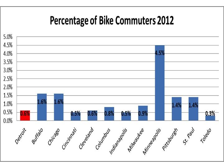
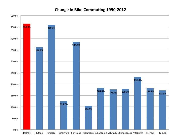
If it seems like there are more bicyclists on the streets these days, it’s because there are. Data from the 2012 American Community Survey, compiled by the League of American Bicyclists in their 2014 annual report, indicates Detroit had the fastest-growing community of bike commuters among 70 of the largest American cities. With a 464.4 percent growth in bicycle commuting since 1990, Detroit tops the list of growth ahead of more well-known cycling locales as Portland, OR which had 430.3 percent growth and San Francisco, which had 292.2 percent growth. It appears through events like Tour de Troit and Bike the Bridge along with policies such as Complete Streets, Detroit is becoming a Midwestern bike Mecca. It only seems plausible this notion can become true with the light traffic, urban roads and flat terrain within Detroit city limits. However, this chart-topping growth has pulled Detroit to merely 44th out of 70 large cities for bike commuting. When further looking into the data, it shows that while Detroit may be the fastest growing in the region and nation, it has challengers on its back wheel.

Detroit has experienced the largest increase in bike commuting since 1990, according to the American Community Survey 5-year estimates (2007-2012). Cycling to work has nearly quintupled in the 12-year span. The average growth in cycling among Great Lakes cities is high, with a mean growth of 251.9 percent. The Highest growth was in  in Detroit, Chicago, Cleveland and Buffalo.

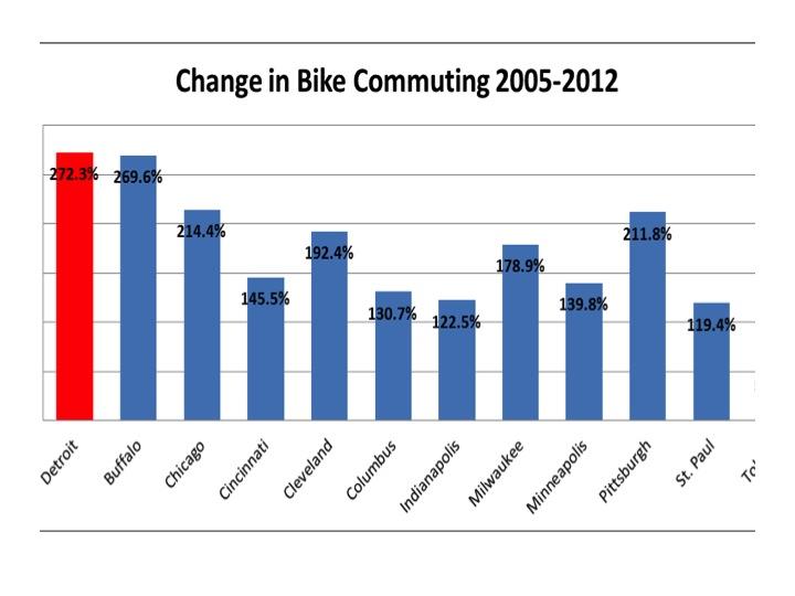
An examination into a subset of those years, 2005-2012, indicates that Detroit has experienced leading growth among Great Lakes peers for the shorter period as well. Although Buffalo is close behind with 269.6 percent growth, Detroit’s recent 272.3 percent expansion in bike commuting indicates a more healthy growth than the region’s 171.2 percent growth in the urban areas, according to the 2012 American Community Survey 5-year estimates.

An examination into a subset of those years, 2005-2012, indicates that Detroit has experienced leading growth among Great Lakes peers for the shorter period as well. Although Buffalo is close behind with 269.6 percent growth, Detroit’s recent 272.3 percent expansion in bike commuting indicates a more healthy growth than the region’s 171.2 percent growth in the urban areas, according to the 2012 American Community Survey 5-year estimates.

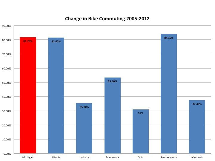
The rest of the state, has not had the same dominant growth pattern. At the state level, while there is still persistent and healthy growth in the number of bike commuters, Michigan falls in line with its peers. Second in growth at 81.7 percent, it falls behind Pennsylvania (84.1) and barely edges Illinois (81.6). The largest rate of growth in the country was in Maryland at 112.8 percent, the average growth was 45.0 percent and just five states saw a decrease in bike commuting since 2005 (Arkansa, Oklahoma, North Dakota, Iowa and Montana).

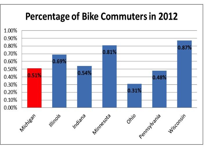
Despite growth, Michigan lags behind the national average with a 0.51 percent rate of bike commuting, leaving it fifth in the region, ahead of just Ohio and Pennsylvania, according to the 2012 American Community Survey. It also places Michigan at 24th of 50 states.

Connection weak between number of internet providers and households with the service

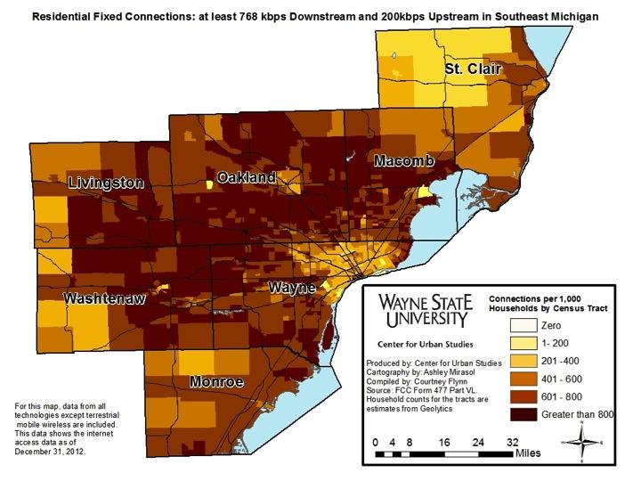
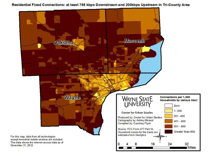
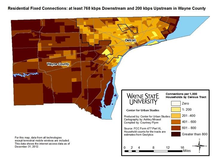
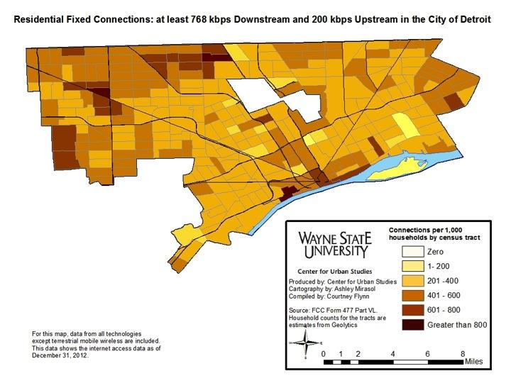
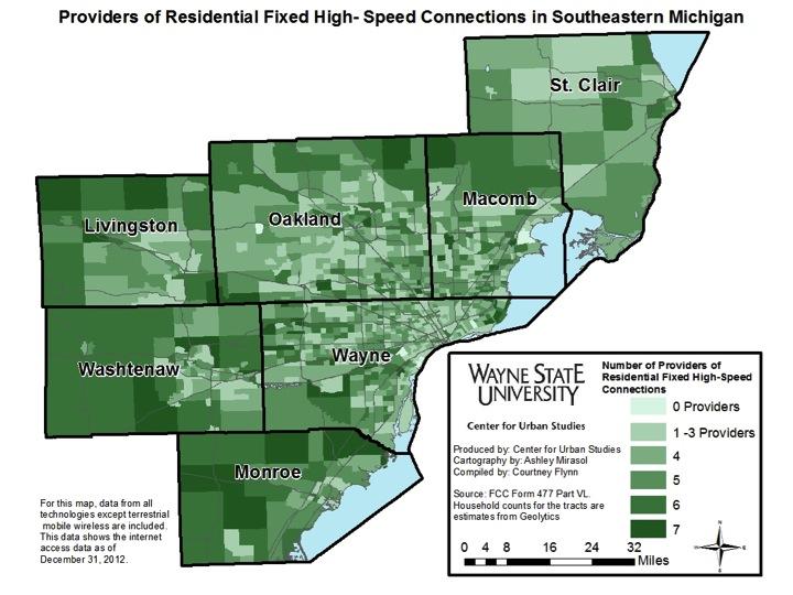
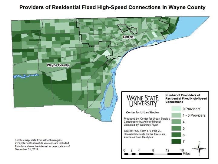
The following post examines residential internet connections in Southeastern Michigan. We show the number of high speed internet connections per 1,000 households, as well as the number of providers across the region. The number of providers is not necessarily correlated with the number of households with high-speed internet. The exception to this is in the City of Detroit, where, the number of households with internet connections and the number of providers are both low in most Census tracts.

The above four maps show the residential internet connections per 1,000 residents in Southeastern Michigan.  Overall, majority of the Census tracts in the region have 200 households or more per 1,000 residences with a high bandwidth connection. As can be seen when examining all four maps, there are only five Census tracts in the region where the number of bandwidth connections per 1,000 residences is 200 or less. Three of the Census tracts are located in Detroit and then one each is located in Macomb and Oakland counties. Oakland County has the largest number of Census where there are greater than 800 connections per 1,000 households. Overall, the number of connections per 1,000 households in the City of Detroit mirrors those in the rural areas of St. Clair County.

The above two maps show the number of residential high speed internet providers in each Census tract in the region. In the rural region of St. Clair County and the inner core of the Wayne-Macomb-Oakland area, there are fewer providers, approximately four or less. There are generally more providers in the outer areas of the region. For example, on the west sides of Livingston, Monroe and Washtenaw counties there are 6 or 7 providers. In some of these areas, particularly the far west areas of Livingston and Washtenaw counties, there are less than 400 connections per 1,000 households. Overall, the data shows that there are fewer providers where bandwidth connections are low. This is seen both in the rural areas of Southeastern Michigan and the City of Detroit.

SMART seeking millage increase

The Suburban Mobile Authority for Regional Transportation (SMART), which is currently the only functioning regional transit authority in Southeast Michigan, is looking to increase the amount of taxes it levies on an annual basis from Wayne, Oakland and Macomb county taxpayers. Currently, SMART levies .59 mils;  organizers are looking to increase that to 1 mil. It has been reported the requested increase is for solely capital needs. For example, SMART reports it needs to replace 146 40-foot busses within the next five years at a cost of about $73 million.

In addition to ridership data, this post also shows the operating revenues and expenses for the authority over the past decade. It also compares its tax support from residents to other transit authorities throughout the state. SMART was originally supported by taxpayers after a millage was approved in the 1995 August primary; this approved request was a third of a mill for years. This same request was approved again in 1998; in 2005 the millage was increased to the .59 mils.

All information was provided by public documents through SMART.

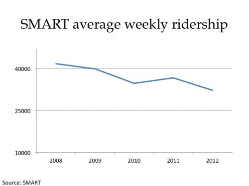
Since 2008 the number of passengers who have utilized SMART’s services has decreased by about 9,000. Following a fare increase in December 2009, average weekly ridership decreased from 39,850 in 2009 to 34,634 in 2011. Then in 2010 routes were decreased. In 2011 the average weekly ridership was 36,579 and in 2012 it dropped to 32,188.

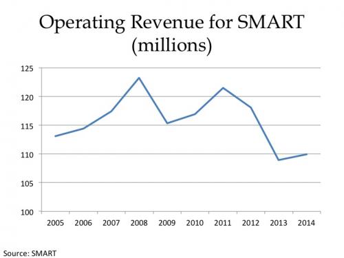
Operating revenue for SMART has decreased by about $3.2 million since 2005. Currently, for 2014 the authority’s operating budget is $109.9 million. The authority reports that without the 1 mill tax levy, which, if passed, has a three year sunset period, it expects to have a $21.1 million deficit in 2018.

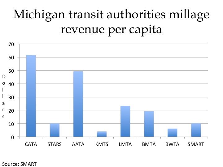
The Capital Area Transit Authority (CATA), which is based out of Lansing, has the highest revenue per capita at $61.64. The Kalamazoo Metro Transit System comes in at the lowest at $4.03. However, SMART, which covers a much larger region, brings in  $10.19 per capita in tax revenue, according to its most recent financial projections.

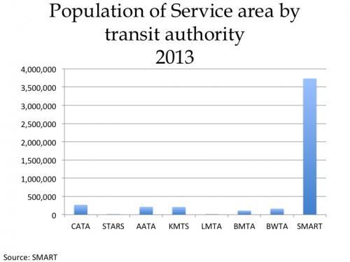
SMART services reach the largest population of transit authorities in the state whose information was available (Grand Rapids transit authority did not have information available). In 2013, SMART reached over 3.3 million citizens in Macomb, Wayne and Oakland counties. CATA reached the second largest population at about 267,000.

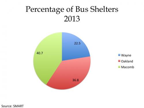
This slide shows the percent of bus shelters available to SMART riders by county. Macomb County has the largest percent of shelters at about 41 percent; Wayne County has the lowest at about 23 percent.

The above chart shows the number of vehicles SMART had in 2009 compared to currently. As can be seen, there has been a decrease in the number of all vehicles used. This is likely a reflection of the fact SMART needs new busses and has reduced service lines in recent years.

The above chart shows how the total for employee wages and salaries has changed. The year 1995 is included as a reference point to when the first millage was passed.  Then, the total for employee wages and salaries was $22 million; in 2014 that total is $35.9 million.

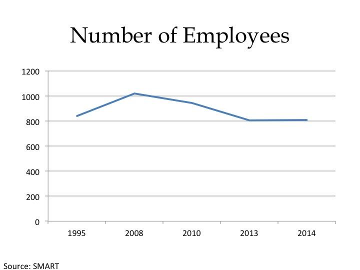
The next chart shows that, like salaries, there has also been a decrease in the number of SMART employees.

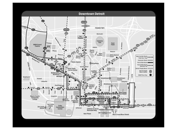
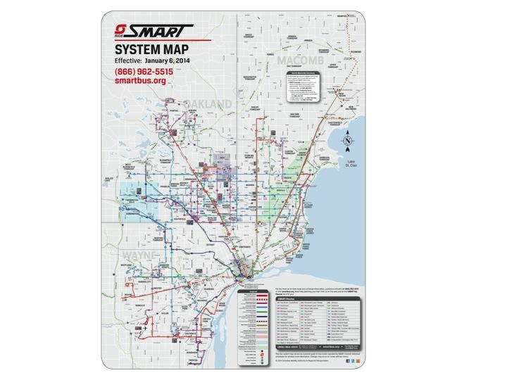
Below are the current routes for SMART. 

Michigan roads just as mediocre as other Great Lakes States’

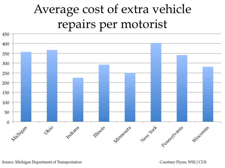
One of the toughest winters on record in Michigan has challenged our roads tremendously, and we are dealing with a plague of potholes and craters. Given this and other neglect, the Michigan Department of Transportation said, the state needs an additional 35 cents per day from every vehicle registered in the state to maintain roads in good/ fair conditions. That’s $127.75 per car. Even so, that’s a lot less than the $357 per car cost that the bad condition of Michigan roads imposes on each motorist.

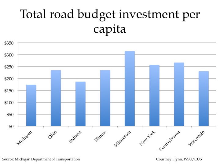
This post seeks to put the conditions of Michigan roads in context by highlighting road conditions in the eight Great Lakes States. Although Michigan invests the lowest amount of funds into roads, per capita, in the region, it does not have the highest percentage of poor roads or cost of vehicle repairs.

Slide03

The chart above shows the additional cost of motor vehicle repairs, per motorist, caused by driving on roads in need of repair. New York has the highest average cost, according to the 2013 Report Card for America’s Infrastructure, at $403. Ohio has the second highest average, in the Great Lakes state region, at $367 and Michigan comes in third at $357. Click here to learn about the vague methodology behind this report.

Slide05

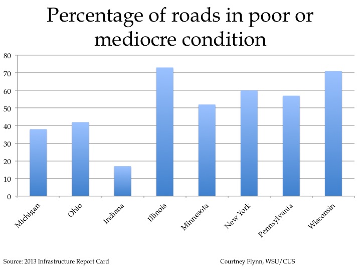
The 2013 Report Card for America’s Infrastructure also showed that, of the Great Lakes States, Illinois had the highest percent of roads in mediocre or poor condition (73%) in the region while Indiana has the lowest (17%). The report indicated Michigan had 38 percent of its roads in mediocre or poor condition (lowest), following. Information is based off of 2009 data; the report card did not objectively define poor, mediocre, or good.

Slide07

According to the Michigan Department of Transportation, Minnesota invested $315 per capita into its total 2014 road budget while Michigan invested $174. This was the lowest in the Great Lakes region. Indiana invested the second lowest at $187.

Slide09

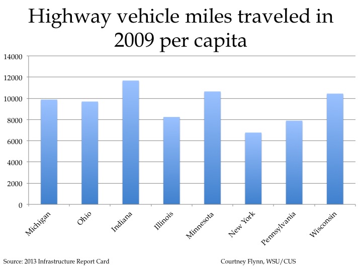
While weather can have an affect on roads, so can the amount of vehicle traffic. According to the 2013 Report Card for America’s Infrastructure, in 2009, Indiana had the highest highway vehicle miles traveled per capita at 11,672. Michigan came in fourth in the Great Lakes region at 9,878 highway vehicle miles per capita.

New policy would mean more responsibility for abandoned buildings

According to a recent column in the Detroit Free Press, two writers believe a new policy would be private industry more responsible for ridding their vacant properties. The suggested policy would require such industry executives to secure sound funding that would allow enough monies to be available at the end of the buildings life to properly deconstruct it. To read more click here. Also, to learn more about Detroit’s vacant properties read our recent post, here.

Great Lakes cargo loads inching up after 2009 drop

GL1

The map above is provided to give readers a perspective on the hydraulic system that makes up the Great Lakes, which are a focus of this post. The information provided in the above map by Indiana University is the historical long-term averages and record highs and lows for the each of the hydraulic systems in the Great Lakes basin. Lake Michigan and Lake Huron are grouped as one throughout this post as they are hydraulically the same body of water. Also, it must be kept in mind that Lake Superior is the largest and deepest of the lakes followed by Lake Michigan/Huron, Lake St. Clair, Lake Erie, and then Lake Ontario.

GL2

Information provided by the Canadian Coast Guard shows that the number of cargo trips made on the Detroit River and Lake St. Clair has decreased since 2006 (the Canadian Coast Guard could only provide information from 2005 to 2012). After a significant drop in 2009, the number of cargo vessel transits increased in 2010 and 2011;there was a slight decrease in 2012. While there is evidence the number of vessel trips being made has experienced an overall decrease since 2005, the Canadian Coast Guard does not track the weight of cargo on the vessels, said Canadian Coast Guard Regional Program Specialist John North.

There were 8,420 trips made in 2005 compared to 6,350 made in 2012. The numbers for each year do not include trips made by passenger vessel ferries, Coast Guard vessels, Navy vessels, vessels used for dredging and tug boats.

While lower water levels do cause cargo ships to have to carry lighter loads, Glen Nekvasil, vice president of the Lake Carriers’ Association, a trade association based out of Rocky River, Ohio, said the decrease is likely associated to the economy. He said the number of cargo trips wouldn’t increase if vessels had to carry lighter loads because vessels can only make a certain number of trips a year because of weather and speed. Cargo ships typically haul materials from March to December and already operate at their top speed, he said.

GL3

The St. Lawrence Seaway is made up of locks, canals and channels that allow vessels to travel from the Atlantic Ocean to the Great Lakes, and vice versa. These vessels can travel as far inland as the western end of Lake Superior.

The above chart shows the total number of vessel transits, both those coming into the Great Lakes or exiting them, on the St. Lawrence Seaway System between 1993 and 2012. In 2009, there was a drop in the total number of transits made; that number was recorded at 3,631. By 2012, though, that number increased to 4,083 vessel transits. The vessels included in data from the St. Lawrence Seaway include cargo vessels, government based vessels carrying cargo and tug boats.

GL4

In 2009, the tonnage of limestone carried throughout the Great Lakes reached a low of 23,504,132; this declining trend began in 2007. There was an increase in the amount of limestone carried between 2009 and 2011, followed by a slight decrease between 2011 and 2012. In 2012, 27,147,231 tons of limestone were transported on the Great Lakes.

According to Nekvasil, limestone is the most common type of cargo carried on vessels in the Great Lakes. It is quarried in Michigan, Ontario and Ohio and transported throughout the Great Lakes and the St. Lawrence Seaway.

GL5

The tonnage of iron ore cargo carried throughout the Great Lakes also reached a low in 2009 at 32,552,016 tons compared to 61,136,841 tons in 2008. Beginning in 2010, the number of tons transported increased; in 2012, 61,599,321 tons were carried.

Iron ore is mined in northern Minnesota, the Upper Peninsula of Michigan, in northern Quebec and western Labrador in the Great Lakes region.

GL6

While there was a significant decrease in the tonnage of coal carried on the Great Lakes from 2008 to 2009, it was in 2012 when the smallest annual load of coal, for the timeframe examined, was carried. According to the Lake Carriers’ Association, there was 25,347,709 tons of coal carried in 2012. Except for a slight increase between 2009 and 2010, there has been a steady drop-off in the tonnage carried since 2008.

Coal transported on the Great Lakes is mined in several locations including Montana, Wyoming, West Virginia and Pennsylvania.

GL7

Beginning in 2004, the amount of cement carried on the Great Lakes began to decrease. In 2009 it then hit an all-time low, for the period examined, of 4,016,999 tons. Since then, the amount of cement carried has remained consistent. In 2011, 4,019,675 tons of cement cargo were carried.

Cement carried on the Great Lakes is produced in several locations in Michigan and Ontario.

Data for 2012 was not available.

GL8

Unlike the other types of cargo examined in this post, during the period observed, 2009 was the peak year for the amount of salt carried on the Great Lakes. In 2009, 12,611,308 tons of salt were transported; that number decreased in 2010 to 8,940,502 tons. There was a slight increase in tonnage carried in 2011 where 10,879,102 tons of salt were transported.

From 2000 to 2009 there was an overall increasing trend in the amount of salt transported on the Great Lakes.

Salt is mined throughout the Great Lakes region including Ontario, Michigan and Ohio.

Data for 2012 was not available.

GL9

The above chart shows the current water levels of the Great Lakes and Lake St. Clair, which is the largest delta in the hydraulic system, along with their record highs and lows in May. While none of the bodies of water are currently below the record low levels, four of the five hydraulic systems that make up the Great Lakes are near such levels.

For Lake Superior, the record low for the month of May was 182.76 meters and current levels reported by the U.S. Army Corps of Engineers are at 183.09 meters.

For the Lake Michigan/Lake Huron hydraulic body of water, 175.93 meters was the record low for May and current water levels were recorded at 175.93.

The record low for Lake St. Clair in May was 174.42 meters and current conditions were recoded at 174.82 meters.

For Lake Erie, the lowest recorded water level in May was 173.44 meters and current conditions were recorded at 174.09 meters.

Lake Ontario has the largest gap from the record low water level for the month of May and the current recorded level. The record low was recorded at 73.08 meters and current conditions were recorded at 74.88 meters.

Depending on the size of the vessel and the type of cargo being carried, 50 to 270 tons of cargo may need to come off the boat for every inch of draft exposed on the ship because of the decreased water levels, according to Nekvasil.
Detroit residential vacancies stabilize in late 2012

How are the neighborhoods doing?

The Center for Urban Studies (Center) has created a database and mapping tool that describes address vacancy using information from the United States Postal Service (USPS).  The U.S. Department of Housing and Urban Development (HUD) recently entered into an agreement with the USPS to aggregate and publicly release USPS data on vacant addresses on a quarterly basis.  The data covers all addresses in the United States and provides comprehensive coverage of vacancies at various geographic levels, including states, counties and census tracts. This inclusion of vacancy data at the census tract level is one of the biggest advantages of the new USPS data set.

Using the 27 HUD /USPS extracts since December 2005, the Center has created a time-series database consisting of over 1.5 million records that describe the address vacancy conditions in every census tract in the United States.  This provides a powerful tool for tracking neighborhood change over time.

There are a number of basic measures for this data set including:

•Total number of residential addresses
•Total number of residential, business and other addresses that are vacant
•Total number of addresses that are “no-stat” (i.e., temporary vacancies)

Vacant , as defined by the USPS, means the occupants of the unit have not collected their mail for 90 days or longer.

The “no-stat” category is separate from vacant, which includes: a) addresses under construction but not yet occupied; b) rural addresses  vacant for 90 days or longer; c) urban addresses identified by a carrier as not likely to be active for some time (e.g., if a building is being  demolished to be replaced by another building, the address is preserved and considered “no-stat”).

The following  figures and maps are based on the USPS/HUD data.

vacancy1


The availability of quarterly vacancy data begins in December 2005.  In March 2008, the USPS began to differentiate residential addresses from businesses and other types of addresses. According to the data, the total percent of vacancies and the percent of residential vacancies remained the same in the third and fourth quarters of 2012. However, this is not a direct reflection on the vacancy rate in the city; this is further explained below.

vacancy2

The overall address vacancy rate in the City of Detroit rose .08 percent from Sep 2012 to Dec 2012.  During the fourth quarter of 2012,  51 addresses became vacant and 1,307 addresses were removed from the USPS master address list.

The overall address vacancy rate was 22.2 percent in December 2012.

In recent years, the USPS has made changes to its counting procedures to improve the accuracy of the vacant indicator.  These new methods should improve data quality over time, but caution should be used in measuring change over time.  For more information, see the following http://www.huduser.org/portal/datasets/usps.html.


The map above illustrates the geography of address vacancy rates for December 2012.

Neighborhoods shaded purple have vacancy rates exceeding 25 percent.  Areas with the lowest address vacancy include: Midtown, Palmer Park and Woods, Grandmont-Rosedale, Rosedale Park, Pembroke, Sherwood Forest, and Rouge Park, among others.

The map above illustrates spatial patterns in address vacancy rates for March 2012.  The are clusters of neighborhoods (shaded purple) having vacancy rates exceeding 30 percent, including the Brightmoor area on Detroit’s west side, the State Fair-Nolan area, the Tireman area, and numerous neighborhoods on Detroit’s east side, a few with vacancy rates exceeding 50 percent.

This map and the previous map do not directly correspond since the purple in this map reflects vacancy rates exceeding 30 percent versus 25 percent. However,  by further looking at the data, there is evidence the vacancy rate in Detroit is slightly higher than it was in March 2012.

Red indicates an increase in address vacancy from Dec 2011 to Dec 2012.  Green areas are those with declining address vacancy rates (improvements) for this same period.  Gray shaded areas showed little change during the period Dec. 2011 to Dec. 2012 (i.e., +/- 1 percent).  The majority of neighborhoods on Detroit’s Eastside showed increases in address vacancy.  Several Detroit neighborhoods near the city’s Westside border showed declines in address vacancy, as did the Boston-Edison, New Center and Medical Center neighborhoods.  Highland Park neighborhoods showed declines in address vacancy, but primarily as a result of a decline in the number of addresses (likely from demolitions of abandoned buildings). In Southwest Detroit, changes in address vacancy were mixed – areas along Michigan Avenue showed declines while areas south of W. Vernor showed increases in vacancy from Dec 2011 to Dec 2012.

Red areas indicate increases in address vacancy from March 2011 to March 2012.  Green areas showed declining vacancy rates (improvements) for this same period.  Gray shaded areas showed very little change in the past year (i.e., +/- 1 percent).  Several neighborhood pockets on Detroit’s west side showed signs of improvement.  Other notable improvements included a big decline in address vacancy in Midtown and some modest improvements in areas along East Jefferson Avenue, on Detroit lower east side.

When comparing this map with the one above, it shows that there was a higher increase in address vacancy from December 2011 to December 2012  than from March 2011 to 2012. This  higher increase can particularly be seen on the east side of Detroit and in western parts of the city.

The most recent information in the maps above, which show that over the last year there have been large pockets of neighborhoods with an increasing number of vacant properties, corresponds with a recent article released by the Detroit Free Press. On March 3 the Free Press released a database that shows how the assessed values of residential properties has changed over the last year. While an average of two out of three communities in the Metro-Detroit area have seen an increase in property values in the last year, Detroit saw a decrease of 11.3 percent, according to the database.


Crashes in the City of Detroit and the State of Michigan

The charts below show the rate of crashes or the rate of people involved (for various types of crashes) for the City of Detroit and the State of Michigan from 2004 to 2011. These rates were calculated using data provided by the Michigan Office of Highway Safety Planning and population numbers for both the state and Detroit. Each rate is based on 100,000 residents. We are seeking total vehicle miles travelled (VMT) as alternative way of calculating rates, and we will provide an additional post when that data becomes available. It may be that VMT will yield either higher or lower rates for Detroit relative to the state because, while a smaller proportion of Detroit residents are drivers, many commuters drive in and out of Detroit.

The Michigan Office of Highway Safety Planning (michigantrafficcrashfacts.org) has data about crashes in the State of Michigan from 1982 until 2011, but data are only available by county from 1992 to 2011 and by city from 2004 to 2011. Crash data include motor vehicles, motorcycles, emergency vehicles, busses, and farm and snow equipment, unless otherwise specified. Specific charts in this post also look at the number of pedestrians and bicyclists involved in crashes.

Crash1

The chart above shows the total crash rate for the State of Michigan is consistently higher than that in the City of Detroit. Overall, both the state and Detroit have seen a decrease in the number of crashes from 2004 to 2011. For example, in 2004 the total crash rate in the state was 3,697 and by 2011 it was 2,876. In the City of Detroit the total crash rate was 3,665 and by 2011 it was 2,786. Also, 2004 and 2011 are years in which the state’s and Detroit’s total crash rates were the closest. The largest difference between the total crash rate for the two was in 2009.crash2

The above chart shows the rate at which male and female drivers were in crashes for both the City of Detroit and Michigan. As can be seen in the chart, male drivers are in motor vehicle accidents more often than females when comparing them just at the state or city level. However, there is a higher rate of drivers at the state level being in crashes, whether male or female, than people in crashes in the City of Detroit. The rate of uncoded/error cases for the City of Detroit is higher than those at the state level.

Crash3

According to the chart above, the rate of alcohol related motor vehicle accidents is higher for the State of Michigan than the rate for the City of Detroit.  While both rates have experienced an overall decline from 2004 to 2011, the decline at the state level has been much more consistent. For example, in 2008 the rate of alcohol related motor vehicle accidents in the City of Detroit was 61 and by 2010 that number was 80. In 2011 though the rate of such accidents in Detroit decreased to 68; the rate for Michigan in 2011 was 100.

Crash4

As can be seen in the chart above, the trend of the rate of crashes in the state being higher than those in the City of Detroit continues. In this chart we see an increase in the rate of crashes where drugs were involved for both the state and the City of Detroit. In 2004, there was a rate of 14 drug related motor vehicle crashes in the state and 4 for Detroit. By 2011 that number increased to 19 in the state and 5 in Detroit. From 2004 to 2011 the rate in Detroit did not go above 5 or below 3. For the state though, the rate never dropped below 14 (which was in 2004) and the high was 20 in 2010.

Crash5

The chart above shows the number of people killed in motor vehicle accidents per 100,000 residents. Detroit’s rate has remained below the state rate in most years. There has been an overall decline for both Detroit and the state for the rate of fatalities in motor vehicle accidents from 2004 to 2011. In 2004 the rate of fatalities in motor vehicle accidents at the state level was 16; that number was 14 for Detroit. In 2011 that rate decreased to 12 for the state and 10 for Detroit. Detroit’s rates have been much more inconsistent than those at the state level.

Crash6

The number of bicyclists involved in motor vehicle accidents has been much more erratic for the City of Detroit than for the State of Michigan. In 2004 the rate for Detroit (24) was higher than state’s rate (22). By 2011 Detroit’s rate decreased to 15, but there were a few peaks and valleys along the way. The state’s rates for motor vehicle accidents involving bicyclists has been much more consistent. By 2011 the state’s rate had decreased to 19, and while this was the low, the high was 22 in 2007.

Crash7

Unlike the other charts we have seen throughout this post, the rate at which pedestrians were involved in crashes with motor vehicles was consistently higher in Detroit than the rate at the state level. In 2004, there were 85 pedestrians involved in such a crash in the City of Detroit; that number was 28 at the state level. While Detroit’s rate has been higher than the 2004 since then, it has not dropped below 54 (this was in 2008 and 2009). In 2011, the rate was 72 for the City of Detroit and 24 for the state.

A deeper look at Michigan bridges

In this post bridges in Michigan will be examined. While the main focus is on the international border crossings, the chart below provides information on all the major waterway bridges in the state of Michigan. This is to give readers a comparison on the basic information so they can have a better understanding of size and location for the bridges examined later in the post.

The above graph shows that Detroit is the most commonly used port of the three international ports in Michigan. According to the Bureau of Transportation Statistics, the number of vehicles that travel through Detroit to or from Canada is over double the amount that travels through Port Huron and four times higher than through Sault Ste. Marie.

The above chart shows the U.S. to Canada traffic flow for the four international crossings in Michigan during the year 2011. The Ambassador Bridge, which is privately owned, has the highest average traffic flow, and the Sault Ste. Marie International Bridge has the lowest. The 2011 traffic flow for the Sault Ste. Marie International Bridge is estimated to be about 5,255,000 less than the Ambassador Bridge. The Blue Water Bridge had the second highest traffic flow in 2011 of about 5.1 million vehicles.

Not only did the Ambassador Bridge have the highest amount of traffic, it also has the highest toll cost at $4.75 per passenger vehicle. The Grosse Ile Toll Bridge, which is one of two bridges that connects Grosse Ile-which is an island of about 10,400 residents-to mainland Trenton, has the a lowest toll rate at $2 per trip. Like the Ambassador Bridge the Grosse Ile Toll Bridge is privately owned.

Although the Mackinac Bridge is the longest Michigan bridge, as shown in previous charts, it has less traffic and lower tolls than the international Ambassador and Blue Water Bridges. The Sault Ste. Marie International Bridge, which also does not receive as much traffic as the Ambassador Bridge and the Blue Water Bridge, is the second longest waterway bridge in the state.

Well construction in Michigan and growth related to Urban Sprawl 1930-2005

The table and images below show wells drilled from 1930 to 2005. Table 1 describes the number of wells constructed in each of the seven counties in Southeast Michigan, from 1930 to 2005. During this period, a total  of 75,145 wells were constructed in this region.  Also, Table 1 and the graph, Well Construction by County, Southeast Michigan 1930-2005, show that Livingston County had the highest number of wells constructed in the region (21,295), with Oakland a close second (20,893).

The graph in Figure X below depicts the number of wells in each county from 1930 to 2005.  Looking into the county level construction of wells through the decades, five of seven counties (Livingston, Oakland, Washtenaw, Macomb, and Monroe) showed significant increases in construction between 1960 and 1990 (See Total by County column).  Livingston County had the highest number of construction between 1970 and 1990 but between 1991 and 2000, Oakland County had more than twice the number of wells constructed compared to Livingston County, indicating a shift in growth area in the region.

The significant increase in the number of wells constructed in St. Clair County between 1990 and 2005 is also worth noting. Only 17%, or 369, (n=2,196 excluding undated wells) were built from 1930 to 1990 but 83% of dated wells, or 1,827 wells, were added from 1991 to 2005. About 4% or 86 wells were undated. St. Clair County showed indications of increased demand for water consumption during these decades. On the other hand, while Wayne County indicated 74%, or 735 (n=990, excluding undated wells), construction between 1930 and 1990, only 26% of dated wells or 255 wells were added past the 1990s.

Overall, wells as water sources for household/domestic, industrial, or public municipal uses are basic infrastructures necessary for development and growth in a given geographic area. The images and table on wells construction presented here provide an alternative way for viewing the pattern of growth and transformation in Southeast Michigan.  To a degree, the distribution of wells represents urbanization beyond the boundaries of the organized delivery of municipal services. As such the images represent a reverse image of dense urban development. At the same time, the distribution shows a broad swath of development beyond city boundaries.

Table 1 and Figure X and Y summarize the data on wells constructed in Southeast Michigan by county and decade. Table 1 and Figure X includes 7.1% (n=75,145) of wells lacking information on date of construction but Figure Y excludes this information.

The images below depict well construction by decade from 1930 to 2005. The first image shows the total construction over time and the remainder break down the totals by decade.