A pocket of Detroit’s downtown exhibits most number of falls

This post examines the number of fall-related calls placed to Detroit EMS from January 1, 2010 to August 26, 2012 . Both the frequency and distribution of these calls are examined, along with the type and number of injuries suffered from the falls. All information obtained was from Detroit EMS. Overall, the post shows that the city’s downtown, predominantly in the area between M-10 and I-375, is where the highest number of falls occurred. The most frequent type of fall was one where the victim fell from less than six feet and suffered no injuries. The most common reported reason for falls was an altered state of consciousness, which could range from an inability to focus to a concussion. In addition to examining fall-related calls for the entire City of Detroit, three neighborhood areas are also highlighted at the end of this post. These three areas (North End and Crossman, Osborn, and Southwest) are highlighted because they are CLEARCorps target areas for the Green and Healthy Homes-Detroit Initiative, which aims to reduce housing related health-risks through “comprehensive home-based assessments and interventions, public outreach and education, and local partnerships.”

falls1

falls2

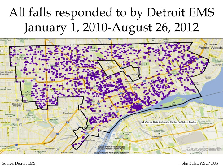
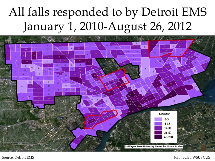
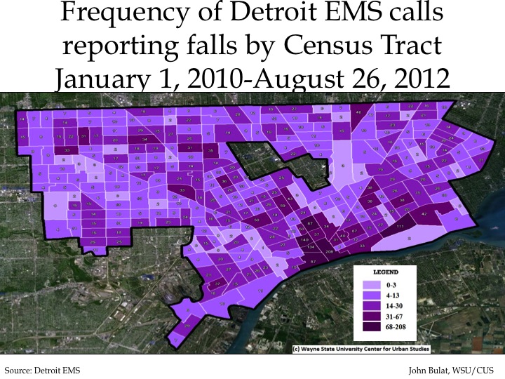
The above maps show the frequency and distribution of fall-related calls Detroit EMS personnel responded to from January 1, 2010 to August 26, 2012. In total, EMS responded to 4,853 calls in that time frame, most of which were concentrated along the city’s downtown near the Detroit River between M-10 and I-375. In that area there are six Census tracts with the highest range of calls (over 67 calls); no other Census tract in the city received more than 67 calls during that time period. For the Census tracts in dark purple there were a total of 767 fall related calls.  There was also a concentration of falls around Woodward Avenue.

In the second map, which shows the distribution of falls in the city, one dot is equal to one fall related call. This remains true in all other distribution maps in this post.

falls3

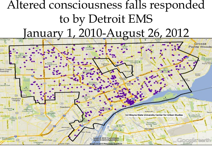
The above map shows the distribution of EMS calls reporting falls associated with the victim having altered consciousness following the incident. In total there were 750 such calls. Similar to the first frequency map of all falls, this map shows the highest concentration of such falls was located downtown, along the Detroit River and down Woodward Avenue.

falls4

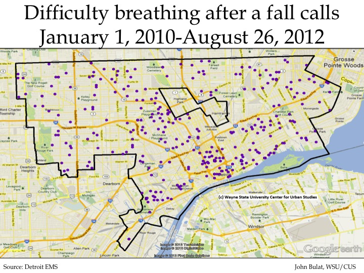
In the time frame examined in this post, there were 350 calls where the victim of a fall had difficulty breathing following the incident. As can been seen, these type of fall-related EMS calls did not occur as often as other types of fall-related calls and were less concentrated in the downtown area of the City of Detroit.

falls5

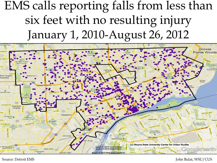
Of the type of fall calls to EMS examined in this post, there were 1,653 instances where a person fell less than six feet and suffered no injuries. These made up 34 percent of the fall calls received by Detroit EMS during the time period examined. There was a heavy concentration of these calls received in the city’s downtown, between M-10 and 375. There was also a string of such incidents just west of I-94, between I-75 and I-96.

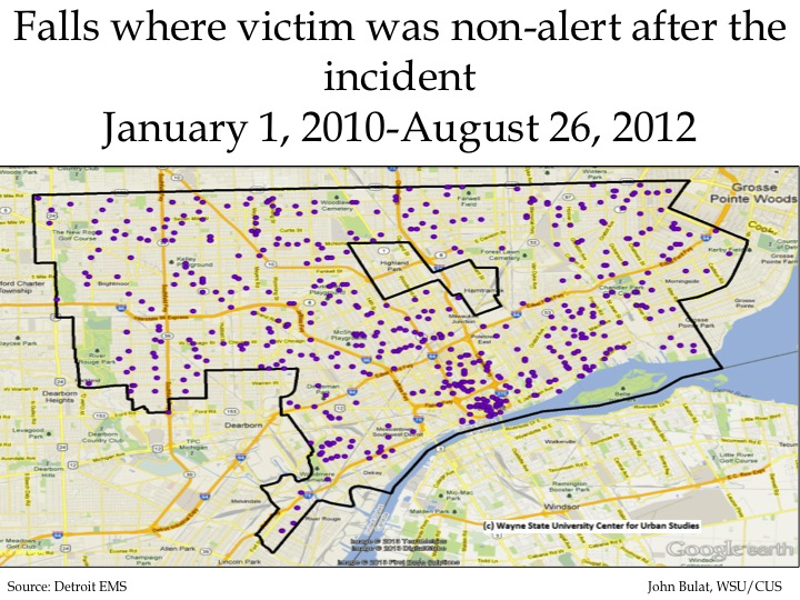
falls6

There were 612 calls to the Detroit EMS from January 1, 2010 to August 26, 2012 related to a person falling and being non-alert following the incident. Aside from the concentration of such falls in the city’s downtown between M-10 and I-375, these calls are fairly evenly distributed throughout the city.

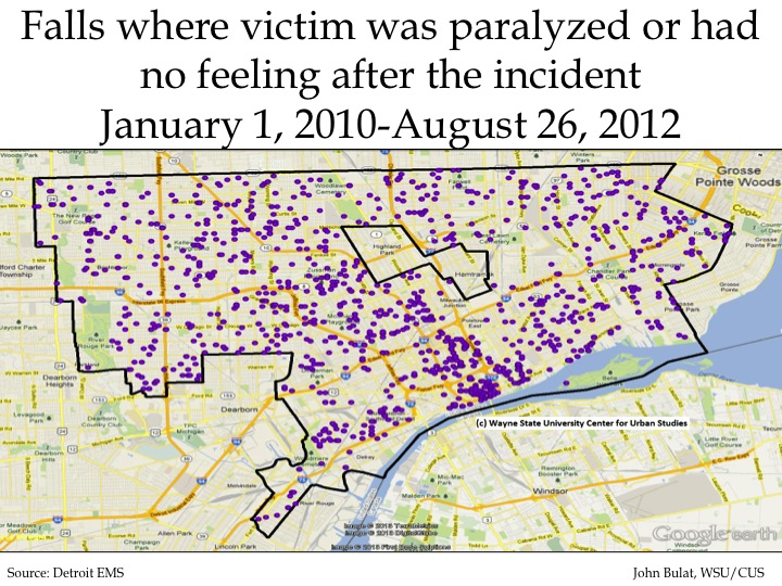
falls7

Between January 1, 2010 and August 26, 2012 Detroit EMS responded to 1,488 calls where the injured person was paralyzed or had no sense of feeling following the incident.

falls8

The Green and Healthy Homes-Detroit Initiative aims to reduce housing related health-risks through “comprehensive home-based assessments and interventions, public outreach and education, and local partnerships.” Through this initiative, ClearCorps is targeting three neighborhoods for housing hazard identification and remediation.  These neighborhoods are the North End and Crossman area (the center target area), the Osborn area (the north target area) and the Southwest area. The map above shows that none of these target areas had Census tracts were Detroit EMS responded to more than 67 falls. All three areas did have at least one Census tract with the second highest range (31-67) of fall-related calls.

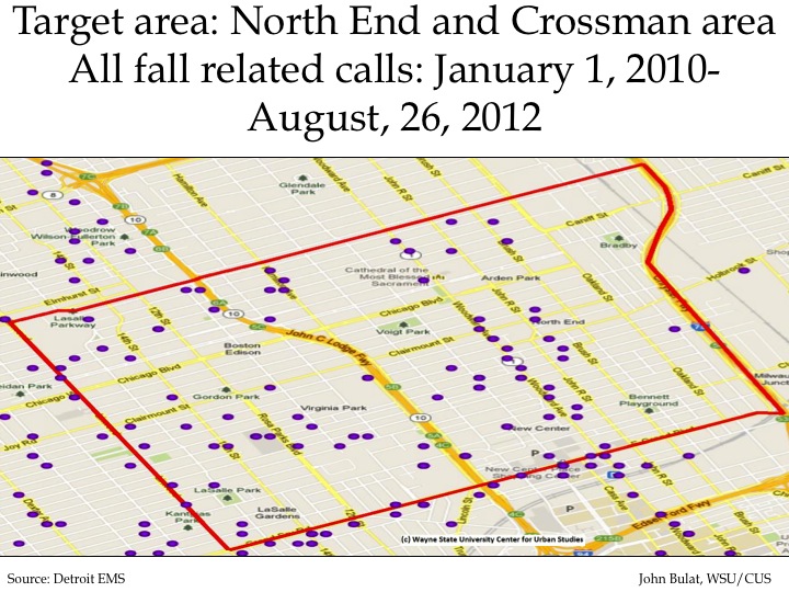
falls9

In the North End and Crossman area there were about 70 total fall-related calls made to Detroit EMS from January 1, 2010 to August 26, 2012. Of those calls, the following types of fall-related calls were responded to:

(The categories below are not mutually exclusive.)

•Altered consciousness: 27
•Difficulty breathing: 9
•A fall from less than 6 feet with no injury: 45
•No alert: 18
•Paralyzed/loss of feeling: 41
falls10

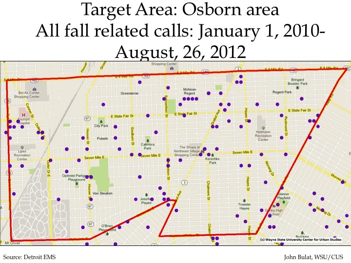
In the Osborn area there were about 80 total fall-related calls made to Detroit EMS from January 1, 2010 to August 26, 2012. Of those calls, the following types of fall-related calls were responded to:

(The above categories are not mutually exclusive)

•Altered consciousness: 25
•Difficulty breathing: 13
•A fall from less than 6 feet with no injury: 60
•No alert: 30
•Paralyzed/loss of feeling: 48

falls11

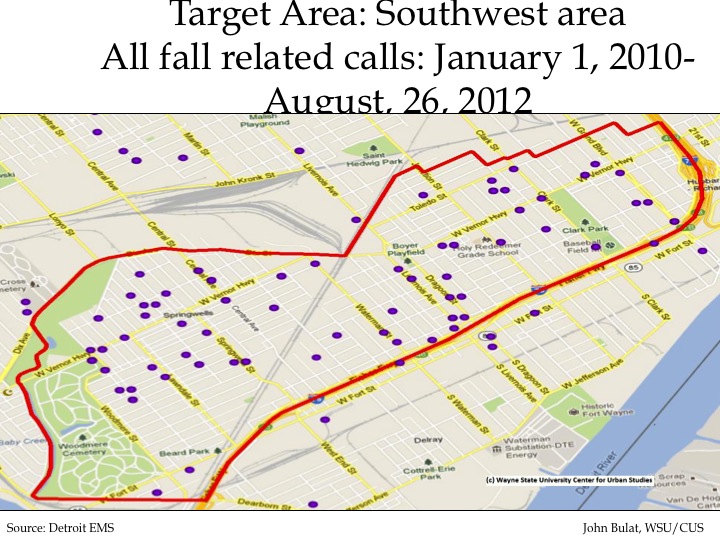
In the Southwest area there were about 60 total fall-related calls made to Detroit EMS from January 1, 2010 to August 26, 2012. Of those calls, the following types of fall-related calls were responded to:

(The categories are not mutually exclusive)
•Altered consciousness: 19
•Difficulty breathing: 20
•A fall from less than 6 feet with no injury: 40
•No alert: 21
•Paralyzed/loss of feeling: 40

STD’s in Metro Detroit:Chlamydia rates rise and Detroit females show most dramatic increase

In this post, rates for syphilis, gonorrhea, and chlamydia are examined for the Metro-Detroit area. The Metro-Detroit area includes Detroit, Wayne County, Macomb County, and Oakland County. Detroit data is included in the Wayne County data shown. All rates are based on 100,000 residents and a 95 percent confidence interval. A confidence interval is a range of values that likely includes an unknown population parameter; the range is calculated from a given set of sample data.

Chlamydia rates in Detroit and Wayne, Oakland, and Macomb counties were on the rise from 1999 to 2011, according to the Michigan Department of Community Health. When looking further into data on chlamydia for City of Detroit residents, it can be seen there was a higher rate of females for this sexually transmitted disease (STD) than males. The data also shows the number of chlamydia and gonorrhea cases was highest for those between the ages of 15-24 for all geographical areas examined in the post.

STD1

Overall, from 1999 to 2011, the chlamydia rate increased for the state and all four geographical areas examined in this post. However, it increased at a much more rapid pace in the City of Detroit than it did in Oakland and Macomb counties. In 1999, the chlamydia rate in Detroit was recorded at 804 cases per 100,000 residents and in 2010, it reached a peak of 2,561. Note, however it declined in 2011 to 2,279. In Wayne County the rate was recorded at 417 per 100,000 residents in 1999 and 1,109 in 2011. For both Macomb and Oakland counties the chlamydia rate was recorded at 75 cases per 100,000 residents in 1999. By 2011, the rate was recorded at 307 cases per 100,000 residents in Oakland County and 233 in Macomb County.  The state as whole more than doubled across these years to 507 cases per 100,000.

STD2

From 1999 to 2011, female Detroit residents consistently had a higher rate of chlamydia infection than Detroit male residents. Between 2006 and 2008, the rate of females infected increased from 1,902 cases per 100,000 female residents to 3,361. In 2011 the rate of females infected was reported to decline to 3,201 cases per 100,000 female residents and the rate of males infected was 1,239 cases per 100,000 male residents.

STD3

In 2011, the 15-19 year old age group had the highest rate of females infected with chlamydia, at 17,156 cases per 100,000 female residents. For males, the 20-24 year old age group had the highest rate at 5,472 cases per 100,000 male residents.

No rates are provided for the 45 and older age group in the above chart because the data to calculate a meaningful rate is too broad because of the age range, according to the Michigan Department of Community Health.

STD4

Of the three STDs examined in this post, syphilis had the lowest rates of infection for Detroit and Wayne, Macomb and Oakland counties. During the time covered it increased in Detroit and Wayne County then fell dramatically in several jurisdictions. During the time period examined, Detroit had the highest rate of syphilis cases. From 1999 to 2001 there was an increase in Detroit’s rate; the rate peaked  in 2001 at 97 cases per 100,000 residents. Detroit’s rate then decreased, reaching a low of 23 cases per 100,000 residents. Since then, the rate generally increased in Detroit; in 2011, the syphilis rate for Detroit was recorded at 41 cases per 100,000 residents.

Unlike Detroit and Wayne County, the syphilis rates for both Oakland and Macomb counties remained fairly consistent and low  since 1999. However, in recent years, the rates for both counties increased; in 2011, both counties recorded their highest syphilis rates of the examined period: 7 cases per 100,000 residents.

STD5

The chart above demonstrates that Detroit males consistently had a higher rate of syphilis than Detroit females. In 2011, there were 66 males  per 100,000 male residents infected with syphilis and 21 females per 100,000 female residents infected.

STD6

The above chart shows Detroit males between the ages of 20 and 24 had the highest rate of syphilis infection in 2011. When looking at the 2011 rates for Detroit females only, the 25-29 year old age group had the highest rate.

There is no rate provided for the 15-19 female age group because not enough data was available. Also, no rates are provided for the 45 and older age group in the above chart because the data was too broad because of the age range to calculate a meaningful rate, according to the Michigan Department of Community Health.

STD7

Similar to the syphilis rates, residents in Macomb and Oakland counties experienced relatively low and consistent gonorrhea rates from 1999-2011, compared to those in Detroit and Wayne County. In 2011, the gonorrhea rate in Macomb County was 60 cases per 100,000 residents; the rate was 82 per 100,000 in Oakland County. For Wayne County the gonorrhea rate in 2011 was 413 cases per 100,000 residents and it was 906 per 100,000 residents for Detroit. In 2008, a gonorrhea rate of 1,166 was recorded for Detroit residents; this was the peak during the time period examined, and it has declined somewhat since then.

STD8

From 1999 to 2000, males had a higher rate of gonorrhea infection than females in Detroit. Between 2001 and 2004, males and females had similar rates. In 2005, the rate of females infected with gonorrhea began to surpass that of males. In 2011, the rate of gonorrhea for females was 1,102 cases per 100,000 and the rate for males was 795 per 100,000.

Slide19

For Detroit females in 2011, the 15-19 year old age group had the highest rate of gonorrhea infection. For Detroit males, the 20-24 year old age group had the highest rate of infection.

No rates are provided for the 45 and older age group in the above chart because the data was too broad because of the large age range to calculate a meaningful rate, according to the Michigan Department of Community Health.

911 data show show breathing and wheezing calls dot Detroit

There were few places in the City of Detroit where Detroit EMS did not respond to a call related to breathing and wheezing problems between January 1, 2010 and August 26, 2012.  there were about six neighborhoods in the western portion of the city and six other neighborhoods throughout the city that exhibited a high frequency of breathing and wheezing-related EMS calls. Aside from these 12 areas, the majority of the city exhibited a fairly low frequency of breathing and wheezing related calls.

Breathing and wheezing problems can be brought on from asbestos, mold and moisture, Volatile Organic Compounds, carbon monoxide, and tobacco smoke, amongst other health issues. Asthma can also bring on breathing and wheezing problems; this was examined in an earlier Drawing Detroit post.

The information used in this post was collected and provided by the City of Detroit. It was analyzed as part of the ongoing efforts of the Green and Healthy Homes Initiative-Detroit to identify hazards and health challenges emerging from housing problems.  The Green and Healthy Homes Initiative-Detroit (GHHI) aims to reduce housing related health-risks through “comprehensive home-based assessments and interventions, public outreach and education, and local partnerships.” Three GHHI target areas—CLEARCorps’ North End and Crossman area, Osborn and Southwest–are examined in this post. Of these three, the Osborn neighborhood had the highest frequency of breathing/wheezing related calls, while the Southwest target area had lower frequencies. locations.

Please click all maps to enlarge them

The map above shows the frequency of all Detroit EMS calls about wheezing and difficulty breathing made between January 1, 2010 and August 26, 2012. Areas north of Michigan Avenue and east of Gratiot appear to have more challenges. One area with the highest frequency is just across the river from Belle Isle (306, 152, 202). There is also a string of Census tracts near downtown that have particularly high numbers of calls (Counts of 911 calls:202, 306, 330) .

The next six maps below show in more detail the distribution and frequency of calls made to the Detroit EMS regarding breathing and wheezing in the target areas for the Detroit Green and Healthy Homes Initiative (GHHI). For each area a dot map of locations (To preserve privacy, the precise addresses are not shown.) followed by a map shaded to reflect frequencies for Census tracts.

The CLEARCorps target area above is located in Detroit’s north end/central Woodward neighborhood; it is  bordered by Linwood (west), Webb/Woodland (north), I-75 (east), and  Grand Boulevard (south). In this target area, there was one Census tract neighborhood with the highest frequency of calls (167) and two with the second highest frequency rating (150 and 130). The remainder of the target area is comprised of locations with a lower frequency of calls.

The Osborn area has a high frequency of calls. This area, which is in the upper east side of the city, contains two Census tracts (with frequencies of 164 and 163) with a very high frequency of breathing/wheezing related calls. Almost every other tract in the Osborn neighborhood was in either either the second or third highest category for frequency of calls. The only exception was a Census tract in the middle of the area, which had a low frequency (38).

The Southwest target area has no tracts with the highest frequency of breathing/wheezing related calls, though some areas have over 100 calls. The entire area is shaded in the low and middle portion of the frequency spectrum.

Dealing with the challenges

The challenges identified in these maps are partly the result of exterior and interior hazards though age of residents or disease processes are also likely to explain part of these numbers. Outside the home, dust, pollution and pollen can create breathing problems. Inside the home, mold, insects, pets and smoke are among the most important risk factors. GHHI concentrates on removing these hazards from home to make them safe for vulnerable populations, typically children and the elderly.


Detroit EMS receives high number of burn calls associated with structure fires

From January 1, 2010 to August 26, 2012 there were about 400 calls received by the Detroit EMS related burns associated with structure fires. In that same time there were only 15 calls related to electrical fire burns.

This post exams the distribution and frequency to which Detroit EMS responded to burn related calls. In addition to showing the overall frequency and distribution of burn related EMS calls, this post also breaks down the calls by the following types:

•Burns related to structure fires: 394 calls
•Small Burns: 262 calls
•An adult with over 18 percent of his or her body covered in burns: 219 calls
•A child with over 10 percent of his or her body covered in burns: 94 calls
•Burns where a person was not alert: 56 calls
•A person with burns and difficulty breathing: 35 calls
•Burns related to electrical fires: 15 calls

This information was obtained and analyzed as part of the ongoing efforts of the Green and Healthy Homes Initiative-Detroit . While these calls presented in this post are not mutually exclusive, each call in the time frame presented was assigned to one of the above categories.

While this information was made available for GHHI purposes, the City of Detroit only publically presents information related to the number of fire calls responded to by the City of Detroit Fire Department for 2006 on their website. According to that data, in 2006 the fire department responded to 33,441 fires and 131,481 medical emergencies. According to the same website, there was an average of 47 people in the city who die each year from residential fire deaths.

The above map shows, by Census tract data, where Detroit EMS assisted burn victims, and the frequency at which they assisted, from January 10, 2010 to August 26, 2012. During this period, there were 1,075 burn calls throughout the city. While much of the City of Detroit was in the mid to low range (2-5 calls per Census tract) for the frequency of burn calls, there were several pockets that had high numbers of EMS calls, according to the legend. The dark green areas have the highest frequency of calls; these areas range from 9 to 12 calls. For the highest frequency areas there is no trend associated with where they are located in the city; there were 11 Census tract locations in the high frequency range. There was however a diagonal string of Census tract areas in the central/ south-central area of the city that had between 6 and 9 EMS burn calls from January 2010 to August 2012.

There were 21 Census tract locations where zero burn related calls were made to the Detroit EMS in this time frame; some of these locations include Palmer Park, Rouge Golf Course, Eliza Howell Park, and Belle Isle; all of which are parks/recreation areas in the city.

This map provides a different picture on where Detroit EMS responded to burn related situations. As mentioned above there is no trend to where the high frequency areas are located in the city, and areas with between 2 to 5 calls seemed to dominate the city.

The above seven maps are a breakdown of the EMS burn calls,  by dispatcher-assigned category, within the City of Detroit. Of the 1,075 total burn calls during this time, 394 were categorized as related to structure fires. The second highest frequency category was small burn related calls.

There were 15 calls to Detroit EMS between January 1, 2010 to August 26, 2012 for burns related to electrical fires, 35 calls related to a person having burns and difficulty breathing, and 56 where a person was burned and not alert. There were far fewer EMS calls in those three categories than EMS calls related to burns and structure fires (394), small burns (262) and children (94) and adults (219) with burns that covered a certain portion of their body.

When the total number of burn related calls were broken down in the seven categories the maps showed there were no clear geographic trends of concentration in certain areas of the city, per category.

Causes of deaths for the Southeastern Michigan area:Homicide, Unintentional Injury & Suicide

This post shows the homicide, unintentional injury, and suicide death rates for the Southeastern Michigan area and the Metro-Detroit area from 1980 to 2010. The Southeastern Michigan area is comprised of Livingston, Macomb, Monroe, Oakland, St. Clair, Washtenaw, and Wayne counties. The Metro-Detroit area consists of Wayne, Macomb, and Oakland counties. While the City of Detroit data is included with the Wayne County data, we also examine just Detroit data in these charts.

The rates for the seven-county region were calculated on a five year rolling average while the rates for the Metro-Detroit area are presented on an annual basis. The Michigan Department of Community Health provided all information, and all rates are per 1,000. Sometimes the series are interrupted because of gaps in the data.

In the following charts you will see:

•Detroit and Wayne County have the highest homicide rate. The rates for these two areas have been increasing in recent years but are not near their peaks.
•The unintentional death rate for those under 25 has been decreasing.
•The suicide rate for those under 25 has also been decreasing, until a recent increasing trend, but the rate for those 25-74 is increasing in some areas.
homicide1
homicide2
homicide3
homicide4
homicide5

The homicide rate, when examined at both the five year rolling average for the seven-county region and the annual rate for the tri-county region, is highest in Detroit and Wayne County in all age groups. In Detroit and Wayne County the rates began to decrease from their peaks in the late-80s to mid-90s. However, for those under 25 in Detroit and Wayne County, the homicide rate began to increase again in recent years when looking at the five year rolling average (as displayed in the chart with data from Southeastern Michigan). When looking at the other counties across age groups, the homicide rate has remained fairly low and stable.

There was only enough information on the homicide rate for those 75 and older for the City of Detroit and Wayne County because the number of murders in the other counties was either so low, or non-existent, that a rate could be determined. In the information that was available, Detroit consistently had higher rates.

injury1

injury2

injury3

injury5

injury5

injury6

According to the Center for Disease Control, unintentional injuries are unplanned injuries that occur suddenly; they are typically associated with crashes, falls, fires, burns, drowning, poisoning, and aspirations. The death rate associated with unintentional injuries was highest for those 75 and older, although rates for the seven-county region have fluctuated across time. The largest increase can be seen in the Oakland County annual rate data; the annual unintentional injury death rate increased from a series low of 35.6 in 1981 to a peak 177.3 in 2010, with a great deal of variation.

Also, the graphs for both for the Southeastern Michigan area and the Metro-Detroit area show an overall decreasing trend in deaths related to unintentional injuries for those under the age of 25 from 1980 to early-2000s.

The City of Detroit had the highest death rates associated with unintentional injuries for the 25-74 age group. Since the early-2000s, there appears to be an increasing trend of deaths related to unintentional injuries for the 25-74 age groups for all counties in the Southeastern Michigan area, with the exception of Oakland and Washtenaw counties.

suicide1

suicide2

suicide3

suicide4

In Southeastern Michigan, the suicide rate has been higher for the 25-74 age group compared to those under 25 from 1980 to 2010. St. Clair County had the highest suicide rate for those 25-74 years old, peaking at 21.5 for the 2006-10 time frame. The rates for those 25-74 years old for St. Clair County and Macomb County have been increasing since the mid-90s, when looking at the five-year averages. When just looking at the tri-county area, it can be seen the suicide rate began to increase in the mid-2000s for the 25-74 age group. It did start to decrease in 2009 though.

For the under 25 age group, St. Clair County had the overall highest rate at 9.1, both in the 1989-1992 and 1990-93 time frames. Overall, data shows there has been a slight decreasing trend in suicides in this age group from the late-80s to the early-2000s. Since then, there appears to be an increasing trend, except in Oakland County. Monroe and Livingston were also showing declines, but their data appears to be missing for recent years.

Mortality trends by causes for Southeastern Michigan

In this week’s post we examine the death rates for several causes for the Southeastern Michigan area, which consists of Livingston, Macomb, Monroe, Oakland, St. Clair, Washtenaw and Wayne counties. We also included the City of Detroit in these charts. When comparing all seven counties in the region, a 5-year rolling average was used, as this was the only consistent type of data reporting used by the Michigan Department of Community Health for all the causes of death examined here. When comparing just the tri-county Metro-Detroit region (Macomb, Oakland, and Wayne counties along with the City of Detroit) data was reported on a yearly basis.  Where numbers aren’t reported in the charts it is because the Michigan Department of Community Health did not have sufficient data; this is seen most often with Livingston, Monroe and St. Clair counties. In addition, all death rates were reported per 100,000.

After examining all charts, the reader will see that heart disease has the highest death rate in the area, but has also seen a significant decrease over the last 30 years for the 75 and older population. Death rates related to strokes and flu and pneumonia for the 75 and older population have also been decreasing. Death rates associated with chronic diseases, such as kidney and respiratory diseases, have been increasing for the older population, as have the death rates associated with diabetes and Alzheimer’s disease.

heart1

heart2


heart3


heart4


The death rate associated with heart disease is the highest of all the causes of deaths examined in this post. While it has been decreasing since the 1980s in the Southeastern Michigan area; the lowest death rate associated with heart disease is still higher than the death rates associated with cancer for the region. For the five year rolling average of the entire Southeastern Michigan area, Washtenaw County has consistently had the lowest death rate associated with heart disease for those 75 and older.

cancer1


cancer2


cancer3


cancer4


The four charts above show the cancer death rate for Southeastern Michigan residents age 75 and older and for those 50 and younger. As can be seen by both the data provided for the seven county regions and the tri-county region, the cancer death rate is well over 1,000 points higher for those 75 and older  than those 50 and younger, when comparing the highest rates in the seven county charts. For those 75 and older, Livingston County had the highest five year rolling average cancer death rate of 1,715.5 from 1995-1999.

For those 50 and younger the City of Detroit had the highest rate at 31.9 from 1991-95. For those under the age of 50 in the chart that compares all seven counties in the Southeastern Michigan area, Detroit consistently had the highest rates, while for those 75 and older Detroit only began to have the highest cancer death rate with the 2000-04; this trend has continued. Before then, Livingston and St. Clair counties had the highest rates for those 75 and older.

stroke1


stroke2


stroke3


stroke4


For the 75 and older population the death rate associated with strokes has been decreasing over time. For example, Washtenaw County started out with the highest death rate caused by strokes when looking at the 1980-84 average; this rate was recorded at 1,179.1. For the 2006-10 average though the rate was recorded at 500.5. Monroe County had the highest death rate average for this population for 2006-10 with a rate of 521.8.

When looking at the data for the 50 and younger population, Detroit had a higher death rate when comparing both the seven county region and the Metro-Detroit area. The 2006-10 average for Detroit was 5.9; this shows how deaths associated with strokes have a much lower rate for the younger population.

flu1


flu2


flu3


flu4


When examining the death rates associated with the flu and pneumonia in all four charts there appears to be a downward trend. However, the death rate did spike in the early 1990’s for all charts except the one that shows the five year rolling average for those 75 and older in the Southeastern Michigan region.   For the 75 and older population the death rate ranged from about 300 to 400 in the early 1980s. Those numbers have since decreased, however the overall range has expanded. For example, for the 2006-10 average for the 75 and older population Livingston County had the highest rate at 243.5 while Monroe County had the lowest at 87.7.

When comparing the younger population with the older population, the death rates are much lower for those who are younger. For example, the highest five year average flu and pneumonia death rate recorded for those 50 and younger was in 1992-96 for the City of Detroit; it was recorded at 8.4. The highest rate recorded for those 75 and older was 543.1 for Washtenaw County residents for the 1986-90 average. For the younger population the Michigan Department of Community Health did not have consistent information available for all counties in the Southeastern Michigan region.

diabetes1


diabetes2


diabetes3


diabetes4


The diabetes death rate for those under the age of 50 is highest for the City of Detroit when comparing data at the yearly level for the Metro-Detroit area and for the five year rolling average when looking at all of Southeastern Michigan.  In recent years the diabetes death rate for those 75 and older has been highest and in St. Clair and Monroe counties. St. Clair County has had the highest five year rolling average since 2002-06. Overall, since 1980 for those 75 and older in the seven county regions, Monroe County recorded the highest rate at 402 for the 1998-02 average.

liver1


liver2

liver2

liver4

While the rate of deaths caused by chronic liver disease shows an overall downward trend for those 75 and older in the Southeastern Michigan area, the data shows that Monroe County residents are following that trend at an even a slower pace.  Monroe and St. Clair counties both saw a peak in the average number of deaths associated with this disease in the 1997-2001 time frame. However, following that, St. Clair County’s numbers decreased more rapidly than those in Monroe County. For the 2006-10 average Monroe County recorded a rate of 36.4; for those 50 and younger Monroe County residents recorded a rate of about 3.8.

For the younger population, City of Detroit residents had a higher death rates associated with chronic liver disease when looking at both the seven county region and the tri-county area. When examining the seven county region though, the decline in deaths associated with this disease was much more prominent. For the 1985-89 average, the City of Detroit reached a peak of 20.2; that number has since decreased to 3.6 for the 2006-10 average. Starting with the 2000-04 average, St. Clair County moved ahead of the City of Detroit for the death rate associated with chronic liver disease. St. Clair County has remained ahead of Detroit and recorded an average death rate of 4.2 for 2006-10.

kidney1

kidney2

liver3

The two charts showing data for chronic kidney disease death rates for those 75 and older shows there has been an increasing trend over time. For example, in the City of Detroit, the 1980-84 average was 111.2 and the 2006-2010 average was 216.2. The City of Detroit has recorded the highest death rate for this disease since the 1996-00 five year rolling average was calculated for the elderly population. While the death rate did begin to trend downward for Detroit after the 2001-05 average, the 2006-10 average is still much higher than the 1980-84 average.

The chart showing the chronic kidney disease death rates for those 50 and younger for the City of Detroit and Wayne County shows Detroit’s rate has consistently remained higher. In 2010 Detroit’s rate was recorded at 2 and Wayne County’s was recorded at 1.2. Information for Macomb and Oakland counties with this population wasn’t consistently available on yearly basis; the same goes for the Southeastern Michigan reason with the five year rolling average.

As with trends seen throughout this post though, the death rate for the younger population with this disease is much lower than those 75 and older.

resp1

resp2

resp3

resp4

When looking at the death rates associated with chronic respiratory disease the data shows they have been increasing for those 75 and older. However, when looking at the rates for those under the age of 50 there is no evidence of such a prominent increase. Instead, the Metro-Detroit region shows no regular trend and for the information available for the Southeastern Michigan area the trend was less erratic, but this can be attributed to the fact that the data is based on a rolling average. The City of Detroit did have the highest rates for both charts that show the data for those under the age of 50.

ALZ

The death rate associated with Alzheimer’s Disease has seen an overall upward trend in the Southeastern Michigan area for all ages. Livingston County though saw a large increase from 1994-98 to 1999-03. The five year age death rate associated with this disease was recorded at 27.8 for 1999-03; which was the highest recorded rate for the county and the region. Washtenaw County has had the highest death rate associated with this disease since the early 2000s.For the 2006-10 average it was recorded at 21.9.


Mortality rates for Detroit and Michigan

mortality1

According to the Center for Disease Control and Prevention, the mortality rate is defined as “a measure of the frequency of occurrence of death among a defined population during a specified time interval.” The above chart shows the mortality rates from 2010 for each of the seven counties that make up Southeastern Michigan. Of these counties, St. Clair County had the highest mortality rate in 2010 at 1,007.1 per 100,000 residents; Wayne County had the second highest rate at 985.2. Washtenaw County had the lowest rate at 581.2.

mortality2

The above chart shows the mortality rates for the City of Detroit, the State of Michigan, and the United States. The rates from Michigan and the United States cover the time span of 1970 to 2010, while the rate for the City of Detroit only covers 1990 to 2010, the only years for which this data was available.

As can be seen, the mortality rate in the City of Detroit remained higher than the rates in Michigan and the United States from 1990 to 2010. The mortality rate in Detroit had a decreasing trend from 1995 to 1997. In 1997, the mortality rate was 9.9 per 1,000 residents, and in 1998 it increased to 10.1. Since then, the mortality rate in the city has ranged from 10.2 to 10.8. In 2010, it was recorded at 10.5.

For Michigan and the United States, the mortality rate trends over time are much smoother.  Although they were declining from 1972 to 1979, the rates increased in 1980 and remained fairly constant until 2001. From 2001 to 2010, the mortality rate for the United States began to decline while the rate in Michigan began to increase. In 2010, Michigan’s mortality rate was 8.9 per 1,000 residents, and the rate in the United States was 8.

mortality3

In 2010, the mortality rate, per 100,000 residents, in the City of Detroit was highest for those individuals 85-years-old and older; it was recorded at 13,081.2. The age bracket for individuals 75-84 years old had the second highest rate at 5,710.9. The age bracket with the lowest rate was 1 to 14-year-olds with a rate of 31.7. There was a gradual progression of increasing rates as the age groups became older, with the exception of the under 1 year old age group. For this group, there was a mortality rate of 1,423.2 per 100,000 residents in 2010. For more information on infant mortality rates, please see our previous post here.

mortality4

The above chart shows that in 2010, the mortality rate for males was consistently higher than the rate for females in every age category in the City of Detroit. For example, in the 85 and over age group, the mortality rate for males was 14,350 per 100,000 residents,  while the mortality rate for females was 12,506.

mortality5

The above chart shows the top 10 leading causes of death for Detroit and Michigan residents in 2010, according to the Michigan Department of Community Health. Heart disease had the highest mortality rate per 100,000 residents for both the City of Detroit and the State of Michigan. However, that rate was 80 deaths per 100,000 residents higher in Detroit (316) than the state (236).

mortality6

The above slide shows the death rate for each one of the counties that make of Southeastern Michigan for heart disease, which is the leading cause of death for all the above counties. Wayne County has the highest rate at 988.1. St. Clair County has the second highest rate 296.8. The rate for St. Clair County is closer to Washtenaw County’s rate of 138.2, which is the lowest of the seven counties, than it is to Wayne County.

In an upcoming post we will explore how the top 10 leading causes of death for each county in Southeastern Michigan and how they have changed over time.

Infant mortality rates in Detroit and Michigan

infantmortality2

The above chart shows the infant mortality rate for 2010 and the five year rolling average for the infant mortality rate from 2006 to 2010 for the counties in Southeastern Michigan. Wayne County has the highest infant mortality rate: in 2010, it was 9.7 per 1,000 live births and the five year rolling average was 10.2. When looking at the rolling average rates, Washtenaw County is the lowest with 5.3. In 2010, St. Clair County had the lowest infant mortality, with a rate of 4.7.

infantmortality3

The above chart shows that the infant mortality rate for the City of Detroit has consistently been higher than the rate for the State of Michigan from 1970 through 2000. While the rates have been decreasing for both the city and the state, Michigan has a smooth decreasing trend, whereas Detroit’s rate has been unstable. Part of the smoothness of the Michigan curve is simply the larger number of cases.  Detroit’s lowest infant mortality rate was 13.4 in 2006 while the state’s lowest rate was 7.1 in 2010. Detroit’s infant mortality rate was 13.5 in 2010.

infantmortality4

infantmortality5

According to both the charts above, in both the state and the City of Detroit, black children had the highest infant mortality rate from 1990 to 2010. In Michigan, the highest rate among that race was 22.1 in 1992; that rate decreased to 14.2 in 2010. For the white race the highest rate was 7.9 in 1990 and the lowest rate was 5.4 in 2004; it was 5.5 in 2010.

The instability of a constant decline, or increase, is pronounced in the white race in the City of Detroit, again, probably because of a smaller number of cases.  In 1990 the rate of infant mortality for whites in the City of Detroit was 8.7 and in 2010 it was 8.5. During this 20-year period, it reached a high of 11.5 (2003) and a low of 3.4 (1996). For blacks, the infant mortality high was recorded at 23.3 in 1992 and has since decreased to 14.4 in 2010.

infantmortality6

The above chart shows the three-year rolling average rate of infant mortality from 2008 to 2010 by cause of death. The Michigan Department of Community Health only tracked these causes per 10,000 live births, as opposed to the rates based on 1,000 live births above, because they are grouped into broader categories when being coded. Premature birth/low birth weights and congenital abnormalities  were the two highest causes of infant death, according to the Michigan Department of Community Health. The rate for premature birth/low birth weights was 16.7 per 10,000 and the rate for congenital abnormality related deaths was 15.2. The cause with the lowest rate was birth trauma with a rate of 0.

infantmortality1

The above chart compares the infant mortality rates of Detroit and Michigan to the highest and lowest international rates and the four countries with rates closest to Detroit. As can be seen, in 2010, Angola had the highest infant mortality rate of 178.3 and Monaco had the lowest with 1.78. The countries closest to Detroit 2010 infant mortality rate of  13.5 were Aruba and Turks and Caicos, which were just below the city’s rate, and the Bahamas and British Virgin Islands, which were just above it. The 2010 infant mortality rate for the U.S. is lower than both Detroit’s and Michigan’s rates.

The HIV epidemic in the Detroit Metropolitan Area

In this post, we will examine the HIV/AIDS epidemic in Michigan with particular emphasis on the Detroit Metropolitan Area. The Michigan Department of Community Health (MDCH) considers the Detroit Metropolitan Area (DMA) to include the counties of Wayne, Oakland, Macomb, St. Clair, Monroe, and Lapeer. Michigan has the 13th highest number of persons living with HIV in the United States. According to the 2012 Epidemiological Profile of HIV in Michigan, 15,753 persons were known to be infected with HIV in Michigan by the end of 2011. All told, 63% of all persons living with HIV in Michigan reside in the Detroit Metropolitan Area where 43% of the state’s population lives.

HIV1

The state separately reports data for the City of Detroit and the balance of Wayne County. As can be seen in the following graph, in 2011, HIV infection was concentrated in Wayne and Oakland counties. Over half of the persons living with HIV in the DMA resided in the City of Detroit, with 16% in the balance of Wayne County and 18% in Oakland County.

hiv2

HIV continues to disproportionally impact African Americans. In Michigan, the rate of infection is 10 times higher among black males than white males and 25 times higher among black females than white females.  Within the DMA, the infection rate among black persons is higher than for the general population. When the information is broken down by gender and race it shows there is a higher prevalence of HIV in both black males and females. According to data on the DMA, by 2011 approximately 64% of males diagnosed with HIV  and 81% of diagnosed females were black.


HIV3


HIV4


As shown in the graph below, almost a third of persons living with HIV were between 30 and 39 years old at the time of diagnosis. The next highest number of cases occurs with persons who were diagnosed between 20-24 years or 40-49 years old, both of which were reported at 18%. This information shows the percent of those diagnosed with HIV was highest for those in the 20-29 age group, which the MDCH epidemiologist breaks down into two groups to emphasize the differences in HIV rates, especially in trend analyses. Trend data calculated by MDCH from 2006 to 2010 indicates the rate of new HIV diagnosis increased an average of 11% per year among persons 20-24 years of age and an average of 8% per year among those persons 25-29 years of age.

HIV5

HIV/AIDS is transmitted through contact with specific bodily fluids: blood, semen, vaginal secretions and breast milk (CDC, 2012).  In the U.S., HIV is most commonly transmitted through specific sexual behaviors (e.g., anal or vaginal sex) or by sharing needles or injection drug equipment with an infected person. Less common transmission routes are through oral sex, transfusions, or an HIV-infected woman passing the virus to her baby.

According to the MDCH HIV/STD/VH/TB Epidemiology Section of the Bureau of Disease Control, Prevention and Epidemiology, nearly half, 49%, of people infected engaged in “man who has sex with a man” (MSM) behavior. However, keep in mind  not all those in the MSM category are MSMs. MSM is a broad category that also includes transgenders and bisexuals; these groups would argue they are not MSMs.

Exposure through unprotected heterosexual sex constitutes 17% of HIV cases; 11% were exposed through injection drug use.

In terms of the 18% with no identified risk, this means it is too difficult to determine the exact route of exposure for such reasons as there can be at least three months or longer lag between exposure and a positive diagnosis. With such a time frame, many people are not sure of the exact cause, which is why it is listed as “no identified risk.” Also, some do not get diagnosed until they have symptoms, which could be 20 years post exposure.  Also all exposure data is, by necessity, self-reported, and some don’t acknowledge having any risks.

HIV6

More detailed information about the epidemiologic profile of HIV/AIDS in Michigan and the DMA can be found at http://www.michigan.gov/mdch/0,4612,7-132-2940_2955_2982_46000_46003-36307–,00.html

To find a free or low cost confidential HIV or STD testing location you can check the website http://hivtest.cdc.gov/Default.aspx to find free testing sites in your area. Just enter your ZIP code. Testing is confidential.

Michigan’s obesity rate on the rise

Obesity has been documented as a growing problem, not only in Michigan, but across the country. This post will examine the obesity rate for Michigan, particularly its increase over the past few years. According to the Center for Disease Control, a person is considered obese if their Body Mass Index (BMI) is 30 or above while a person is considered overweight if their BMI is between 25 and 29.9.

Michigan’s obesity rate was been increasing since 1990, according to America’s Health Rankings (part of the United Health Foundation). Since 1990 the obesity rate has increased 17.6%. The year 2011 was the highest with 31.7%; in 1990 it was documented at 14.1%.

Of the 11 Midwest states Michigan is ranked the highest for its obesity rate at 31 percent. Indiana is ranked second with an obesity rate at 30.8 percent,  and Missouri came in third at 30.3 percent.

Michigan’s obesity rate was been increasing since 1990, according to America’s Health Rankings (part of the United Health Foundation). Since 1990 the obesity rate has increased 17.6 percent. The year 2011 was the highest with 31.7 percent; in 1990 it was documented at 14.1 percent.

The above chart shows the number of documented conditions, often associated with obesity, in the year 2010.  Hypertension and arthritis had the highest number of document cases, both at 1.9 million; obesity related cancers was the lowest at 150,809.

The above chart shows the percentage of obese children and adolescents according to the most recent studies by various organizations. The 10-17 year old age range, which is the widest range presented in the chart, had the highest obesity rate at 30.6 percent in 2007.

The number of obese Michigan residents with diabetes increased from 1995 to 2007. Then, in 2007 it began to level out. In 1995 35.2 percent of those with diabetes were obese; by 2007 that number reached 58.3 percent, and in 2010 it was 57.7 percent.

In the future, we will examine data about obesity in Detroit and the suburbs.