Metro-Detroit’s home prices increasing

  • From May 2015 to June 2015, the unemployment rate across the state and in the city of Detroit’s decreased (monthly);
  • The Purchasing Manager’s Index for Southeast Michigan increased from May 2015 to June 2015 (monthly);
  • Commodity Price Index increased from May 2015 to June 2015 for Southeast Michigan (monthly);
  • Standard and Poor’s Case-Shiller Home Price Index for the Detroit Metropolitan Statistical Area shows home prices are about $3,000 higher than this time last year.
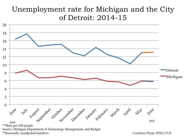
According to the most recent data provided by the Michigan Department of Technology, Management, and Budget, the unemployment rate for the state of Michigan decreased from 5.9 percent in May to 5.8 percent in June. During this same period, unemployment in the city of Detroit also marginally increased from 13 in May percent to 13.1 percent in June. However, it is 3.3 percentage points lower than where it was in June of 2014.
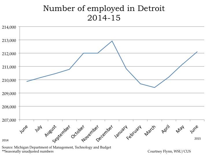
From May to June, the number of people employed in the city of Detroit increased by about 900, leading to a total of 212,107 people employed in June. Since March, the number of people employed in the city has increased by 2,690. In the last year, the month of March had the lowest number of people employed in the city of Detroit.
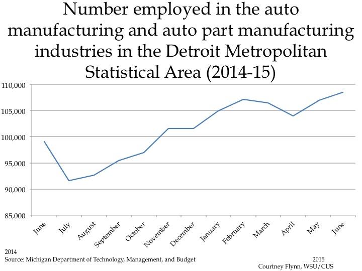
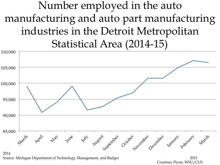
The above chart shows the number of people employed in the auto manufacturing industry in the Detroit Metropolitan Statistical Area (MSA) (Detroit-Warren-Livonia) from June 2014 to June 2015. From May to June the number of people employed in this industry increased by 1,600, to a total of 108,500. The June number is the highest employment number this industry has had in the last year.
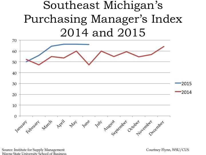
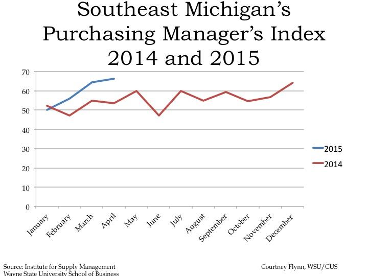
The Purchasing Manger’s Index (PMI) is a composite index derived from five indicators of economic activity: new orders, production, employment, supplier deliveries, and inventories. A PMI above 50 indicates the economy is expanding.

According to the most recent data released on Southeast Michigan’s Purchasing Manager’s Index, the PMI for June 2015 was 66.1, an increase of 0.3 of a point from the prior month. It was also an increase of 19.0 from June of 2014.
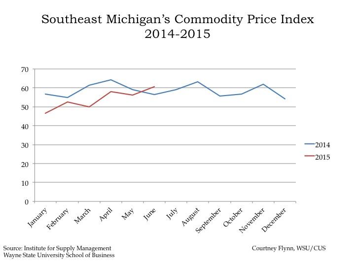
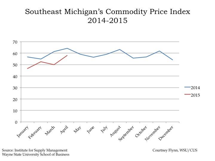
The Commodity Price Index, which is a weighted average of selected commodity prices, was recorded at 60.7 points in June 2015, which was 4.4 points higher than the previous month and 4.2 points lower than June 2014.
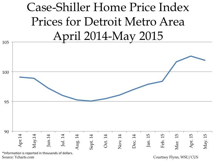
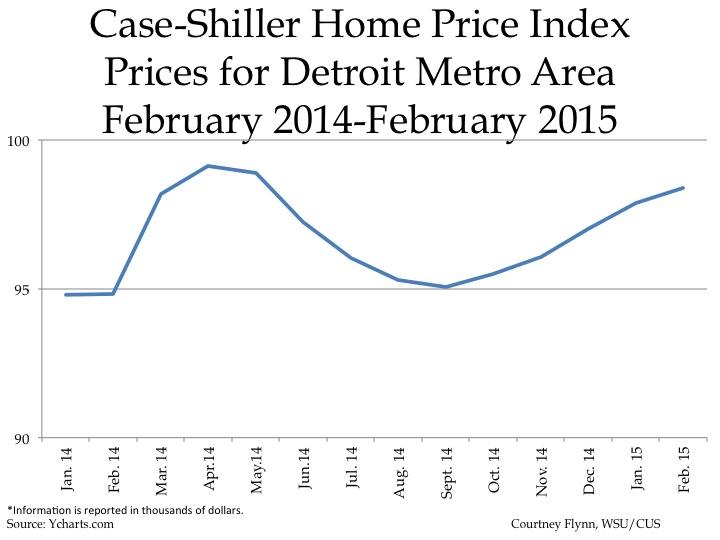
The above charts show the Standard and Poor’s Case-Shiller Home Price Index for the Detroit Metropolitan Statistical Area. The index includes the price for homes that have sold but does not include the price of new home construction, condos, or homes that have been remodeled.

According to the index, the average price of single-family dwellings sold in Metro Detroit was $101,930 in May 2015. This was an increase of $3,040 since May of 2014 but a decrease of $1,082 from April of 2015.
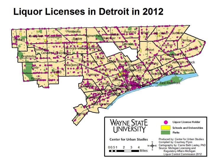
Seven percent of Detroit’s Liquor License holders located less than a half mile from an elementary school

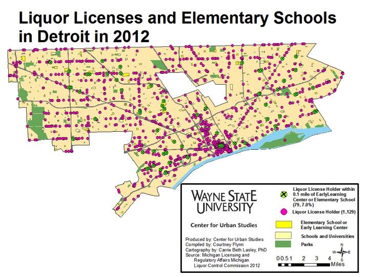
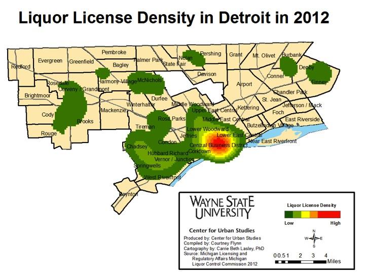
In 2012, there were about 1,130 establishments in the city of Detroit with liquor licenses, of which nearly 7 percent were located within 0.1 mile of an early learning center or elementary school. In viewing the maps below, we see that the highest concentration of liquor license holders was within the Central Business District, with a medium density of the license holders spanning out into the lower Woodward Avenue, Corktown, and Lower East Central areas.

In Michigan there are several types of liquor licenses which can be obtained. These include licenses needed to sell just beer, those need to sell beer and liquor at a golf course, a hotel, a bar and at a private event. Additionally, brewpubs, distilleries, wholesalers (both those in state and those out of state bringing goods in), winemakers, and stores selling beer and/or liquor need a license. All liquor licenses in the state of Michigan are issued by the Michigan Liquor Control Commission.

According to a study by the Pacific Institute, a high concentration of liquor stores holders can may be related to several public safety and health problems, ranging from high rates of alcohol related hospitalizations, to pedestrian injuries, to high levels of crime and violence. According to data from the Federal Bureau of Investigation we know that Detroit’s crime rate was 2,122.9 per 100,000 residents in 2012, while the state of Michigan’s was 454.4 per 100,000 residents.

The above density map shows where the liquor licenses in Detroit are located and how some areas have a higher concentration of such licenses. As already stated, the highest concentration was in the Central Business District, where there is a combination of bars, restaurants, and liquor stores.

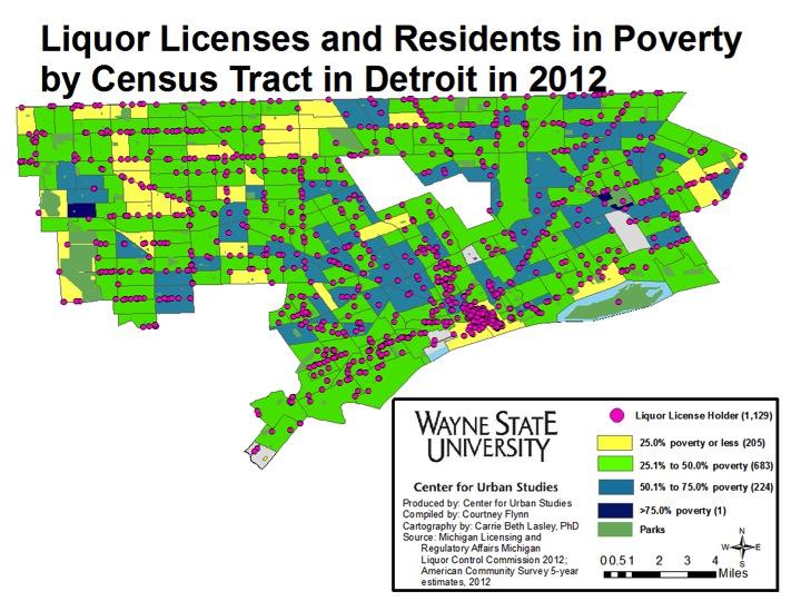
In the map below, we see where liquor license holders were located, along with what the poverty rates. The majority of the liquor license holders ( 683 or 60 percent) were located in census tracts where the poverty rates ranged between 25.1 and 50 percent. Although the Central Business District had the highest concentration of liquor license holders, the poverty rate in these census tracts was 25 percent or lower. Throughout the entire city there were 205 liquor license holders in census tracts where the poverty level was 25 percent or less.

Of the 1,129 liquor license holders in the city of Detroit, 79, or 7 percent, were located within 0.1 mile of an elementary school or early learning center.

According to the Pacific Institute study, a high concentration of liquor stores (in this post we look at liquor license holders) can lead to several public safety concerns, particularly crime.

In addition to crime being mentioned in the Pacific Institute study, it also discussed how the location of schools near liquor stores can affect the overall health and well-being of the community and the children within those communities. Although there are likely many suggestions on how to better a communities wellbeing, some solutions for Detroit officials may include: enforcing zoning ordinances to restrict nuisance activity by liquor stores or establishments that hold a license, using economic development strategies to transition current liquor stores into places for residents to access healthy foods, and working with the state to re-determine how many liquor licenses the city of Detroit should actually hold and/or what policies should be in place preventing the location of liquor license holders within a certain proximity to schools.

WSJ: 28 percent of Wayne County homes are worth less than their mortgage balance

The Wall Street Journal recently posted an interactive map that shows the percentage of homes in counties across the nation that were worth less than what was owed on them during the first quarter of 2015. Here, we see that in Wayne County 28 percent of homes were worth less than the mortgage balance on them. In Oakland County that number was 13 percent and in Macomb County 17 percent of homes were worth less than what is owed on them.
Michigan ranked 31 nationwide for amount of taxes per capita

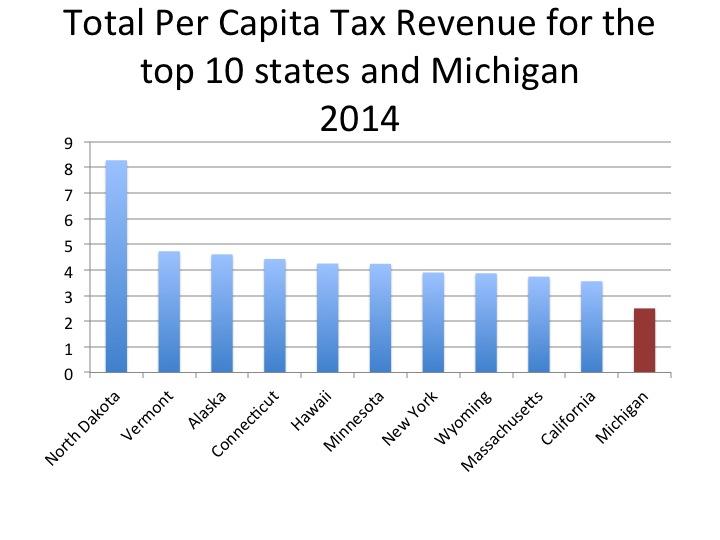
The chart above compares the taxes per capita in Michigan, which is $2.50, to the 10 states with the highest taxes per capita. Michigan ranked 31 out of 50 and North Dakota came in at number 1 with its taxes per capita at $8.28.

Other states in the Great Lakes region with higher taxes per capita than Michigan were: Minnesota ($4.24), New York ($3.90), Illinois ($3.04), Wisconsin ($2.85) and Indiana ($2.55).

Nationwide, New Hampshire had the lowest taxes per capita in 2014 at $1.72.

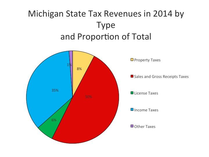
As seen in the graph below, the State of Michigan’s tax revenues come from four primary categories: Sales and Gross Receipt Taxes, Income Taxes, Property Taxes, and License Taxes. All other taxes, which include death and Gift Taxes, Documentary and Stock Transfer Taxes, and Severance Taxes, fall into the “Other” category. This category accounted for only 1 percent of the state’s tax revenue in 2014 while sales and gross receipt taxes accounted for 50 percent, or about $12 billion, of the state’s tax revenue.

The information for this post was taken from the 2014 Annual Survey of State Government Tax Collections.

As noted, half of Michigan’s tax revenue generated in 2014 was from sales and gross receipt taxes, a category that is made up of more than just general sales and gross receipt taxes. General sales and gross receipt taxes accounted for 68 percent of the overall sales and gross receipts of $12 billion brought in 2014 while about 8 percent of those monies were earned through the motor fuel tax.

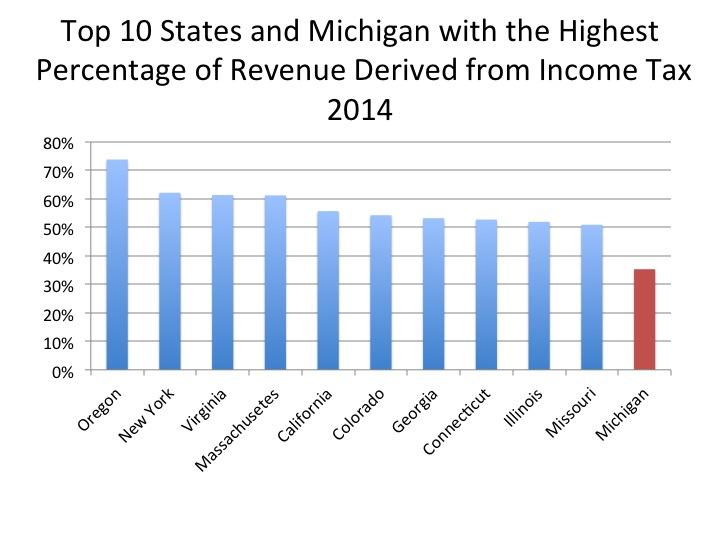
Michigan also relies on income tax monies to fund state operations; 35 percent of Michigan’s tax revenue generated in 2014 (about $8.7 billion) came from income taxes. Of that, 89 percent came from personal income taxes and the remainder was generated from corporation net income taxes.

Overall, according to the National Conference of State Legislatures, states earn about a third of their tax base through income taxes. Though this varies substantially as discussed below.

The majority of Oregon’s tax base (74%) was earned through its income tax in 2014, while Michigan only derived 35 percent of its tax base from income tax. Oregon’s income tax is divided into four brackets depending on a person/family’s earning. In addition, Oregonians are able to subtract what they pay in federal taxes from their state taxable income results, according to an article from The Oregonian.

Michigan has a flat income tax. In Michigan the income tax rate is 4.25 percent, however Republicans in the State Legislature have been working to reduce it to 3.9 percent, according to the Michigan League for Public Policy (MLPP). Such action, according to the MLPP, would reduce revenue flow to areas such as education and infrastructure. Michigan also has an Earned Income Tax Credit that allows lower income workers to retain more of their income. The State Legislature intends to eliminate this credit and instead push those funds into Michigan’s roads.

In addition to the Earned Income Tax Credit that exists in Michigan, and 23 other states (including Oregon), there is also a federal one, according to the National Center for Children in Poverty.

The importance of income taxes has grown since reliance on property tax values has declined in recent years, according to the National Conference of State Legislatures.

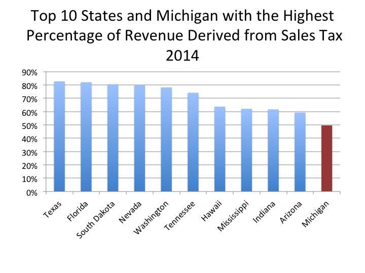
With Michigan’s sales and gross receipt taxes making up 50 percent of the state’s tax generated revenue in 2014, it ranked 19th for percent of sales tax making up a state’s tax base. Texas ranked first with 83 percent of its tax base being made up of sales taxes. Texas is one of the 17 states in the U.S. that does not levy property taxes at the state level, though it does have property taxes at the municipal and county level. Other states that do not levy property taxes (at the state level) and are among the 10 states with the highest percentage of revenue derived from sales taxes include: Florida (2), South Dakota (3), Tennessee (6) and Hawaii (7). Indiana was the only Midwestern state of the 10 states with the largest portion of their tax base being made up of sales taxes. In 2014, 62 percent of Indiana’s tax revenue was earned through sales taxes.

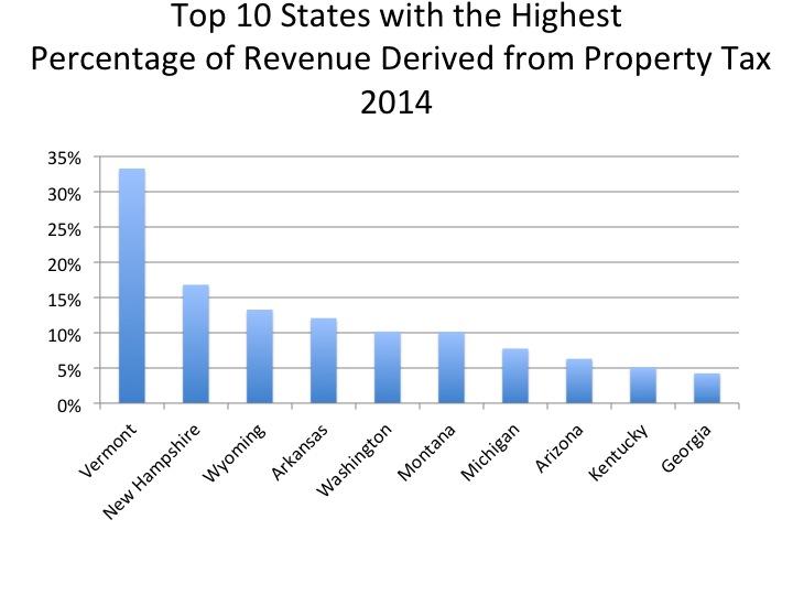
Out of the 33 states in the U.S. that levy property taxes, Michigan ranked seventh for the percent of tax revenues derived from property taxes. In total, about 8 percent of the state of Michigan’s tax revenues, or $1.8 billion, came from property taxes. Vermont ranked at the top, with 33 percent of its state tax revenues comprised of property taxes.

Ann Arbor’s renter occupancy rate is highest in the region

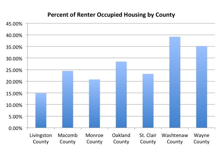
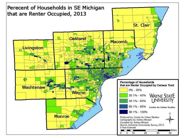
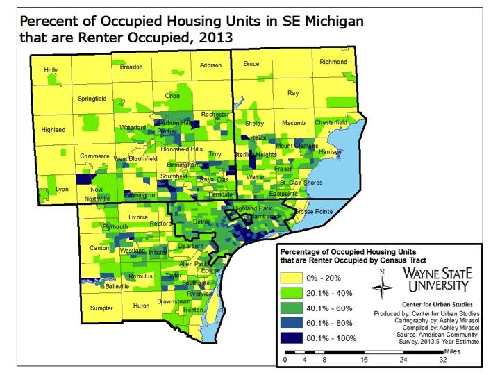
Renter-occupancy in the Southeast Michigan makes up only about a quarter of the region’s housing tenure rates, according to the 2013 American Survey. The majority of municipalities in the region had fewer than 20 percent of residents residing in a rental property. However, there were several cities near Detroit with renter occupancy rates above 35 percent. Washtenaw County had the highest overall renter occupancy rate at 39.2 percent probably because of the number of students attending universities there; Wayne County came in second to that at 35.2 percent.

As defined by the American Community Survey, residency is defined as where an individual was staying at the time of the survey, so long as they were, or intended to be there, for two months or longer.

According to the Joint Center for Housing Studies of Harvard University (JCHS) renting has been an increasing nationally. For example, in 2013 about 43 million households (or more than 35 percent of the all U.S. households) rented rather than owned a home. JCHS attributed the changing homeownership rates largely to the Great Recession. JCHS suggested that following 2008, homeownership was perceived as more risky as people witnessed the large wave of foreclosures that occurred, the drop in home values, and the costs of relocating in order to find better and more stable employment. The freedom renting provides, particularly for millennials, was noted as another reason why the rental market is growing. For these reasons, as well as the expected increase of immigrants coming to the U.S., over the next 10 years, JCHS predicted that the number of renter households will increase by up to 4.7 million by 2023.


Although renting is growing nationally, the JCHS states that rates are higher in central cities where land prices are high and r pool is made up of those whose incomes are below $30,000. In terms of age, the JCHS said low income housing is centralized. The Joint Center said more millennials tend to rent compared to older generations, such as the baby boomers.

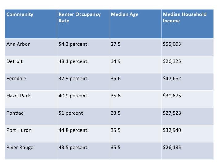
In the seven counties of Southeastern Michigan, 26.6 percent of households were renter occupied in 2013. Among municipalities, Detroit was a hub for rental occupancy in the region: 48.1% of households being renter occupied. There were also pockets of high rental residency outside the city. Many of those locations border the city of Detroit. For example, Ferndale had a renter occupancy rate of 37.9 percent, Hazel Park’s rate was 40.9 percent, and the city of River Rouge’s was 43.5 percent.

Pontiac, the county seat of Oakland County, had a renter occupancy rate of 51.0 percent, a rate higher than Detroit’s. As noted earlier, millennials and those with incomes below $30,000 a year are more likely to rent. The median age in Pontiac in 2013 was 33.5 years and the median household income was $27,528.

The city of Ann Arbor’s renter occupancy rate was 54.3 percent, also above Detroit’s rate. While Ann Arbor’s median income in 2013 was $55,003, it is home to the University of Michigan, which has a student population of about 43,000. A median age of 27.5 and the large student population better explains the high rental occupancy rate there.

Other pockets of high rental occupancy rates were along the I-275 corridor, near Port Huron in St. Clair County and along Lake Erie and the western border of Monroe County.

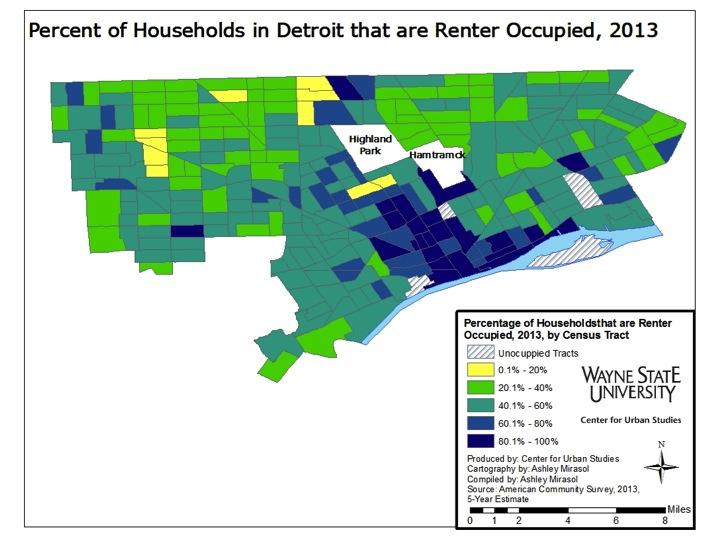
The city of Detroit had one of the highest rates of renter occupied households in the seven county region at 48.1 percent. There were only eight census tracts in the city where 20 percent or fewer of the homes were not renter occupied. The areas in the city with the highest renter occupied rate were the downtown area, Midtown (where Wayne State University is located), and the Jefferson East area. Additionally, the median income in Detroit was $26,325 in 2013 and the median age was 34.9.

As one of the many efforts to revitalize Detroit, companies and organizations such as Wayne State University, the Detroit Medical Center, Henry Ford Health Systems and Quicken Loans have offered employees monetary incentives to live in the city of Detroit. These incentives are offered through the Live Midtown and the Detroit Live Downtown programs and could also be seen as a reason why the rental rate is what it is in Detroit. In addition to city’s median income and age showing a link to the JCHS’ explanation for high rental rates, we also know that certain areas in Detroit (such as Midtown and Downtown) are becoming more attractive to people because of the night life, creative outlets, parks and proximity to sporting and entertainment events.

Detroit’s unemployment rate on the decline

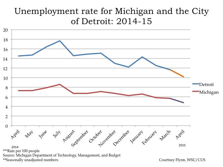
  • From March 2015 to April 2015, the unemployment rate across the state and in the City of Detroit’s decreased (monthly);
  • The Purchasing Manager’s Index for Southeast Michigan increased from April 2015 to May 2015 (monthly);
  • Commodity Price Index decreased from April 2015 to May 2015 for Southeast Michigan (monthly);
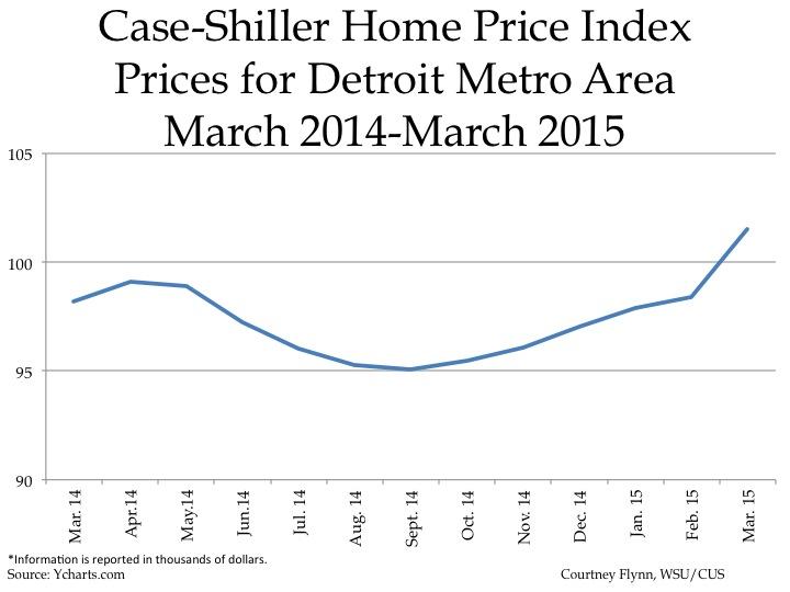
  • Standard and Poor’s Case-Shiller Home Price Index for the Detroit Metropolitan Statistical Area continue to increase.

According to the most recent data provided by the Michigan Department of Technology, Management, and Budget, the unemployment rate for the state of Michigan decreased from 5.7 percent in March to 4.8 percent in April. During this same period, unemployment in the city of Detroit also decreased from 11.7 percent in March to 10.2 percent in April.

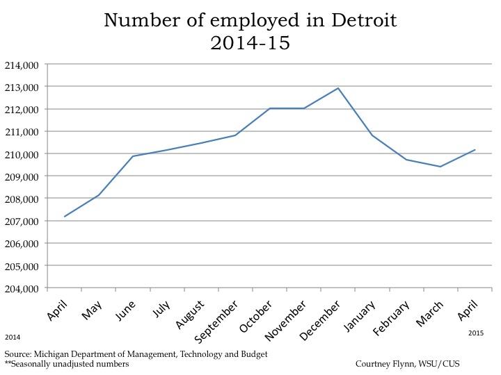
From March to April, the number of people employed in the city of Detroit increased by 744, leading to a total of 210,161 people employed in April.

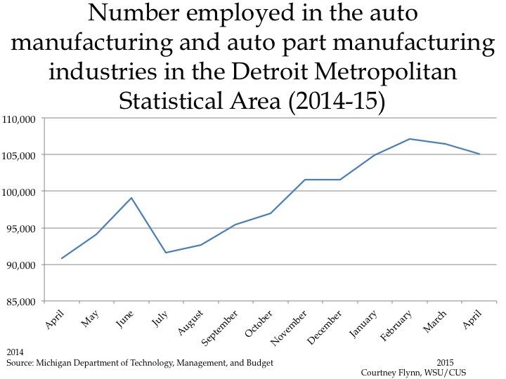
The above chart shows the number of people employed in the auto manufacturing industry in the Detroit Metropolitan Statistical Area (MSA) (Detroit-Warren-Livonia) from April 2014 to April 2015. From March to April the number of people employed in this industry declined by 1,400, to a total of 105,100. Employment in this industry in the Detroit Metropolitan Statistical Area has been decreasing since February.
The Purchasing Manger’s Index (PMI) is a composite index derived from five indicators of economic activity: new orders, production, employment, supplier deliveries, and inventories. A PMI above 50 indicates the economy is expanding.

According to the most recent data released on Southeast Michigan’s Purchasing Manager’s Index, the PMI for May 2015 was 66.4, an increase of 0.1 points from the prior month. It was also an increase of 6.4 from May of 2014.

The above charts show the Standard and Poor’s Case-Shiller Home Price Index for the Detroit Metropolitan Statistical Area. The index includes the price for homes that have sold but does not include the price of new home construction, condos, or homes that have been remodeled.

According to the index, the average price of single-family dwellings sold in Metro Detroit was $101,530 in March 2015. This was an increase of approximately $3,130 from the average price in February 2015. Since March of 2014, prices have increased by $3,330.


More than 50 percent of Wayne County children on Medicaid

Medicaid and MI Child are two different programs that provide children in the state of Michigan with the opportunity to have health care coverage. Medicaid is a federal health care coverage program that provides services to about 43 million children nationally; it is jointly funded by the federal government and each state. In Michigan, a child is automatically referred to the Healthy Kids Medicaid Program (Michigan’s child Medicaid program) if their family’s annual income is at or below 150 percent of the Federal Poverty Level, according to the Michigan Department of Community Health.

MI Child is Michigan’s version of the Child Health Insurance Program (CHIP), a federal initiative created by Congress in 1997 that is offered to uninsured children, ages 19 and below, of working parents. This program is also jointly funded by the federal government and states but its match rate, according to Medicaid.gov is typically about 15 percent higher than Medicaid; according to the Michigan League for Public Policy funding for this program is currently at risk. According to the Michigan League for Public Policy, this program was created to provide children with quality healthcare when their family earns too much to qualify for Medicaid but cannot afford private coverage. To qualify for MI Child, the child must have no comprehensive health insurance and the parents must have a gross adjusted income between 160-212 percent of the Federal Poverty Level, according to the MI Child Manual. For a family of four to be eligible for MI Child, the annual income limit is $47,700, according to the Michigan Department of Community Health.

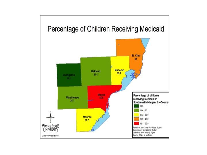
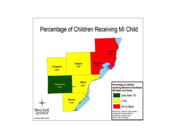
In the maps below we see that there is a higher percentage of children covered by Medicaid in Southeastern Michigan than on MI Child. Also, while Wayne County had the highest percentage of children on Medicaid, Macomb County had the highest percentage of children with MI Child as their health insurance coverage plan. Overall though, each county had a higher percentage of children with Medicaid coverage than with MI Child coverage. This means that among those who applied for government health care coverage for their child, there was a higher percentage of families with income levels at or below 160 percent of the Federal Poverty Level than families with a gross income level between 160-212 percent of the Federal Poverty Level.

In the seven county region of Southeast Michigan, Wayne County had the highest percentage of children with Medicaid coverage in 2013, according to the Michigan League for Public Policy. In total, 55.5 percent of children aged 19 and under in Wayne County received Medicaid coverage in 2013. This amounted to about 258,000 children. The county with the second highest percentage of children receiving Medicaid coverage in the region in 2013 was St. Clair (42 percent or approximately 16,250 children).

Livingston County had the lowest percentage of children receiving Medicaid coverage with 18.5 percent in 2013. That same year, 40.8 percent of Michigan children received Medicaid coverage.

As noted, MI Child is Michigan’s version of the CHIP initiated by Congress in 1997 to provide healthcare to children who don’t qualify for Medicaid but whose families cannot afford private insurance. In the region, the percentage of children with MI Child coverage is smaller than those with Medicaid. For example, Macomb County had the highest percentage of children with MI Child coverage in the region in 2013 at 2.4 percent. During the same time period, 35.8 percent of Macomb County children received Medicaid coverage. Of the counties examined, Washtenaw County had the lowest percentage of children aged 19 and under receiving MI Child coverage in 2013 at .9 percent.

Michigan and Detroit’s unemployment decreases while home values continue to increase

  • From February 2015 to March 2015, the unemployment rate across the state and in the City of Detroit’s decreased (monthly);
  • The Purchasing Manager’s Index for Southeast Michigan increased from March 2015 to April 2015 (monthly);
  • Commodity Price Index increased from March 2015 to April 2015 for Southeast Michigan (monthly);
  • Standard and Poor’s Case-Shiller Home Price Index for the Detroit Metropolitan Statistical Area shows home prices have been increasing since September.

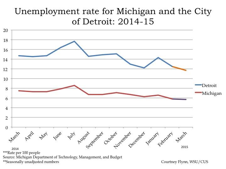
According to the most recent data provided by the Michigan Department of Technology, Management, and Budget, the unemployment rate for the state of Michigan decreased from 5.8 percent in February to 5.7 percent in March. During this same period, unemployment in the city of Detroit also decreased from 12.5 in February percent to 11.7 percent in March.

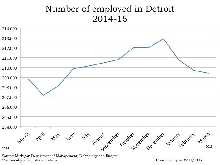
From February to March, the number of people employed in the city of Detroit decreased by 300, leading to a total of 209,417 people employed in March.

The above chart shows the number of people employed in the auto manufacturing industry in the Detroit Metropolitan Statistical Area (MSA) (Detroit-Warren-Livonia) from January 2014 to January 2015. From February to March the number of people employed in this industry declined by 600, to a total of 106,500. This is the first time employment in this industry in the Detroit Metropolitan Statistical Area has dropped since July of 2014. Despite the decline, March had the second highest number of people employed in the auto manufacturing industry in the last year; February had the highest number.

The Purchasing Manger’s Index (PMI) is a composite index derived from five indicators of economic activity: new orders, production, employment, supplier deliveries, and inventories. A PMI above 50 indicates the economy is expanding.

According to the most recent data released on Southeast Michigan’s Purchasing Manager’s Index, the PMI for April 2015 was 66.3, an increase of 1.8 points from the prior month. It was also an increase of 10 from April of 2014.

The Commodity Price Index, which is a weighted average of selected commodity prices, was recorded at 57.9 points in April 2015, which was 7.9 points higher than the previous month and 6.4 points lower than April 2014.

The above charts show the Standard and Poor’s Case-Shiller Home Price Index for the Detroit Metropolitan Statistical Area. The index includes the price for homes that have sold but does not include the price of new home construction, condos, or homes that have been remodeled.

According to the index, the average price of single-family dwellings sold in Metro Detroit was $98,400 in February 2015. This was an increase of approximately $5,000 from the average price in January 2014. Since February of 2014, prices have increased by $3,590.

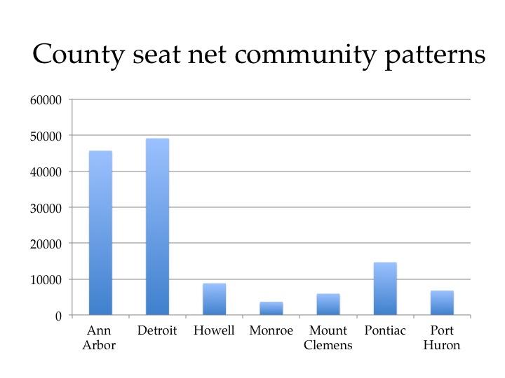
Detroit receives about 49,000 more commuters than it loses

This post examines work-related, commuting patterns for Southeastern Michigan. In 2010, the majority of the commuting within the region was either to or from the city of Detroit or the area directly around it. Interestingly, 228,000 commuters left the city of Detroit each work day to work in another jurisdiction, but at the same time, 277,000 commuters from the suburbs also traveled to the city to work, according to data provided by the Southeastern Michigan Council of Governments and the American Community Survey. A deeper dive into the data shows that the city of Southfield received the highest number of commuters (12,600) from Detroit, but it also sent the highest number of commuters to Detroit (8,800).

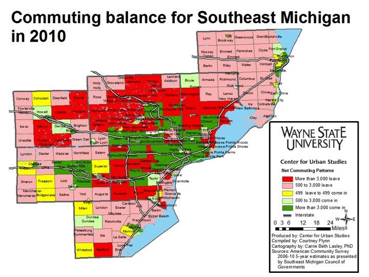
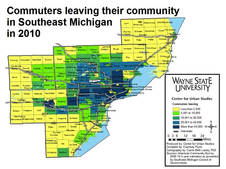
The above map shows the net commuting patterns for the region in 2010 and we see that the county seats in each county (Howell, Mount Clemens, Pontiac, Port Huron, Ann Arbor, Detroit and Monroe) all have net positive commuting patterns of more than 3,000. This means that more individuals are coming into that that city than leaving.

A few of the inner ring suburbs of Detroit, like Dearborn, Warren, and Southfield also have net positive commuting patterns of more than 3,000 commuters, along with other communities like Troy, Romulus (which is where the Detroit Metropolitan Airport is located), Livonia, and Novi.

On the other side of the spectrum, we see that there are about two dozen communities where 3,000 or more commuters leave their place of residence to commute elsewhere (a net negative). Particularly in Wayne, Oakland, and Macomb counties, we see that the communities with a higher loss of commuters surrounds the communities that receive upwards of 3,000 daily commuters.

In addition to the dark red signifying the loss of 3,000 or more commuters a day, the lighter red shows that the more rural outskirts of the region (which are also less populated) tend to lose between 500 and 3,000 commuters a day. This shows that, overall, a majority of the communities within the Southeast Michigan region are losing commuters, rather than gaining them.

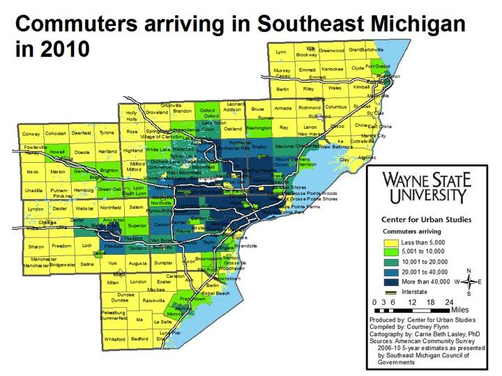
As already noted, in 2010, a large number of motorists from the region commuted to Detroit each day for work. From the first map, we know that the city gained more commuters than it lost. The second map shows it received substantially more than 40,000 commuters each work day (277,145 total). Other Detroit suburbs that received 40,000 or more commuters are Southfield (82,643), Sterling Heights (55,097), Warren (82,442), Troy (87,193), Livonia (72,663), and Dearborn (83,005). But, as noted in the map below, Sterling Heights also loses more than 40,000 commuters (58,998), which is why their net commuting pattern shows a loss in the first map (net loss of about 4,000).

Additionally, in looking at all three of the above maps, we see that the communities that tend to gain and/or lose the most are located around the interstates. For example, in following I-96 out of Novi through Livingston County we see that communities like Genoa, Green Oak, and Lyon Township both gained and lost between 500 and 3,000 commuters.

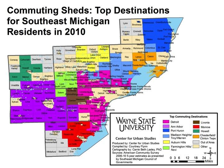
The above map shows the top commuting destination for each community. For example, all of the Downriver area and most of the inner-ring suburbs have a majority of their residents commuting to Detroit for work. However, in Washtenaw County, a the majority of the residents commute to Ann Arbor, and in St. Clair County, most of the commuters who live within the county travel to Port Huron. These patterns again reflect that county seats tend to be a common destination for those commuting to work.


US Postal Service: Address vacancies increase in Detroit

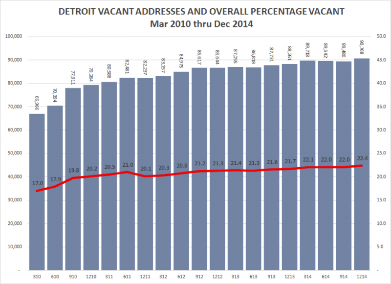
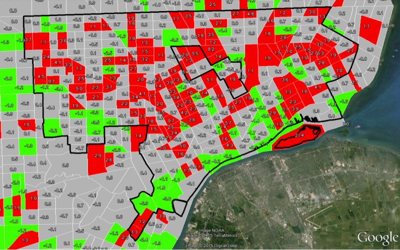
As an ongoing project, David Martin, Ph.D. of Wayne State University’s Center for Urban Studies, has tracking the number of address vacancies in the city of Detroit. As you will see in this particular post, there has been a gradual increase in vacancies, a trend that has not been all that uncommon over the years.


The most recent (December 2014) quarterly statistics from the U.S. Postal Service show an increase in the total number of vacant addresses in the city of Detroit. The total number of vacant addresses (both residential and commercial) increased by 1,288 from 89,480 to 90,768 for the period Sep 2014 to Dec 2014. The total number of residential addresses declined by 372 from 361,887 to 361,515 likely reflecting ongoing demolition activity during the quarter. The total vacancy rate increased from 22.0% to 22.4%.

Source: United State Postal Service via HUD, March 2014.

Tracking Neighborhood Vacancy Change in Detroit:

Percentage Point Change in Address Vacancy over the Past Year (12/2013-12/2014)

Best Performing Neighborhoods in Detroit 12/2013-12/2014 (Green)

Wayne State, West Canfield, Art/Cultural Center, Atkinson/Euclid. Lafayette Park, East Riverfront,, Cody, Rouge Park, Palmer Park, Indian Village, Castle Rouge, Springwells, Woodmere, Islandview, Von Steuben.

Worst Performing Neighborhoods in Detroit 12/2013-12/2014 (Red)

Tireman, NW Goldberg, Newberry, Lasalle Gardens, Brightmoor, Grandmont, Schoolcraft, State-Fair/Nolan, The Eye, Stewart, East Warren, Southeastern, Regent Park, Denby, Pulaski, Outer Dr/Van Dyke, Medical Center, Masonic, Temple/Cass