Michigan’s gubernatorial voter turnout lowest since 1990

Slide02

Michigan’s voter turnout on Nov. 4, 2014 was the lowest in 24 years–41.6 percent. In 1990, voter turnout was 38.6 percent. Four years ago, during the previous gubernatorial race, turnout was 42.9 percent. Considering the data above, it is clear that more voters turn out during presidential elections than during gubernatorial elections—which, in Michigan, occurs during mid-term election years. Within the last 24 years, the highest voter turnout (50.7%) for a mid-term year was recorded during the 2006 general election, in which Gov. Jennifer Granholm, a Democrat, won a second-term.

Voter turnout in primary elections is even lower than in gubernatorial elections. For example, during this year’s primary election, statewide voter turnout was 17.5 percent. The last time it fell below that was in 2006, when only 16.9 percent of voters turned out in the primary.

As shown in the map (below), though 2014 general election voter turnout for the entire state of Michigan was 41.6 percent, five of the seven counties in Southeast Michigan had a higher voter turnout. Of those seven counties, Livingston County had the highest voter turnout at 50.2 percent, and also one of the highest percentages of turnout in the state.

According to the Michigan Secretary of State, turnout in only five counties exceeded 50 percent. These top five counties are:

Keweenaw – 59.56% Leelanau – 56.52%   Clinton – 52.72%   Eaton – 50.81%   Livingston – 50.26%

Wayne County had the lowest percentage of voters turnout in the Southeast Michigan region for the 2014 general election (39.2%), but it did not make the list of one of the five counties with the lowest voter turnout in 2014 (it did in 2012 though). According to the Michigan Secretary of State, the five Michigan counties with the lowest voter turnout this November were:

Cass – 34.11%   Menominee – 34.16%   St. Joseph – 34.37%   Berrien – 34.95%   Branch – 35.94%

As seen in the map below, there were 13 total counties where voter turnout was below 40 percent on Nov. 14, 2014. This map also shows that majority of the state fell in the 40.1 to 45 percent range for voter turnout. In the northern part of the state (particularly the Upper Peninsula and the tip of the Lower Peninsula), the average was in the 45.1 to 50 percent range. Of course there were a few exceptions.

Slide04Slide05

Voter turnout in Wayne County and all the other counties in the Southeast Michigan region was lower than it was in 2010.

For Wayne County, the difference was rather minor, despite the fact the overall voter turnout was low. In 2010, 39 percent of registered voters cast a ballot, compared to the 38.23 percent who voted in 2014, according to records from Michigan Secretary of State.

Monroe County experienced the largest percentage difference. In 2010, 44 percent of registered Monroe County voters cast a ballot and in 2010, 39.4 percent did so—a 4.6 percent difference.

Washtenaw County had the second largest difference: voter turnout was 47 percent in 2010 and 43 percent in 2014, according to the Michigan Secretary of State.

Slide07

The above chart shows Michigan party identification from 1995-2013. When just comparing Democratic and Republican party identifications, Democrats have maintained an edge over Republicans for nearly two decades. For the decade between 1997 and 2007, Democrats outnumbered Independents as well as Republicans.

In 2013—the most recent non-election year for which data are available—the percentage of registered Michigan voters who identified with the Democratic Party remained higher than those who identified themselves as Republicans. That year, 33 percent of registered voters identified as Democrats; 44 percent identified as Independents, and 23 percent identified as Republicans.

The above chart is based on data from the Institute for Public Policy and Social Research. State of the State Survey. Michigan State University. East Lansing, Mich. Available on Web: http://www.ippsr.msu.edu/SOSS. The variables used were PartyID and sossyr and the data file used is the Longitudinal SOSS Data File. No response, other, and missing values are not included, hence totals do not equal 100%.

Turnout data demonstrate that young voters are among those least likely to vote in mid-term elections. We illustrate this effect in Michigan using Ann Arbor precinct data. (presented below) We have identified the Ann Arbor precincts with an especially high proportion of young, educated voters near the University of Michigan. (These show both the 2012 and 2014 turnout.) Ann Arbor’s precinct-level data reveals that these precincts where large populations of students live had exceptionally low turnout on November 4, 2014. Some of these precincts had 30 percent or more voter turnout in the 2012 presidential election, then had single-digit percent turnout in the 2014 general election. Each of these precincts with high concentrations of students had turnout of less than 15 percent.

There are confounding variables in using these data. Students who registered to vote in the 2012 election may have graduated and moved. But, it should be possible to register new student voters to replace those who have moved away if mobilization efforts are targeted effectively.

Slide10Slide11

In addition to examining the voter turnout near the U of M campus, we explore information from a Web site, CIRCLE, run by Tufts University that reports on research about young voters. According to Tufts, the takeaways related to young voters in this year’s election were:

Slide13

Highland Park has lowest percent of owner occupied housing

According to the Census Bureau, a housing unit is owner-occupied if the owner or co-owner lives in the unit, even if it is mortgaged or not fully paid for. In the seven county Southeastern Michigan region in 2012, the mean owner-occupied percentage was 74.1 percent. At that time, the counties in the region with a percentage of owner occupied homes above the region’s total average were: Livingston, Macomb, Monroe and St. Clair counties. Livingston County had the highest percentage at 85.9 percent; this was also the only county where the percentage of owner-occupied homes was above 80 percent.

PctOwnOcc7CO (1)

In the seven county region, Washtenaw County, which is home to the University of Michigan, had the lowest percentage of owner-occupied homes. Uof M is the largest university in the region, enrolling about 47,000 students on an annual basis. With such a large student population, it can be argued that this contributes to the city of Ann Arbor’s low owner-occupied percentage, which was 45.5 percent in 2012. Also located in Washtenaw County is the charter township of Ypsilanti, which houses Eastern Michigan University and has a lower income population residing within the township. Both these attributes likely play a role in the owner occupied housing percentage of 58.9 percent in Ypsilanti.

Wayne County had the second lowest percentage at 65.6 percent.

PctOwnOccTriCo (1)

The above map shows the percentage of owner-occupied housing in the tri-county region in 2012. The lower income communities, such as Detroit and the cities of Mount Clemens and Pontiac, were below the regional mean for owner occupied percentage. In contrast, the wealthier communities (like Grosse Ile, Livonia and the Grosse Pointes) and the more rural communities (like the northern half of Macomb County and the southwest portion of Wayne County) have a much higher percentage of owner occupied housing.

To see the median income of communities throughout the Southeast Michigan click here.

PctOwnOccWAYNE

PctOwnOccDET

Note that in the downtown area of Detroit, primarily along Woodward Avenue, there is a very low owner occupied housing percentage, below 25 percent. This is because there are dozens of rental housing units along, and in the vicinity of Woodward Avenue, in which owners of the units are more likely to lease out the properties. In the far north of the city, near Palmer Park, an area where the owner occupied housing percentage is below 25 percent appears to be mainly the actual park and cemetery.


Hamtramck had largest family size in region in 2012

According to the American Community Survey, a family is defined as a “group of two people or more (one of whom is the householder) related by birth, marriage, or adoption and residing together; all such people (including related subfamily members) are considered as members of one family.” For this post we are examining the average family size throughout Southeastern Michigan.

In the U.S., the average family size is 3.21 while in Michigan and the Southeast Michigan region that average is 3.13.

Wayne and Macomb counties were the only two in the region where the average family size in 2012 was above the average for the state and the region. The average family size in Wayne County in 2012 was 3.45, making it the largest in the region, and Macomb County’s was 3.14.

Wayne County’s large average family size can be attributed to the average family sizes of the cities of Detroit and Hamtramck. Hamtramck was the municipality with the largest average family size in the region at 4.26. The city of Detroit had an average family size of 3.71. These family sizes can be linked to the high birth rates in both communities. According to the Michigan Department of Community Healthy, Hamtramck’s birth rate in 2012 was 20 per 1,000 residents and Detroit’s was 14; the state’s was 11.4.

While the city of Hamtramck was the only municipality in the region to have an average family size above 4, there were several Census tracts at or above this threshold. For example, the east side of the city of Dearborn, along with several pockets in the city of Detroit. For example, the Campau Area District in Detroit had an average family size of 5.91.

On the opposite end of the spectrum, St. Clair County had the lowest average family size in the region at 3.04. While the city of Port Huron has a growing population (as we noted in this previous post), St. Clair County is much more rural that the inner tri-county area. Monroe County is also rural and had the second lowest family size in the region at 3.06.

In the tri-county region Lake Angelus, which is located in Oakland County, had the lowest average family size of 2.39. Lake Angelus is the state’s smallest incorporated city. Lake Angelus was one of nine municipalities in the Oakland County where the average family size was less than 2.5. Macomb County had five municipalities where the average family size was less than 2.5 and Wayne County had none.

Population pyramids highlight distinctions between Southeast Michigan communities

In this post we examine the age distributions of the 2012 population by displaying the data in population pyramids for the following cities: Ann Arbor (Washtenaw County), Brighton (Livingston County), Detroit (Wayne County), Livonia (Wayne County), Monroe (Monroe County), Port Huron (St. Clair County), Sterling Heights (Macomb County),and Troy (Oakland County). For each city the percent of the population in the age groups listed on the y-axis are displayed for both males and females. The age groups with the wider arm in the pyramid represent age groups that make up a larger percent of the city’s overall population. These cities were chosen because they are the largest cities in each of the seven counties of Southeast Michigan; Livonia was included in addition to Detroit to highlight what differences may exist between the county’s two largest cities. All population data was taken from the American Community Survey, 2012-5 year estimates. They are listed in alphabetical order. Note that the scale for the City of Ann Arbor pyramid is different in order to accommodate local patterns, so readers should attend closely to the scales.

In addition to a population pyramid showing age distribution of the population, it also sheds light on the birth rate, death rate and life expectancy of the population. There are general shapes to a population pyramid: a pyramid, a box or barrel, and an inverted pyramid. These type of pyramids represent the following:

  • Pyramid: a developing nation, or in this case city, with a slow growth rate, high birth rate, and often a short life expectancy.
  • Barrel: a nation or city that is already well established with a low infant mortality rate, slow population growth, and high life expectancy.
  • Inverted pyramid: a nation or city with negative growth, which is associated with a low birth rate, a shrinking population and low life expectancy.

In this post, one sees substantially diverse pyramids across the cities. One visual pattern, consistent with all other data, is the far higher share of women living to greater ages than men.

Slide03

Note: Ann Arbor’s scales are substantially different than the other charts to accommodate the large college age population.

In 2012, the majority of the population in Ann Arbor, which is home to the University of Michigan, was ages 15 -19 and 20 -24: for females 31.5 percent of the population was represented in these two age groups and for males and 38.5 percent of the population was represented. Of all the age groups, the 20-24 one was the most represented for males and females: for females, 19.3 percent of the population was aged 20-24 and for males 20.7 percent of the population was aged 20-24 in 2012. Aside from the population bulges for the college-age students, population growth was fairly stable, as can be seen by the similar age-group representations throughout the pyramid. However, population among children is much lower than some other cities in this post.

Slide05

In 2012 in Brighton, 51.6 percent of the male population was between the ages 25 and 59 in 2012 and 70.7 percent of the female population was in that age range. The age group of 40-44 had the highest percentage of females in 2012, with 10.6 percent of the female residents being in that age range. For males, the most common age group was between the ages of 30 and 34; 9.8 percent of the male population was in that age range. In Brighton, the 20-24 age group was the least numerous, with 2 percent of males in Brighton being in that age group and 2.2 percent of females. Brighton is the only city in this post where there were more older men than women. This can be seen by the fact that the percent of males aged 85 and above was 5.2 percent while only 4.5 percent of females were aged 85 and above.

Slide07

The city of Detroit compared to the other cities in this post, with the exceptions of Port Huron and Monroe (for females) had a relatively high birth rate, as can be seen by the fact 32.7 percent of the males in the city were aged 19 or below and 28.5 percent of the females in Detroit were below the age of 19 in 2012. According to the Michigan Department of Community Healthy, the city’s birth rate in 2012 was 14 per 1,000 residents; the state’s was 11.4. Detroit’s population bulge occurred in the 15-19 age group for both males and females. Also, in 2012, according the Michigan Department of Community Health the infant mortality rate in Detroit was 15 while the state of Michigan’s was 6.9.

As the population ages, the chart shows a more traditional male-to-female ratio in the older years, unlike in Brighton. Starting with the 60 to 64 age grouping, there began to be a larger difference between the percent of males represented versus the percent of females represented in the population. In total, 14.3 percent of the males in Detroit were aged 60 and above in 2012 compared to 18.8 percent of females who were aged 60 and above.

Slide09

For the city of Livonia, the population bulge in 2012 was between the ages of 45 and 59 for both males and females (25.2% of both males and females where in this age range), highlighting the baby boomers, who would have been between the ages of 47 and 66 in 2012. Overall, the population pyramid for Livonia’s population in 2012 shows that the population was middle aged. For males, the age group with the highest representation was the 50-54 percent age group with 8.9 percent. For females, the 50-54 age group had the highest representation at 9.2 percent.

Slide11

The population pyramid shows Monroe’s population was fairly stable, with a fewer percentage of both males and females in the 25-34 age range. Also, aside from those five-year ranges aged 70 and above, males between the age of 10 and 24 years of age were the smallest group at 3.9 percent, indicating an aging population.

Slide13

In 2012, Port Huron’s population pyramid showed that the population was slightly growing, because of the high dependent population, which is those age 9 and under, and overall pyramid shape to the population distribution, with a wide base and narrow top, closely resembling a pyramid. At that time, 26.9 percent of females in Port Huron were 19 or under and 30.3 percent of males were 19 or under. In Port Huron in 2012 the birth rate was 14 per 1,000 residents, compared to the state’s rate of 11.9.

Slide15

The population pyramid above, which represents Sterling Heights, is more stable, seeing as how a majority of the age groups represented in the chart made up similar percentages of the population in 2012. For males, the 45-49 age group was the most represented at 7.9 percent and for females the 50-54 age group had the highest representation at 7.8 percent. Sterling Heights, like Livonia, shows a bulge in the population just beyond child-bearing years, but still of working age.

Slide17

For the city of Troy, those between the ages of 35-69 and 5-19 for both males and females were part of the population bulges. For males, the age groups of 45-49 and 50-54 each had the highest representation of the population at 8.9 percent. For females, the 50-54 age group had the highest representation at 8.4 percent. In addition to the middle-age population bulge, this chart shows that in recent years birth rates started to decline, as can be seen from the transition from the under 5 years of age group up through the 15-19 years of age group. For example, in 2012 the birth rate per 1,000 in the city of Troy, according to the Michigan Department of Community Health, was 9.8 per thousand residents (this is less than the state’s and far less than Detroit’s 14). Those under 5 years of age for males made up 5.5 percent of the male population, and females under the age of 5 made up 5.3 percent of the female population.

Wayne County has highest rate of reported domestic violence incidents in Southeastern Michigan

According to the Michigan State Police, in every county in the region in 2013 the percentage of reported female victims was higher than the percentage of reported male victims. One reason for this is because men and boys are less likely to report domestic violence. Wayne County had the highest percentage of female victims in the region at 75.7%, along with the highest rate of domestic violence incidents.

In Southeastern Michigan, the most common relationship a domestic violence victim had with their abuser was being their was their boyfriend or girlfriend; in some cases the relationship also involved living together. Although this was the most common relationship, it does not discount the victims who experienced abuse from their spouse, child, sibling, parent, grandparent or grandchild. Domestic violence victims tend to have long-term relationships with their abusers.

The information described above and throughout this post is from the annual report the Michigan State Police (MSP) releases, detailing the number of domestic violence incidents by county. According to the MSP, domestic violence is “the occurrence of any of the following acts by a person that is not an act of self-defense: causing or attempting to cause physical or mental harm to a family or household member; placing a family or household member in fear of physical or mental harm; causing or attempting to cause a family or household member to engage in involuntary sexual activity by force, threat of force, or duress; and/or engaging in activity toward a family or household member that would cause a reasonable person to feel terrorized, frightened, intimidated, harassed, or molested.”

According to the Michigan State Police, “the term domestic violence is a pattern of learned behavior in which one person uses physical, sexual, and emotional abuse to control another person. Domestic violence can occur within relationships between spouses or former spouses, dating or formerly dating couples, individuals with a child in common, or residents or former residents of a common household.”

  • Male Victims of Violence. National Coalition Against Domestic Violence. Retrieved from: http://www.ncadv.org/files/MaleVictims.pdf

Slide03Slide04

In 2013, Wayne County had the highest rate of domestic violence incidents in the seven county region at 1,349.5 per 100,000 residents. The other two counties in the region where the rate of domestic violence incidents was above 1,000 per 100,000 residents were Monroe (1,117) and St. Clair (1,026.7). Livingston County had the lowest rate of domestic violence incidents in 2013 at 324.9 per 100,000 residents.

The rates were calculated using the number of reported domestic violence incidents, according to the Michigan State Police, multiplying that number by 100,000 and then dividing it by the 2013 county population estimates from the American Community Survey.

In addition to having the highest rate of domestic violence incidents, Wayne County also had the highest number of reported domestic violence incidents in the region in 2013: 26,521. Monroe County had the second highest number of reported incidents with 1,698. Livingston County had the lowest number of reported domestic violence incidents at 588.

Slide06Slide07

When examining the reported domestic violence incidents by the gender of reported victims, in 2013, Wayne County had the highest percentage of female victims at 75.7 percent, while Monroe County had the highest percentage of male victims at 32.2 percent. Subsequently, this means Wayne County had the lowest percentage of male victims at 24.2 percent and Monroe County had the highest at 32.2 percent. Livingston County had the second highest percentage of male victims at 31.8 percent. Monroe and Livingston counties were the only two in the region where the total percentage of reported female victims was under 90 percent.

Slide09

The MSP break down victim-to-offender relationships into 20 categories. Above are the top five most occurring categories of victim-to-offender relationships in 2013 in the region, according to the MSP. For the boyfriend/girlfriend category and ex-boyfriend/girlfriend category this includes couples who currently or did live together and homosexual couples.

Of all the types of victim-to-offender relationships that existed in reported domestic violence incidents in 2013, the most common in all seven counties was a boyfriend/girlfriend relationship. In Wayne County, the boyfriend/girlfriend category represented 8,498 of the total 27,297 reported relationships, or 31.1 percent, and the ex category accounted for 4,570 of the total reported relationships, or 16.7 percent. Washtenaw County had the second highest percentage of boyfriend/girlfriend victim-to-offender relationships with 805 of the 2,740, 29.4 percent, representing this category. Monroe County had the lowest percentage of boyfriend/girlfriend victim-to-victim relationships at 21.4 percent; this percentage is reflective of the 374 of the 1,745 reported boyfriend/girlfriend relationships.

When not comparing percentages, Livingston County had the overall lowest number of boyfriend/girlfriend victim-to-offender relationships at 138. There were 603 total reported relationship making the boyfriend/girlfriend victim-to-offender relationships equal 22.9 percent of the total reported relationships.

Other relationships the MSP categorized, aside from the ones represented in the chart above, include: grandparents, grandchildren, parents, step-parents, children and siblings, ex-spouses, and common-law spouses.

Note that the number of victim-offender relationships in the chart above is not equal to the number of victims shown in a prior map ,because there were incidents where there were several offenses, but only one offender, according to the Michigan State Police.

How many structures in Detroit are blighted and ready for demolition?

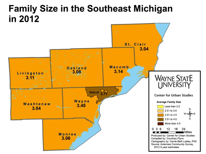
Detroit has embarked on one of the largest scattered site demolition projects in the world. This task is reflective of the city’s vacancy rate, which is considered one the highest in the nation (Kolko, 2013). Property values are still on the decline in Detroit, as can be seen by a more than 10 percent decrease in the city’s state equalized value (SEV) in the past year (Liu, 2014). Property values are very sensitive to such vacancies, impacting the potential for revenue generation in a city just emerging from bankruptcy. Thus, the blight demolition projects have taken center stage as the city tries to revitalize itself. Here we take a closer look at the various sources of statistics that show discrepancies in just how many structures are considered blighted and ready for demolition. We consider the policies surrounding this issue.

The first step to determining how many, and which, houses to tear down includes a complete inventory of the residential structures within the city, including an analysis of how many of those are vacant. For those structures that are determined vacant, it must then be determined how many are in such a state of disrepair and decay that they are unlikely to attract interest from someone willing to renovate and move in.

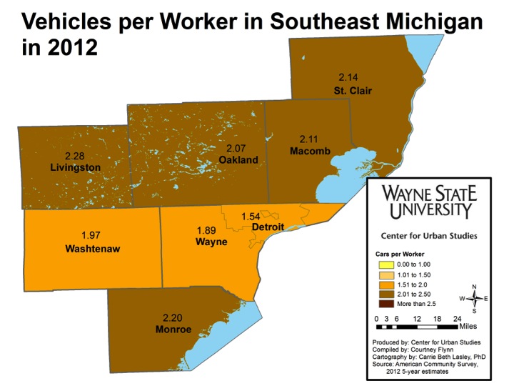
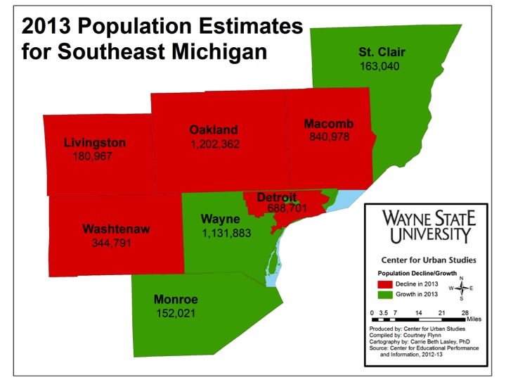
There are stark differences in the extimates of the number of vacant homes. Data Driven Detroit’s Motor City Mapping project (www.motorcitymapping.com), deployed over 100 data collectors throughout the city to survey every city lot and to rate the condition of the remaining structures including vacancy and fire damage. They identified 261,275 total structures in Detroit in 2013, and identified 48,327 as unoccupied, for a vacancy rate of 18.5 percent.[i] In 2012, which is the most recent data, the American Community Survey for the U.S. Census Bureau, estimated in its 5-year estimates that 104,143 of 363,010 housing units (not just structures) were vacant, for a rate of 28.7 percent. The Blight Removal Task Force, which was formed by the Obama administration in 2013 to recommend a course to deal with the massive amount of blight in Detroit, estimated that Detroit had 78,506 vacant structures of 380,000 for a rate of 20.7 percent; this data was collected from December 2013 to January 2014. Additionally, the U.S. Postal Service recognized 87,731 vacant addresses out of 363,045 for a rate of 21.6 percent in December of 2013. Below is a table that summarizes these figures:


Data Driven Detroit

(2013)

Blight Removal Task Force

(2013)

USPS

(2013)

American Community Survey (5 yr estimate 2012) Total Average
Detroit Vacancy Rate


18.5 20.7 21.6 28.7 22.5

The estimates of the number of structures that should be removed is just as variable. The Motor City Mapping platform states that the need for two major repairs results in the structure as being deemed in “poor condition.” For a structure to be deemed for “suggested demolition” by Motor City Mapping it must “not appear to be structurally sound, may pose safety risks, and is generally uninhabitable. The building may be buckling, caved in, or otherwise severely compromised.” With this definition, Motor City Mapping determined 4,431 properties were rated for demolition, a rate of 1.7 percent of structures. In the same study, Motor City Mapping indicated that 6,873 structures, or 2.6 percent, had fire damage in 2013; 5,979 (2.3 percent) had become obvious dumping sites and that 27,640 (10.6 percent) structures needed boarding from intruders and the elements. By contrast, the Blight Removal Task Force recommended 40,777 structures for immediate removal, or 10.7 percent of the housing stock. The task force determines if a structure should be removed if it meets the definition of blight and where the estimated cost of rehabilitation (to code) will exceed market value or create positive economic opportunities for the neighborhood,” (Detroit Blight Removal Task Force Plan, pg.125). The Detroit Blight Task Force considers a property blighted if it is: a public and/or attractive nuisance; fire damaged or otherwise dangerous; has code violations posing a severe or immediate health or safety threat; is open to the elements and trespassing; is already on the city of Detroit’s demolition list; is owned or under the control of the land bank; has had utilities, plumbing, heating or sewage disconnected, destroyed, removed, or is otherwise ineffective; is a tax reverted property; has been vacant for five consecutive years and is not maintained to code (timetoendblight.com).

Data Driven Detroit Blight Removal Task Force
Recommended for demolition in 2014 4,431 40,777
Percent of housing stock 1.7% 10.7%


According to the federal, state and city government, removing these structures is essential for “neighborhood stabilization” (City of Detroit Planning and Development Department 2011, Michigan Foreclosure Task Force 2013, U.S. Department of Housing and Urban Development 2010). Demolition of of several thousand homes will be completed through the use of $52.3 million in Hardest Hit Funding. These funds, allocated by the U.S. Treasury from the Troubled Assessed Relief Problems (TARP) funds for those states hardest hit by the mortgage foreclosure crisis, must be spent by April 30, 2015 or it will be lost (Detroit Building Authority 2014). An additional investment of approximately $250 million may be awarded toward the same goal in a short period. While each state helps to tailor the local allocation of Hardest Hit Funding, most communities in Michigan and other states have elected programs that help homeowners facing foreclosure to make payments while they look for work (U.S. Department of Treasury, 2013). Other uses of this funding, besides demolitions, include property auctions and loans for renovation. More information about these programs can be found at www.buildingdetroit.com.

While the decision-makers engaged in this process appear unified on the need to use demolition to spur redevelopment, these decisions are being made in an unstable urban environment. In the short run population is still in decline, having not yet reached its nadir. Nearly 120,000 residents have left Detroit since 2008 (U.S. Census Bureau 2014). As Detroit’s population dwindles homes likely will continue to be left vacant, as the number of people moving back to Detroit is unlikely to come close to equaling the number of those who have left.

High-profile urban institutes, including the Brookings Institute, have identified Detroit’s vacant homes as an economic handicap, citing the need for demolition to equalize supply and demand in the housing market and thus stabilize property values; to resolve expensive nuisance issues related to maintaining abandoned properties; and to reduce disincentives to revitalization (Mallach 2012). Other potential benefits of a demolition policy include removal of sites of criminal activity and removal of pests such as rats, roaches and stray animals (Detroit Blight Removal Task Force Plan 2014, Institute of Population Health 2014).

However there are major potential downsides to this massive program of demolition. The large-scale demolition in a small area of Detroit in a short time is likely to exacerbate health problems that may be unconcerning for a single demolition. This is the case according to the Blight Removal Task Force’s own plan as well as the Health Impact Assessment funded by the National Association of County and City Health Officials and the Centers for Disease Control and Prevention’s Health Initiative (Detroit Blight Removal Task Force Plan 2014, Institute of Population Health 2014). Lead and other heavy metals and toxic chemicals from the demolition will create toxic dust and aerosols that may impact neighbors by causing or triggering conditions such as lead poisoning or asthma. Lead can be ingested through dust and can also contaminate soil, especially around older buildings with flaking external paintwork, or near industrial buildings. The most prevalent risk from lead exposure is IQ deficiency in children – even with relatively low lead levels in blood, there are indications it negatively affects children’s IQ. The most vulnerable age group is children under 3 years old because of potential effects on neurological development, and because young children’s bodies more readily take up lead. Other risk groups include pregnant women and fetuses. For asthma, which is a chronic disease characterized by the swelling and narrowing of the airways to the lungs, it can be triggered by, dust, mold and volatile organic compounds (among other things), which have the potential to be emitted into the environment following demolitions. Those who experience symptoms of asthma often wheeze, have shortness of breath, a sensation of a tight chest, and cough.

In addition to the potential health risks related to mass demolitions, there is also no guarantee that if you demolish a structure, a new home will take its place. After the building has been removed, there are limited investment incentives currently in place to encourage investors to redevelop these vacant parcels, leaving the city pocked with large swaths of vacant and open land between homes in some areas. Aside from the Detroit Land Bank, where structures and vacant lands in the city are auctioned off, land will be city-owned, meaning maintenance of these vacant parcels will be the obligation of the city. This has caused problems historically for other cities, especially financially insecure cities like Detroit. After Hurricane Katrina, New Orleans and neighboring communities that lost significant tax bases encountered similar issues of having a substantial number of abandoned properties turned over to the municipality. The problem became how to redistribute this property to other agencies or investors to reduce the maintenance burden on a city incapable of significantly expanding its staff to meet the maintenance needs.

         What would be an improvement is a strategy that reduces demolitions, while tightening the dust suppression by implementing protocols similar to those in Baltimore that call for increased deconstruction and the use of temporary barriers during demolition. This would cost more, but reduce the consequences for this generation of Detroit’s children.

In addition, more housing should be boarded so it could be rehabilitated as the city’s housing market improves. Third, housing rehabilitation should be targeted for neighborhoods that are already starting to improve as directed patrol, CompStat and other public safety interventions reduce crime and increase public safety. Within these targeted neighborhoods, home improvement would targeted around schools where safe routes have been established and educational improvement is underway. Together these measures are likely to produce an improving market as we are beginning to see in Midtown, North End, Corktown and along some stretches of East Jefferson.

[i] This is an on-going endeavor. Right now DDD is deploying data gatherers to update its data in several neighborhoods where change is particularly fast.

Detroit’s unemployment still below July’s high

  • From August 2014 to September 2014, the unemployment rate across the state remained stagnant while the City of Detroit’s increased (monthly);
  • The Purchasing Manager’s Index for Southeast Michigan increased from August 2014 to September 2014 (monthly);
  • Commodity Price Index decreased from August 2014 to September 2014 for Southeast Michigan (monthly);
  • Wayne, Oakland, and Macomb counties all experienced decreases in the number of monthly building permits pulled.

Slide02According to the most recent data provided by the Michigan Department of Technology, Management and Budget, from August to September the unemployment rate for the state of Michigan remained steady at 6.7 percent. The city of Detroit a experienced slight unemployment rate increase — from 14.4 percent in August to 14.6 percent in September. The unemployment rate in Detroit has decreased 2 points since September of 2013.

Slide04

From August to September the number of people employed in the City of Detroit decreased by about 109, leading to a total of to 285,018 people employed.

Slide06

The above chart shows the number of people employed in the auto manufacturing industry in the Detroit Metropolitan Statistical Area (MSA) (Detroit-Warren-Livonia) from September 2013 to September 2014. During the period under consideration, the highest employment levels in the auto manufacturing and auto parts manufacturing industries occurred in June 2014, when there were 99,100 people employed in the Detroit MSA. That number dropped by 3,700 people to a total of 95,400 people employed in September; however, this is also an increase of 3,800 from the month of July.

Slide08

The Purchasing Manger’s Index (PMI) is a composite index derived from five indicators of economic activity: new orders, production, employment, supplier deliveries, and inventories. A PMI above 50 means the economy is expanding.

According to the most recent data released on Southeast Michigan’s Purchasing Manager’s Index, the PMI for September was 59.4, a positive increase of 4.6 points from the prior month and a decrease of .5 points from last year at this time.

Slide10

The Commodity Price Index, which is a weighted average of selected commodity prices, was recorded at 55.7 points in September, which was 7.4 points lower than the previous month and 1.5 points higher than a year ago.

Slide12Slide13Slide14

The above charts show the number of residential building permits obtained each month in Wayne, Oakland, and Macomb counties from January 2013 until September 2014. These numbers are reported by local municipalities to the Southeastern Michigan Council of Governments and include single-family units, two-family units, attached condos, and multi-family units.

Two of the three counties experienced a decrease in the number of building permits pulled from August 2014 to September 2014. Oakland experienced a decrease 51 building permits from August to September while Macomb County experienced a decrease of 48 and Wayne County pulled the same number of building permits in September of this year as it did last year, 54.


Rural counties in Southeastern Michigan have higher access to vehicles

With a weak public transportation system in Southeastern Michigan, access to a vehicle is critical for the commuting to and from work, school and other necessary places. In this post we examine the average number of vehicles residents in Southeastern Michigan residents have access to. The maps will show that at the county level the more rural counties have workers with more access to a vehicle, but at the census tract level it is the wealthier areas with a higher access number.

Data for this post was received from the 2012 American Community Survey. All workers age 16 and above in a household were considered when determining the average number of vehicles a worker has access to.

In 2012, in every county in the region, there was, on average, at least one vehicle or more per worker. When examined at the municipal level, even Detroit, where there was less than one car per worker in many census tracts, the average number of vehicles per worker was 1.54.

Livingston and Monroe counties, which are both rural, averaged access to the highest number of vehicles per worker in the region. Livingston County averaged access to 2.28 vehicles per worker in 2012 and Monroe County averaged access to slightly less, with 2.20. Wayne County had the lowest average access to vehicles per worker in the region. The average in 2012 was 1.89.

A closer look at the municipalities in the region shows that Highland Park had the lowest access average to the number of vehicles per worker in the region. This access number was 1.34 vehicles per worker. York Township in Washtenaw County averaged access to 2.62 vehicles per worker, making it the municipality with the highest average in the region.

When examining this data at the census level, there are clear differences between the counties in the tri-county area in terms of access to vehicles per worker. Overall, a majority of the census tracts in Oakland County, particularly those in the northern, western and eastern sides of the county, averaged access to more than 2.5 vehicles per worker. While the majority of census tracts in Macomb County had workers with access to over 2 vehicles per worker, only one, located in Shelby Township, had workers with access to 2.5 vehicles or more per worker. In Wayne County, there were no census tracts where workers had to access to, on average, more than 2.5 vehicles. However, one tract in Detroit had an average of 0.33 vehicles per worker. Viewing cars as a critical asset and a de facto necessity for getting work in a region where jobs are sprawled throughout the metropolitan area, these data clearly represent another dimension of the mal-distribution of resources across these seven counties.

Overall region experiences slight population loss from 2012 to 2013

One important aspect of understanding a region is to understand its population distribution and demographics. To keep our readers updated on this we regularly update our maps to reflect the most current population statistics.

In this post, 2012 population statistics from the American Community Survey are presented.

Slide05


Overall, this post will examine the 2012 population numbers for the municipalities located in Southeastern Michigan; this is because 2013 population statistics are not yet available at the local level. However, above we provide a comparison of the counties’ populations from 2012 to 2013. Wayne County experienced the largest decrease from 2012 to 2013, about 47,196 residents left, about 32,000 of those residents left from within the city of Detroit. According to the American Community Survey, every other county lost residents as well, with the exception of Monroe and St. Clair counties. These losses were minute next to the loss experienced in Wayne County. The county that lost the second highest number of residents from 2012 to 2013 was Oakland County; about 4,700 residents left from 2012 to 2013. Monroe County gained 77 residents and St. Clair County gained 62.

Although Detroit’s population has been declining since the early 1960s, it still remains the largest city in both the region, and the state. In 2012, the population was reported to be 721,459, about a 1 percent increase from the population of 713,000 in 2010.


In Wayne County, the City of Detroit was the only municipality in which the population exceeds 100,000. In the seven-county region there were only four municipalities with a population exceeding 100,000– Detroit (721,459), Warren (134,550), Sterling Heights (129,887) and Ann Arbor (114,725). Warren and Sterling Heights are located in Macomb County and Ann Arbor is in Washtenaw County. In Oakland County, where the total population was 1,207,297 in 2012, the municipality with the highest population was the city of Troy (81,307).

The Tri-County Region (Wayne-Oakland-Macomb) contained the largest portion of the population in Southeastern Michigan in 2012, about 84 percent. Livingston, Monroe St. Clair and Washtenaw counties did not have one municipality with a population above 35,000. Washtenaw had just Ann Arbor and Ypsilanti exceeding this figure. In Livingston County, Hamburg Township had the highest population at 21,396. In Monroe County, Bedford Township had the highest population at 31,055. Port Huron had the highest population in St. Clair County at 30,253. As already noted, Ann Arbor had the highest population in Washtenaw County at 114,725.

Since 2010 the overall population in Southeastern Michigan has experienced a population increase, despite decades of population decline, with the city of Detroit falling from the fourth-largest American city in the mid-twentieth century to barely cracking the top 20 today. However, the region is still home to around four million people, and it is second only to Chicago among other Midwestern metropolitan areas.

Highland Park has highest percentage of Supplemental Security Income recipients

Supplemental Security Income (SSI) is administered on a monthly basis by the federal government to the disabled, blind, or those above the age of 65. It is only provided to such recipients in these categories who have a limited income, with the purpose of aiding in the purchasing of food, clothing and shelter (for more info-click here). In 2014, the monthly SSI benefit rate increased to $721 for an individual and $1,082 for a couple; these increases were reflective of an increase in the Consumer Price Index, according to the Social Security Administration.   Thus an individual receiving SSI in 2014, would receive an annual income of $8,652.

This post examines the percentage of residents who received SSI in 2012 throughout the seven-county region of southeast Michigan. At that time, an individual’s monthly benefit was $698 and a couple’s was $1,048. In examining the percent of residents throughout the region who collect SSI, it is also helpful to understand the percentage of residents age 65 or older in each community and county. To view this information, please click here for our previous post.

Slide03Slide04Slide05Slide06

As noted earlier, SSI recipients must be either legally disabled, blind, or above the age of 65, and have limited incomes. The first map shows that Washtenaw County had the lowest percent of residents who received SSI in 2012. There were only four municipalities’ in that county where more than 4.01 percent of the population received SSI checks, and none of those communities had more than 8.01 percent of the population collecting SSI. It is important to note that Washtenaw County also had the lowest population of residents aged 65 or older in 2012. According to American Community Survey data, 10.3 percent of Washtenaw’s County was 65 years of age or older in 2012.

Macomb and St. Clair counties had the highest population of those 65 years of age and above in 2012 at 14.4 percent and 14.6 percent, respectively. However, both of these counties had fewer municipalities with more than 4.01 percent of the population collecting SSI benefits than Wayne County. Macomb had eight municipalities and St. Clair had 10 municipalities with more than 4.01 percent of the population receiving SSI benefits. Wayne County, where seniors comprised 12.7 percent of the population, had 22 communities with more than 4.01 percent of residents receiving SSI in 2012. In St. Clair County, the city of Memphis had the highest percent of residents collecting SSI benefits at 12.8 percent. In Macomb County, Richmond Township had the highest percentage of residents receiving SSI benefits at 5.1 percent.

The second map above breaks down the percentage of residents in each community who collect SSI benefits by census tract. For example, in St. Clair County, both the city of St. Clair and Casco Township are split in half with the percent of residents who collect SSI benefits. For both of these municipalities, one half has 4 percent or less of the population collecting SSI benefits while the other half has between 4.01 and 8 percent of the residents collecting SSI benefits. One reason for this may be that those census tracts with a higher percent of the population collecting SSI benefits house facilities such as nursing homes.

Slide08Slide09

In 2012 in Wayne County, there were five different municipalities where more than 10 percent of the population collected SSI benefits. Highland Park had the largest percentage at 19.2 percent. The City of Detroit was also one of the top five municipalities; 11.9 percent of that population collected SSI benefits in 2012. During that same year, 12.5 percent of Wayne County’s population, 14.3 percent of Highland Park’s population and 11.5 percent of Detroit’s population were 65 years of age or above.

The final map shows the percent of residents receiving SSI in each census tract in Detroit and the surrounding areas. There were five tracts where 32.1 percent or more of residents collected SSI benefits.